Preview image. Unlock full-res
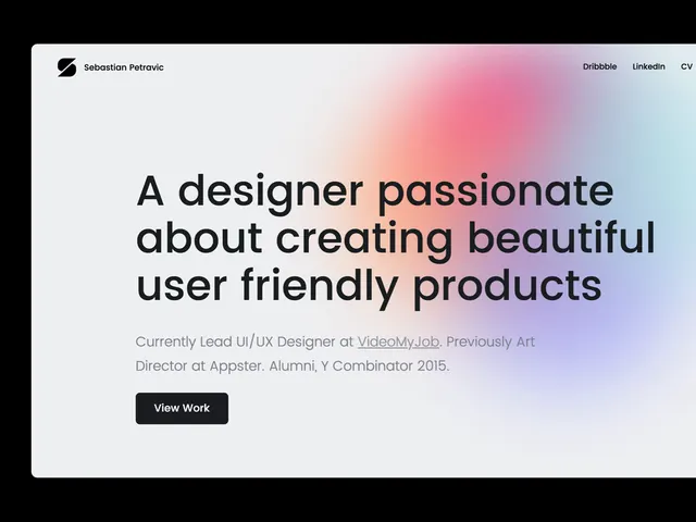
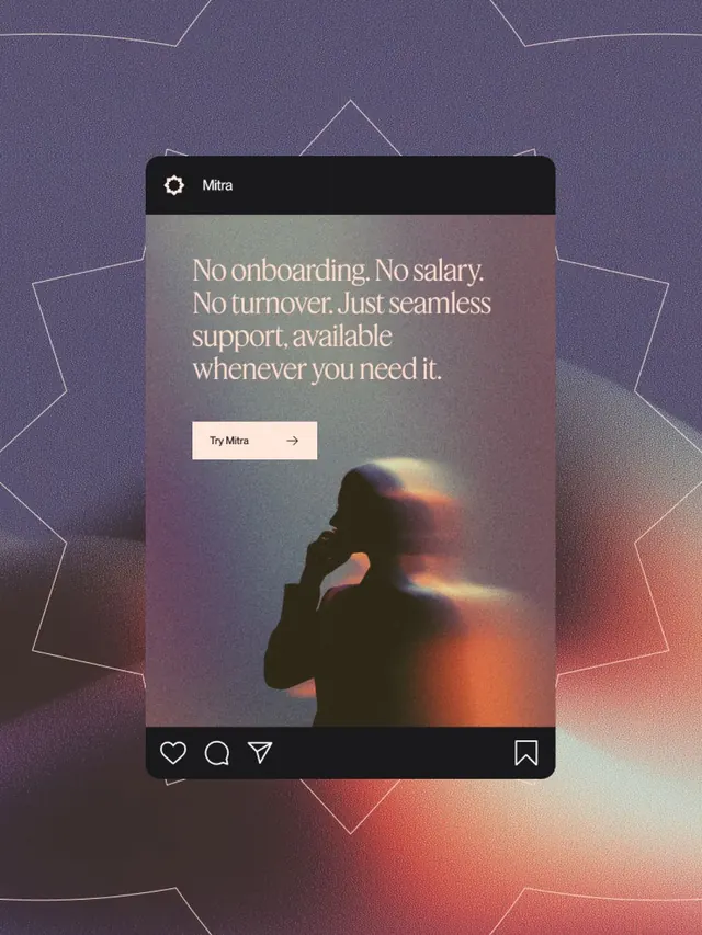
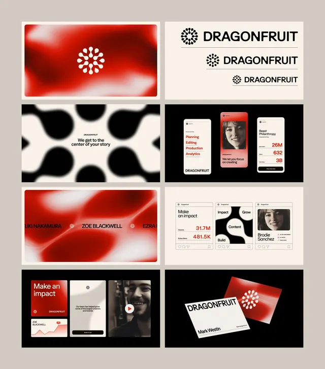
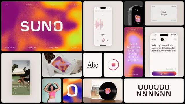
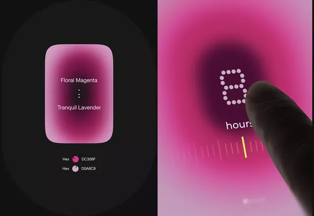
This design uses a soft, luminous color palette to evoke feelings of tranquility and vibrancy.
Summary
This design uses a soft, luminous color palette to evoke feelings of tranquility and vibrancy.
Visual description
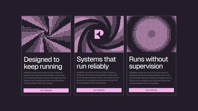
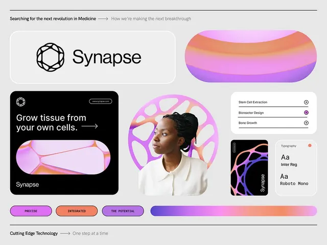
This design uses a soft, luminous color palette to evoke feelings of tranquility and vibrancy. The visual language relies on smooth gradients, subtle shadows, and high contrast between dark and bright tones to highlight specific color swatches or data points. The composition is structured in a two-panel split, contrasting a dark background with a highly saturated pink field, which provides clear visual separation. Simple, clean sans-serif typeface is used for labels and data presentation.
Key takeaway
An ui screen reference. Worth saving for its minimalist, luminous, gradient treatment.
Reuse notes
Fits general design work.