Preview image. Unlock full-res
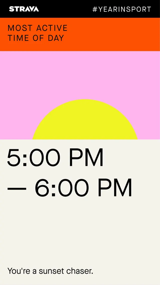
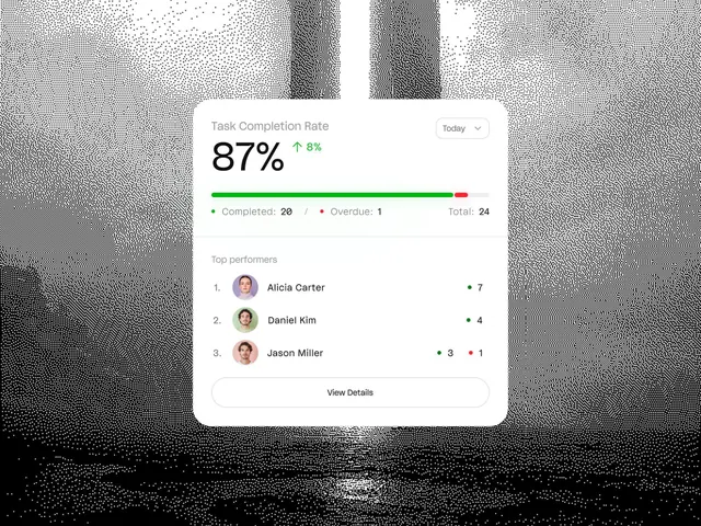
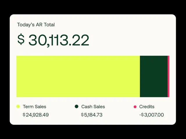
The design is clean, modern, and highly functional, utilizing a strong contrast between bright orange/pink backgrounds and stark white text to present performance metrics clearly.
Summary
The design is clean, modern, and highly functional, utilizing a strong contrast between bright orange/pink backgrounds and stark white text to present performance metrics clearly.
Visual description
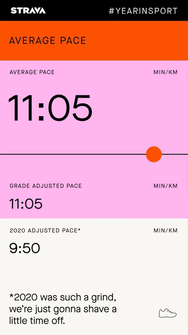
The design is clean, modern, and highly functional, utilizing a strong contrast between bright orange/pink backgrounds and stark white text to present performance metrics clearly. The visual language is minimalist, relying on large numbers and simple dividers to emphasize key data points. The layout is vertically structured, using distinct horizontal sections separated by thin lines to organize different pace metrics. Sans-serif typeface is used throughout, prioritizing readability and a contemporary feel.
Key takeaway
A dashboard reference. Worth saving for its minimalist, data-driven, modern treatment.
Reuse notes
Fits fitness work.