Preview image. Unlock full-res
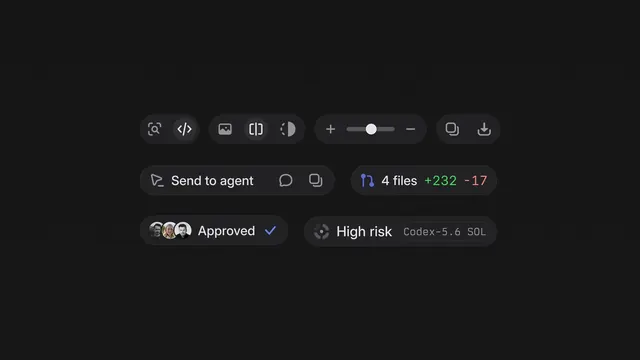
A set of dark-themed UI components and icon buttons designed for Linear, including toolbar controls, status pills, git diff indicators, and approval badges.
More like this
See all
Summary
A set of dark-themed UI components and icon buttons designed for Linear, including toolbar controls, status pills, git diff indicators, and approval badges.
Visual description
A dark background displaying isolated UI components in horizontal rows: rounded-pill icon buttons with search, code, image, and brightness controls; a spacer-slider element; a "Send to agent" action button; file change indicators showing "+232 -17" in green and red; an approval badge with overlapping user avatars and a checkmark; and a risk-assessment badge reading "High risk Codex-5.6 SQL". All components use consistent rounded corners and subtle contrast.
Key takeaway
Group related UI patterns into a component showcase grid to communicate visual consistency, interaction states, and contextual usage across a design system at a glance.
Reuse notes
Reach for this as a ui screen reference. Pairs with minimal, clean directions. Original by Adrien Griveau.