Preview image. Unlock full-res
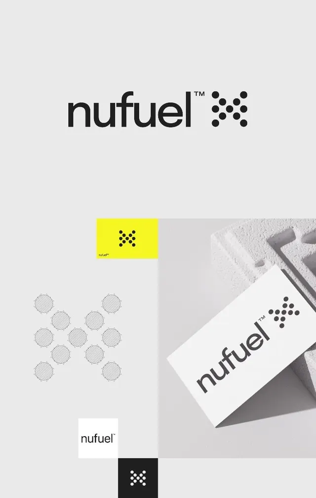
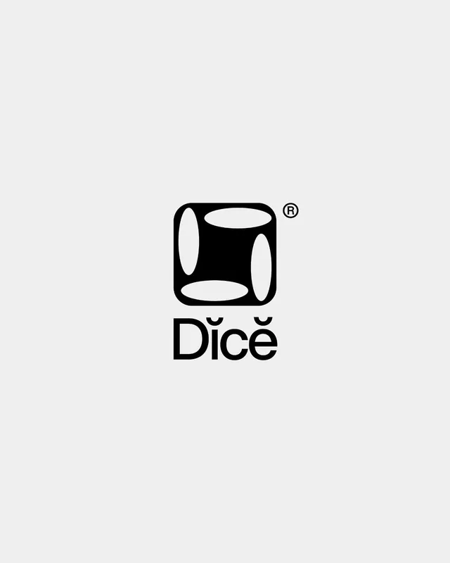
This design utilizes strong geometric shapes and negative space to create a clean, memorable brand mark.
Summary
This design utilizes strong geometric shapes and negative space to create a clean, memorable brand mark.
Visual description
This design utilizes strong geometric shapes and negative space to create a clean, memorable brand mark. The visual language is minimalist and precise, relying on solid black forms contrasted against a light background to achieve high impact. The composition is centered, stacking a distinct graphic element directly above the brand name for clear hierarchy. A bold, clean sans-serif typeface is used for the wordmark, emphasizing modernity and readability.
Key takeaway
A logo reference. Worth saving for its minimalist, geometric, modern treatment.
Reuse notes
Fits general design work.