Preview image. Unlock full-res
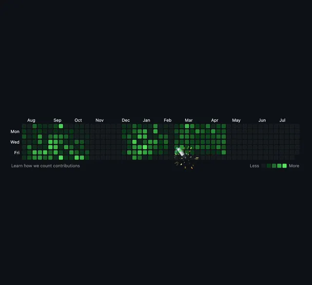
A tool that lets you visually fill gaps in your GitHub contribution graph, shown through animated before-and-after comparisons with playful particle spray effects.
More like this
See all
Summary
A tool that lets you visually fill gaps in your GitHub contribution graph, shown through animated before-and-after comparisons with playful particle spray effects.
Visual description
A dark navy background displays a GitHub-style contribution grid spanning August through July with day-of-week labels. Green squares in varying intensity represent contribution levels. A playful animated particle spray burst with yellow and white sparkles erupts in the center-right area. Text below reads 'Learn how we count contributions' with a legend showing intensity levels.
Key takeaway
Add celebratory particle burst effects to functional data visualization to transform routine interaction into a delightful micro-moment.
Reuse notes
Reach for this as a ui screen reference. Pairs with minimal directions. Original by gianmarco simone.