Preview image. Unlock full-res
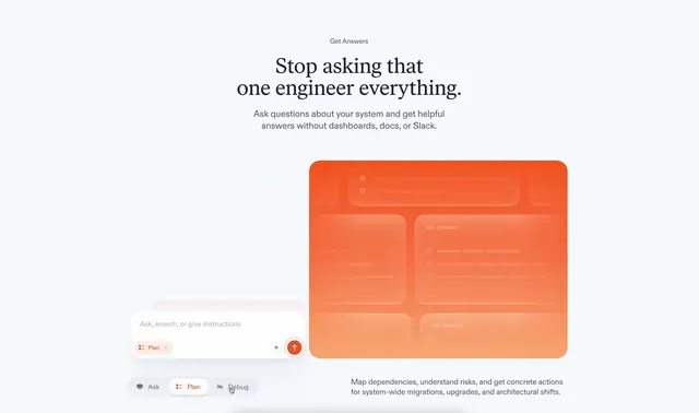
A collection of clean, minimal product feature pages for a developer observability tool, showcasing sections for answering, diagnosing, preventing, and fixing engineering issues.
More like this
See all

Summary
A collection of clean, minimal product feature pages for a developer observability tool, showcasing sections for answering, diagnosing, preventing, and fixing engineering issues.
Visual description
Centered vertical stack with small gray label, oversized serif headline, and compact sans-serif subheading. Below sits a chat-like input bar with searchable filter chips and action buttons for Ask, Plan, and Debug. The right side hosts a large rounded-corner orange mockup rectangle showing faint internal UI elements. Generous whitespace throughout, accent color for call-to-action, modest explanatory text anchored at the bottom.
Key takeaway
Use a prominent, full-bleed visual mockup as the hero alongside minimal copy; position the primary interaction affordance (input/chat control) front and center to guide users directly into product engagement.
Reuse notes
Reach for this as a ui screen reference. Pairs with minimal, clean directions. Original by Oguz Yagiz Kara.