Preview image. Unlock full-res
Jason Yuan's redesigned personal portfolio site showcasing a curated grid of dark, high-contrast creative work spanning motion, interface, and campaign design projects.
More like this
See all
Summary
Jason Yuan's redesigned personal portfolio site showcasing a curated grid of dark, high-contrast creative work spanning motion, interface, and campaign design projects.
Visual description
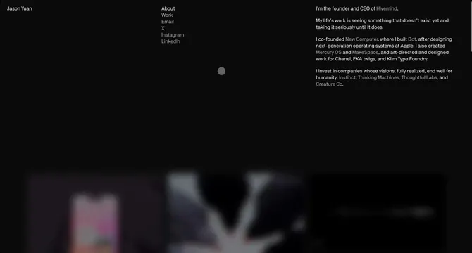
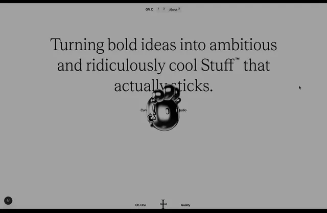
A black page with a two-column text header: a small name at top left, a short vertical menu in the middle with the active item brighter than the rest, and a paragraph bio on the right with some words dimmer to read as links. A small grey dot cursor floats under the menu. Along the bottom, a row of project tiles shows through a heavy blur, hinting at a pink phone screen, a white abstract shape and a dark panel. Type is small, light and set in a clean grotesque on a wide, generous layout.
Key takeaway
Blur the project grid beneath a text-only intro so the page opens quiet and typographic, then sharpens on interaction. Using brightness alone to separate active from inactive links keeps a monochrome layout hierarchical.
Reuse notes
Reach for this as a ui screen reference. Pairs with minimal, editorial directions. Original by Jason Yuan.