Preview image. Unlock full-res
A comprehensive brand case study for SONATA healthcare, featuring abstract floral gradients, premium UI design, and real-world physical applications.

Summary
A 15-slide carousel showcasing SONATA, a genomics-driven concierge medicine platform. The deck blends soft abstract gradients with functional healthcare UI, revealing both the brand identity and the personalized patient experience built around biomarker data and AI-powered health insights.
Visual description
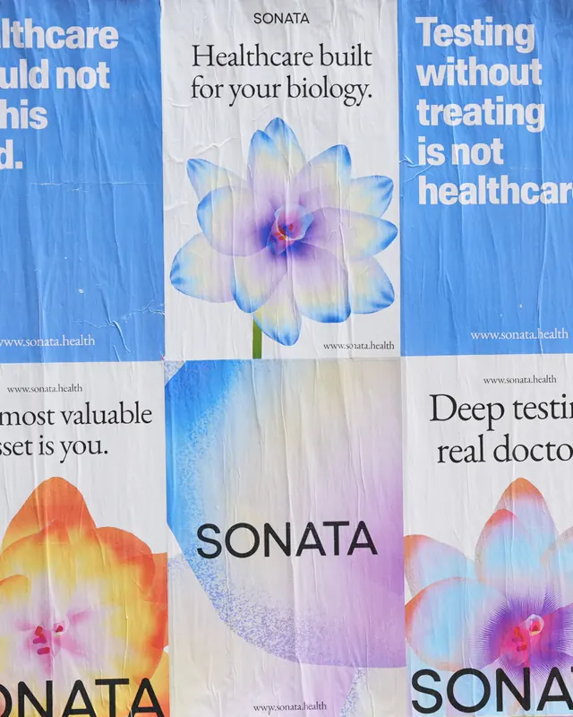
Slide 1 opens with the SONATA wordmark overlaid on soft, flowing petal-like gradient shapes in blues, pinks, corals, and pastels. Subsequent slides explore the visual system through abstract gradient compositions, introducing circular data visualizations and dot-pattern graphics that suggest complexity distilled into clarity.
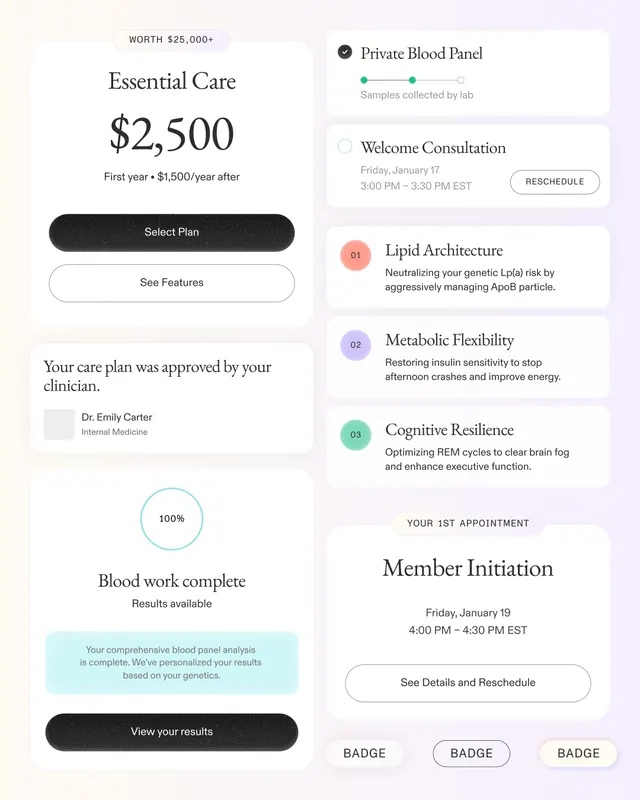
The middle section transitions to product UI: a pricing screen shows the "Essential Care" plan at $2,500 with a "Private Blood Panel" tracking interface, followed by detailed care plan cards organized by health dimension (Lipid Architecture, Metabolic Flexibility, Cognitive Resilience). A progress ring shows "Pace of Aging" and "1.00X" baseline. A personalized notification card addresses a patient named "Deena" as a "Guardian" (neutral genetic profile), with explanatory copy and an "Enter SONATA" CTA button.
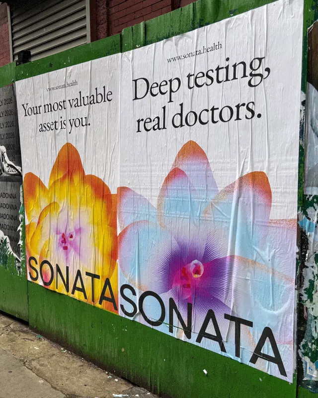
A radar chart visualizes health metrics (Cardiovascular, Metabolic) overlaid on the same floral gradient background. Real-world applications appear as a street-level billboard showing the brand tagline "Deep testing, real doctors" with the signature petal forms illuminated at sunset scale.
The final slides return to the abstract visual system and close with an inspirational hero screen: "Your health story begins today" with SONATA branding, reinforcing the premium wellness positioning.
Key takeaway
The bridge between healthcare abstraction and accessibility: soft organic gradients (aspiring, human-centered) paired with rigorous data visualization (trustworthy, precise). The tagline "Healthcare built for your biology" is backed visually by a system that transforms complex genetic and biomarker data into intuitive, personalized insights. Animated transitions between data states hint at real-time health monitoring.
Reuse notes
Ideal for health-tech, biotech, and fintech products targeting affluent, health-conscious audiences. The gradient palette works best on light backgrounds but can be inverted. The numbering and step-through UI patterns suit onboarding flows and progressive disclosure of health data. Pair with serif typography for copy-heavy sections, sans-serif for UI labels and metrics. The floral abstraction humanizes medical data without sacrificing credibility; avoid cartoonishness.