Preview image. Unlock full-res
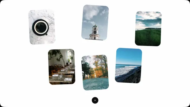
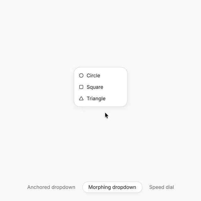
A React component playground built with GSAP showcasing three interaction patterns including an anchored dropdown, a morphing dropdown, and a radial speed dial with fluid open and close animations.
More like this
See all
Summary
A React component playground built with GSAP showcasing three interaction patterns including an anchored dropdown, a morphing dropdown, and a radial speed dial with fluid open and close animations.
Visual description
A minimal interface on a light background showing a rounded card with three menu items stacked vertically: Circle, Square, and Triangle. Each item pairs a simple geometric icon on the left with black serif text on the right. Below the card sits a tab bar with three options: Anchored dropdown, Morphing dropdown (selected), and Speed dial.
Key takeaway
Displaying multiple interaction patterns side by side in tab form lets designers quickly compare behavioral alternatives for dropdowns without context switching, making it obvious which pattern solves each use case best.
Reuse notes
Reach for this as a ui screen reference. Pairs with minimal directions. Original by Arek.