Preview image. Unlock full-res
A minimal bilingual design studio website for KEI inc featuring an editorial Source section, project showcases with photography, and a clean typographic identity.
Summary
A minimal bilingual design studio website for KEI inc featuring an editorial Source section, project showcases with photography, and a clean typographic identity.
Visual description
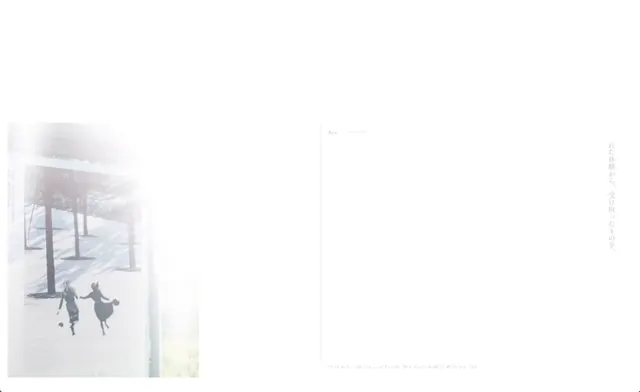
The layout is primarily white with generous negative space, featuring a soft-focused photograph on the left showing figures in a snowy winter landscape. Minimal text appears on the right in light gray, including the word 'Art' and vertical lines of Japanese characters. The top navigation and bottom text remain nearly invisible against the cream background, creating an extremely refined editorial aesthetic. The photograph is the only saturated visual element, everything else recedes into whitespace and typography.
Key takeaway
Deploy extreme whitespace and desaturated photography alongside barely-visible light gray typography to create a serene, gallery-like editorial presence that feels sophisticated through restraint.
Reuse notes
Reach for this as a ui screen reference. Pairs with typographic, minimal directions. Original by 宇都宮 勝晃.