Preview image. Unlock full-res
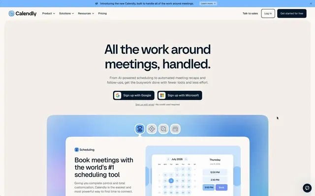
A pinned scroll interaction on the Calendly website where feature cards remain fixed while the background gradient smoothly shifts between pastel hues as the page scrolls.
More like this
See all

Summary
A pinned scroll interaction on the Calendly website where feature cards remain fixed while the background gradient smoothly shifts between pastel hues as the page scrolls.
Visual description
A light website hero with a blue announcement strip, a slim navigation bar and a large centered dark headline in tight bold sans reading All the work around meetings, handled. Below are a short grey subline, two dark pill buttons for sign-in options and a tiny signup link. A rounded panel with a soft blue and lavender gradient frames a row of four icon tabs and a cream feature card showing a Scheduling title, copy and a calendar and time-slot mockup.
Key takeaway
Place a pinned feature card on a soft pastel gradient panel so the background can shift color while the card stays fixed. Icon tabs with a highlighted active state make the section feel like a compact product demo.
Reuse notes
Reach for this as a ui screen reference. Pairs with minimal, clean directions. Original by Calendly.