Preview image. Unlock full-res
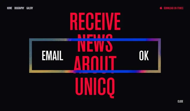
Website or app interface concept with bold red typography overlaid on a dark background with gradient border accent.
Summary
A high-contrast dark UI concept stacked with bold all-caps red typography and a horizontal gradient-bordered button panel containing white text and icons.
Visual description
Pure black background fills the frame. Centered are three large red all-caps words stacked vertically: "RECEIVE NEWS ABOUT UNICO". Overlaid horizontally across the middle is a white-text button panel with a vibrant diagonal gradient border (blue to gold to pink). Inside the panel are three sections: "EMAIL" (left), a red-outlined circle (center), and "OK" (right). Navigation links appear at the top (HOME, BIOGRAPHY, GALLERY) and a small "CLOSE" button at bottom right. The palette is stark: pure black, pure red, pure white, and the neon gradient.
Key takeaway
The graduated approach: background color (black) → accent type (red) → interactive state (gradient-bordered button). The gradient border itself is the only element with visual warmth, making it command attention. This is neo-brutalism with a single concession to playfulness.
Reuse notes
Strong for edgy, tech-forward, or arts/fashion brand interfaces. The gradient border is a quick way to inject visual interest into stark layouts. Red-on-black has high readability but can feel aggressive—pair with plenty of whitespace. Works best for prominent CTAs or section dividers, not body copy.