Preview image. Unlock full-res
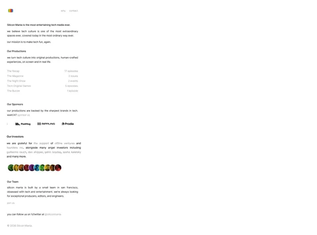
A clean, minimal website for Silicon Mania showcasing their tech media productions, sponsors, investors, and team with understated typography and generous whitespace.
More like this
See all

Summary
A clean, minimal website for Silicon Mania showcasing their tech media productions, sponsors, investors, and team with understated typography and generous whitespace.
Visual description
A clean white webpage with a small striped-square logo top left and minimal navigation (why, contact). Content flows vertically with generous spacing between sections, featuring sparse bold headlines, readable body paragraphs, production listings with episode counts, sponsor logos arranged inline, and a row of colored avatar circles representing investors. Typography is restrained and modern, with ample whitespace defining the layout hierarchy.
Key takeaway
Use abundant whitespace, restrained type weights, and sparse navigation to communicate editorial authority. A minimal color accent (the logo) focuses attention without overwhelming.
Reuse notes
Reach for this as a ui screen reference. Pairs with typographic, minimal directions. Original by Silicon Mania.