Preview image. Unlock full-res
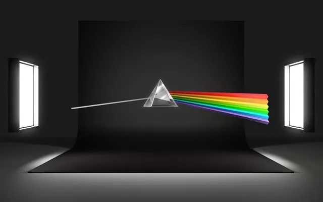
A studio 3D render of the Pink Floyd Dark Side of the Moon prism artwork, with a glass pyramid splitting a white light beam into a rainbow spectrum against a black backdrop with two softbox studio lights.

Summary
A photorealistic 3D render recreation of Pink Floyd's iconic Dark Side of the Moon prism, showing a white light beam passing through a crystal prism and splitting into a full rainbow spectrum.
Visual description
A studio-lit 3D scene against a matte black backdrop. A clear triangular prism sits center-stage, with a focused white light beam entering from the left. The beam refracts through the prism and exits as a full spectrum rainbow (red, orange, yellow, green, blue, indigo, violet) on the right. Two large softbox studio lights are visible as bright white rectangles on either side of the scene, creating realistic studio photography lighting. The floor is a neutral gray with subtle shadow gradations. The rendering emphasizes optical physics and clean geometric composition.
Key takeaway
Effective use of 3D rendering to visualize light physics and color theory. The juxtaposition of the iconic cultural reference with technical precision. Lighting and environment design enhance the subject's visual impact.
Reuse notes
Reference for 3D product visualization, educational materials on optics and light, or design projects engaging with iconic cultural imagery. The technical precision and dramatic lighting work well for luxury or premium brand applications. Note: This asset is a 3D illustration, not a digital product interface.
More like this




Keep what you find
A free account saves references to boards and can send you a weekly email of picks based on what you save.
To see every result, go Pro.