Preview image. Unlock full-res
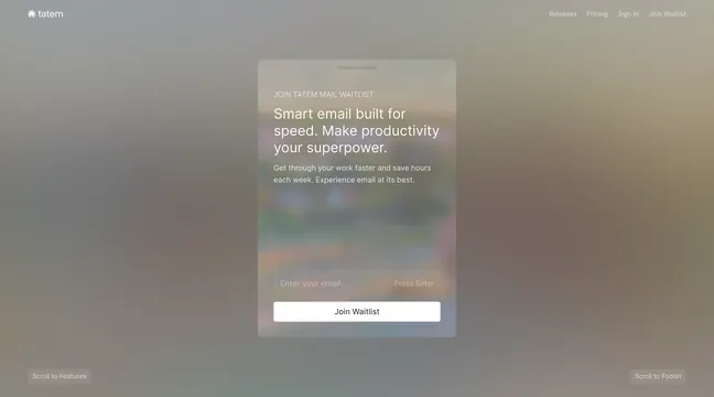
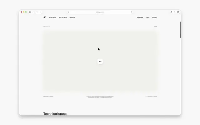
A clean, minimal website for Lightspark's money API platform featuring soft blurred UI card visuals, a global payment network graph, and targeted landing pages for neobanks and enterprises.
More like this
See all
Summary
A clean, minimal website for Lightspark's money API platform featuring soft blurred UI card visuals, a global payment network graph, and targeted landing pages for neobanks and enterprises.
Visual description
A browser window on a pale grey backdrop shows a near white marketing page with a thin top bar carrying a small asterisk mark, the nav links What we do, Who we serve and About us on the left and View docs, Log in and Contact on the right. The centre of the viewport is an enormous empty canvas of faint dotted grid on a warm off white field, with a single small rounded white tile holding the asterisk mark floating dead centre and a cursor arrow just above it. Micro labels in tiny grey sans anchor the corners and centre of that canvas, reading Lightspark API top left, a coordinate readout top right, Capabilities / Payouts bottom left, a two line caption about sending payouts and converting funds in the centre and Pan and zoom to explore bottom right. A heavy black headline reading Technical specs breaks into frame at the bottom edge, setting up the next section.
Key takeaway
Give an interactive canvas almost the entire viewport and let tiny corner labels do all the explaining, so the empty space reads as an invitation to pan and zoom rather than as unfinished layout.
Reuse notes
Reach for this as a ui screen reference. Pairs with minimal, clean directions. Original by Geoff Teehan.