Preview image. Unlock full-res
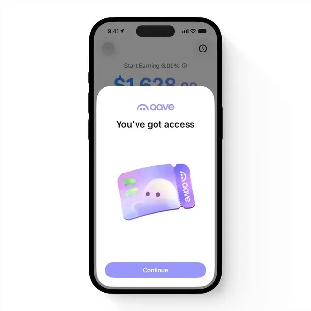
A walkthrough of the Aave mobile app onboarding experience, moving from an access confirmation screen through terms acceptance and Face ID setup to the main savings dashboard.
More like this
See all
Summary
A walkthrough of the Aave mobile app onboarding experience, moving from an access confirmation screen through terms acceptance and Face ID setup to the main savings dashboard.
Visual description
A mobile onboarding screen centers the Aave brand logo and You've got access headline on a light gray ground, with a whimsical gradient-filled mascot character (purple-pink coloring with dot eyes and the Aave logo affixed to its side) positioned above a rounded primary button. The design uses soft shapes, muted colors, and playful imagery to welcome new users, with the app dashboard barely visible behind the modal overlay as context. The composition balances brand identity, instructional clarity, and emotional warmth through the illustrated character.
Key takeaway
Introducing a branded mascot character at the onboarding gate establishes emotional connection and reduces cognitive friction on the critical first login touchpoint, turning a procedural moment into a memorable brand interaction.
Reuse notes
Reach for this as a ui screen reference. Pairs with minimal, clean directions. Original by Alex Vanderzon.