Preview image. Unlock full-res
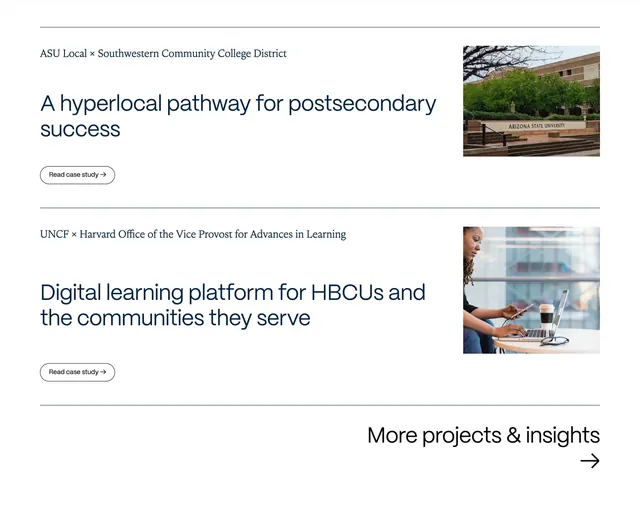
White case-study list with partnership labels, bold headlines, pill Read case study buttons, and right-aligned project photos.
Summary
Two stacked case-study rows pair serif partnership labels and navy headlines with campus and learner photos, ending in a More projects and insights arrow link.
Visual description
White background with thin gray horizontal rules dividing rows. Each row splits roughly 65/35: left shows small serif partnership line (ASU Local x Southwestern Community College District, etc.), large navy sans headline on hyperlocal pathways, and outlined Read case study pill with arrow; right holds rectangular photo of brick campus trees or a learner with laptop and phone. Below final divider, bottom right shows More projects and insights in medium sans with large arrow beneath.
Key takeaway
List rows with dividers feel editorial and scale better than cards for deep case studies. Partnership micro-labels above headlines clarify context without extra layout.
Reuse notes
Ideal for consultancy or foundation project indexes with strong photography. Rows need consistent image aspect ratio; stack image below copy on mobile.