Preview image. Unlock full-res
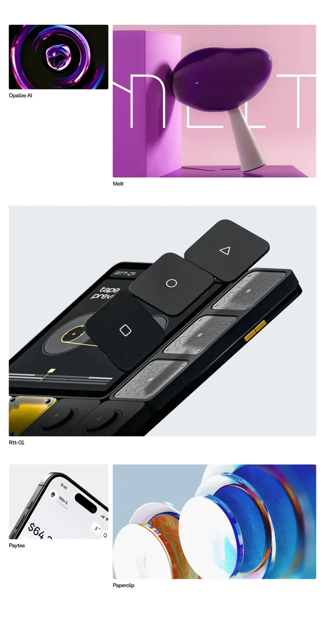
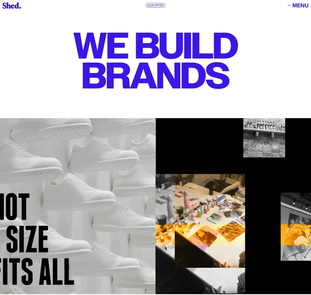
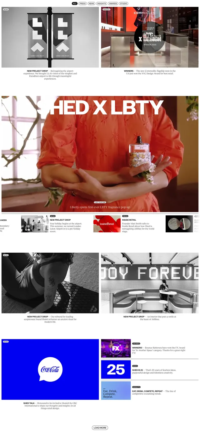
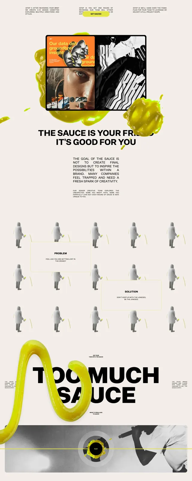
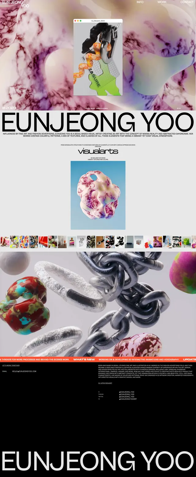
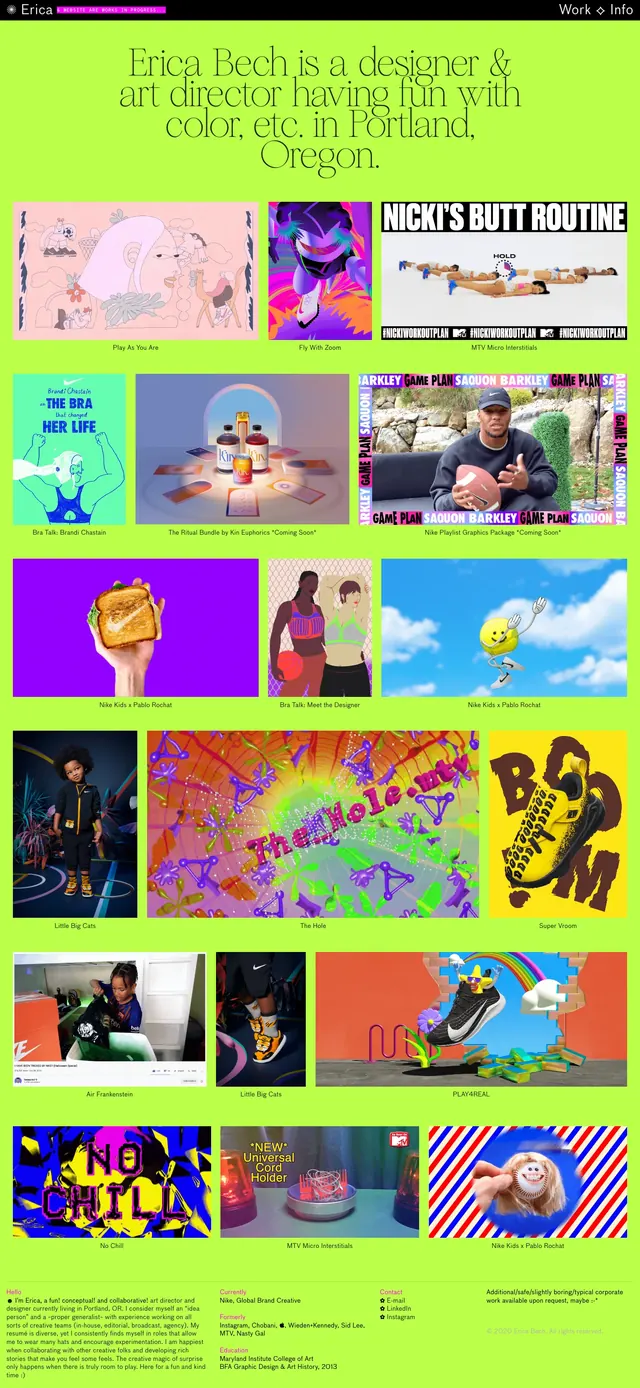
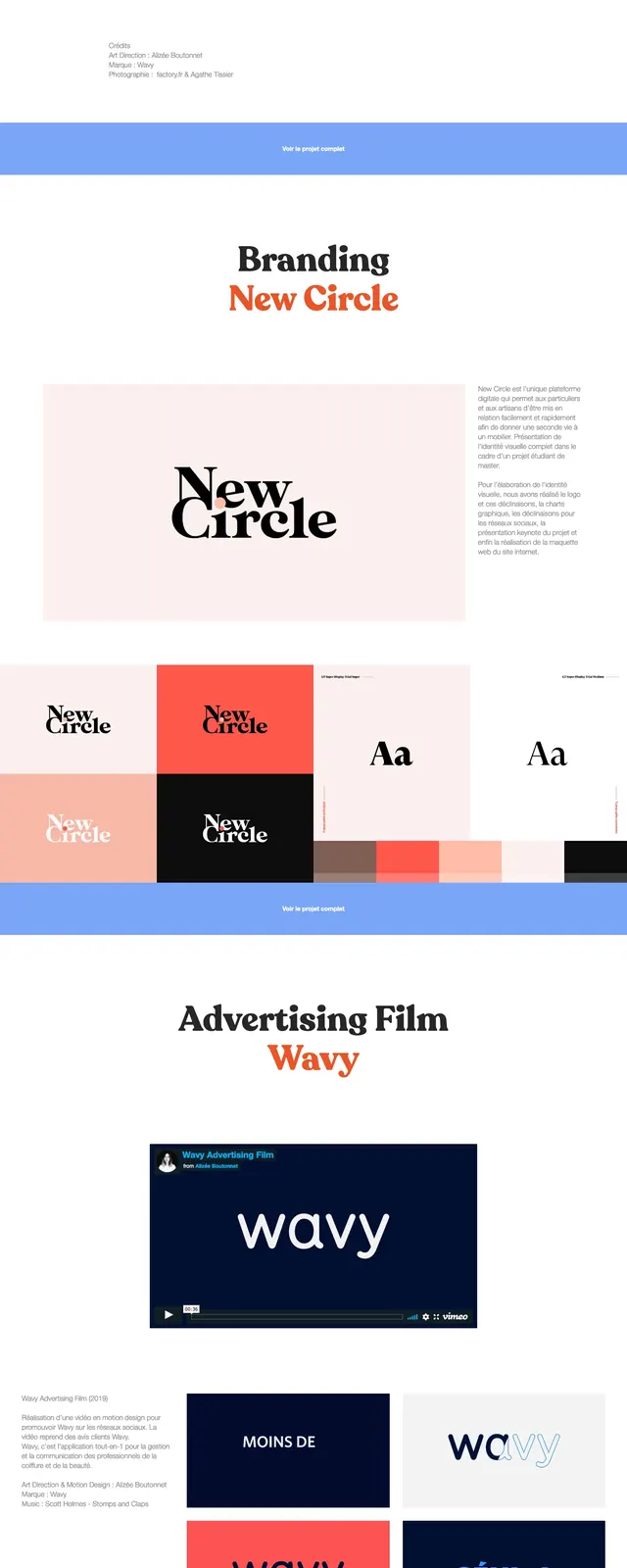
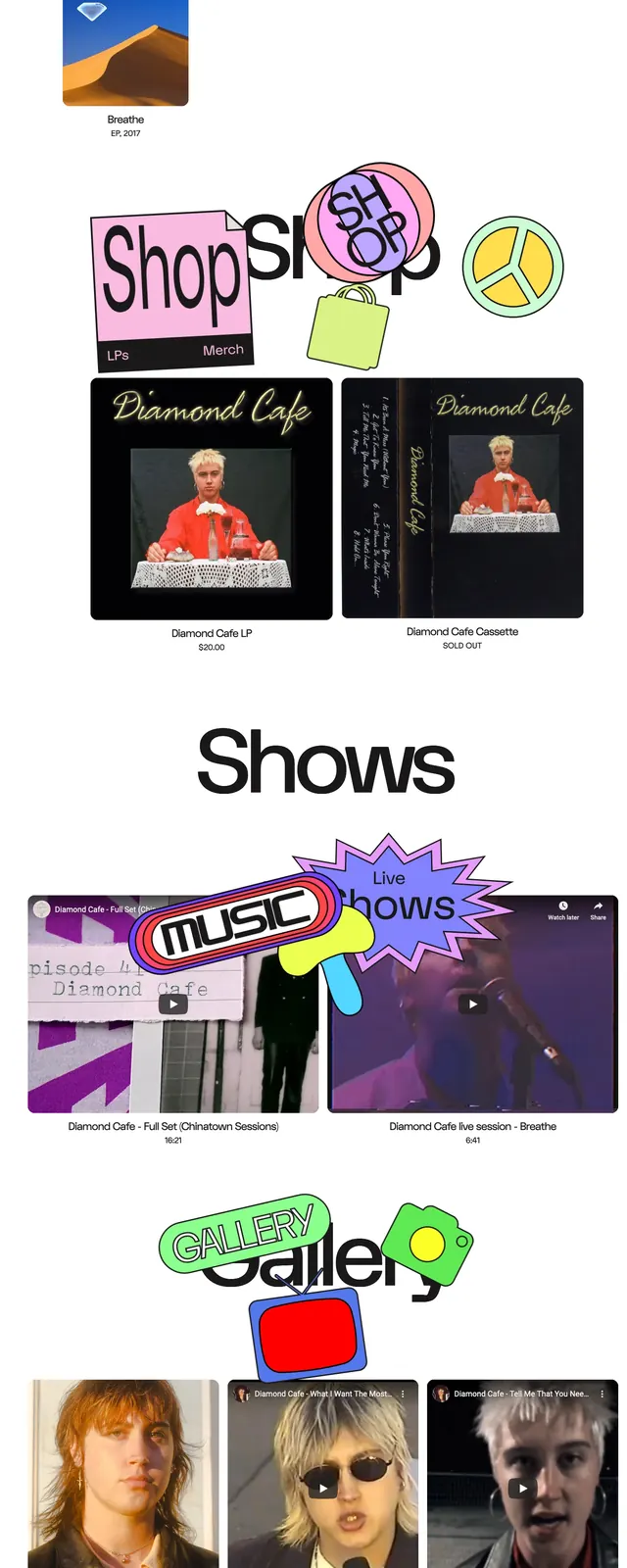
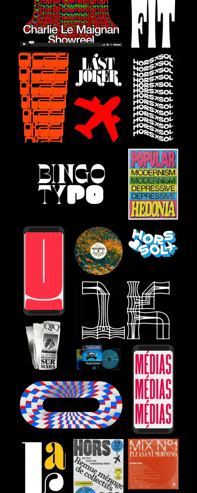
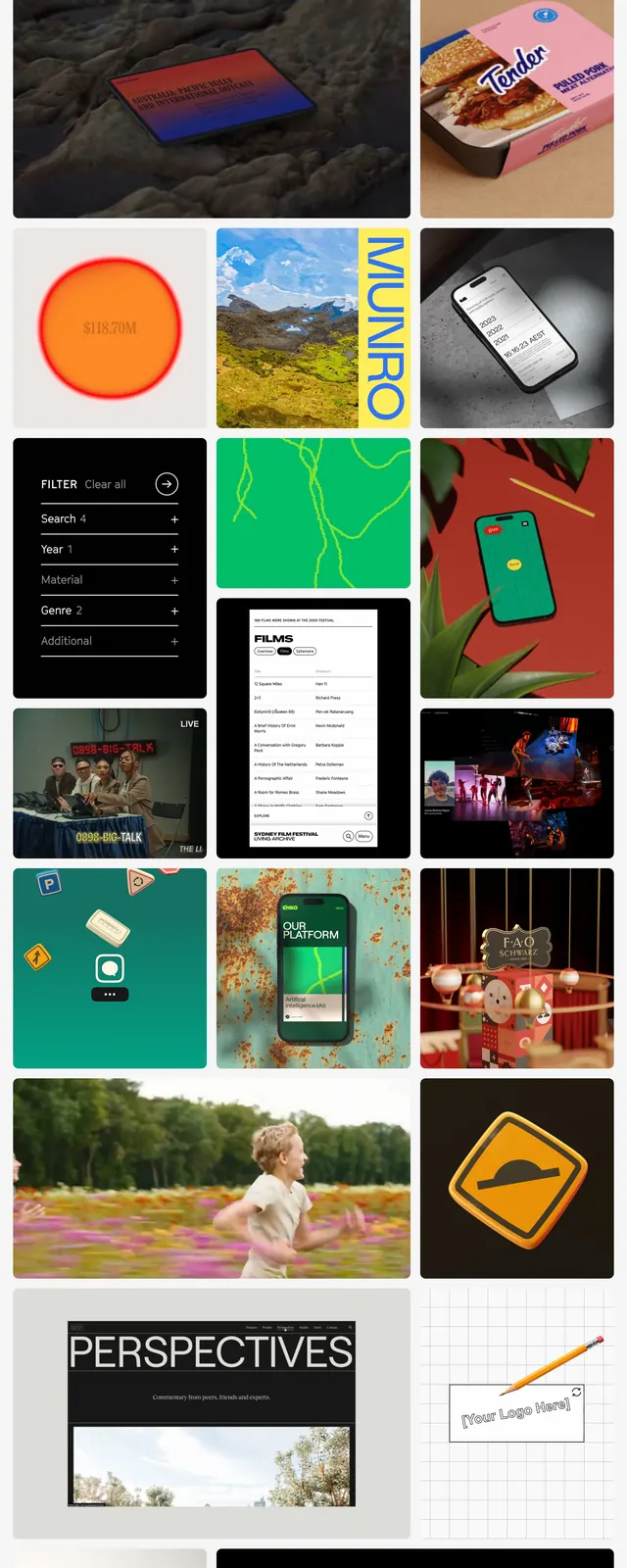
A bold portfolio-style landing page with a dense mosaic of project thumbnails, oversized call-to-action blocks, and a minimal white shell.
Summary
A bold portfolio-style landing page with a dense mosaic of project thumbnails, oversized call-to-action blocks, and a minimal white shell.
Visual description
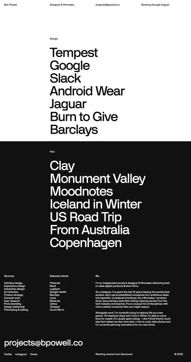
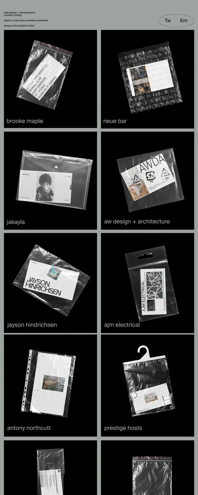
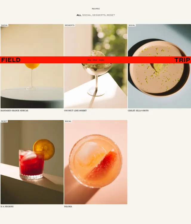
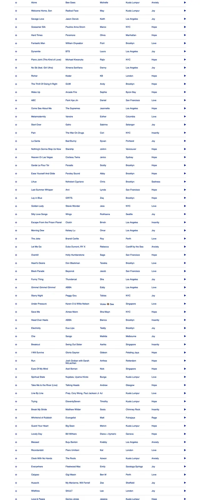
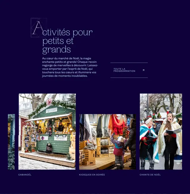
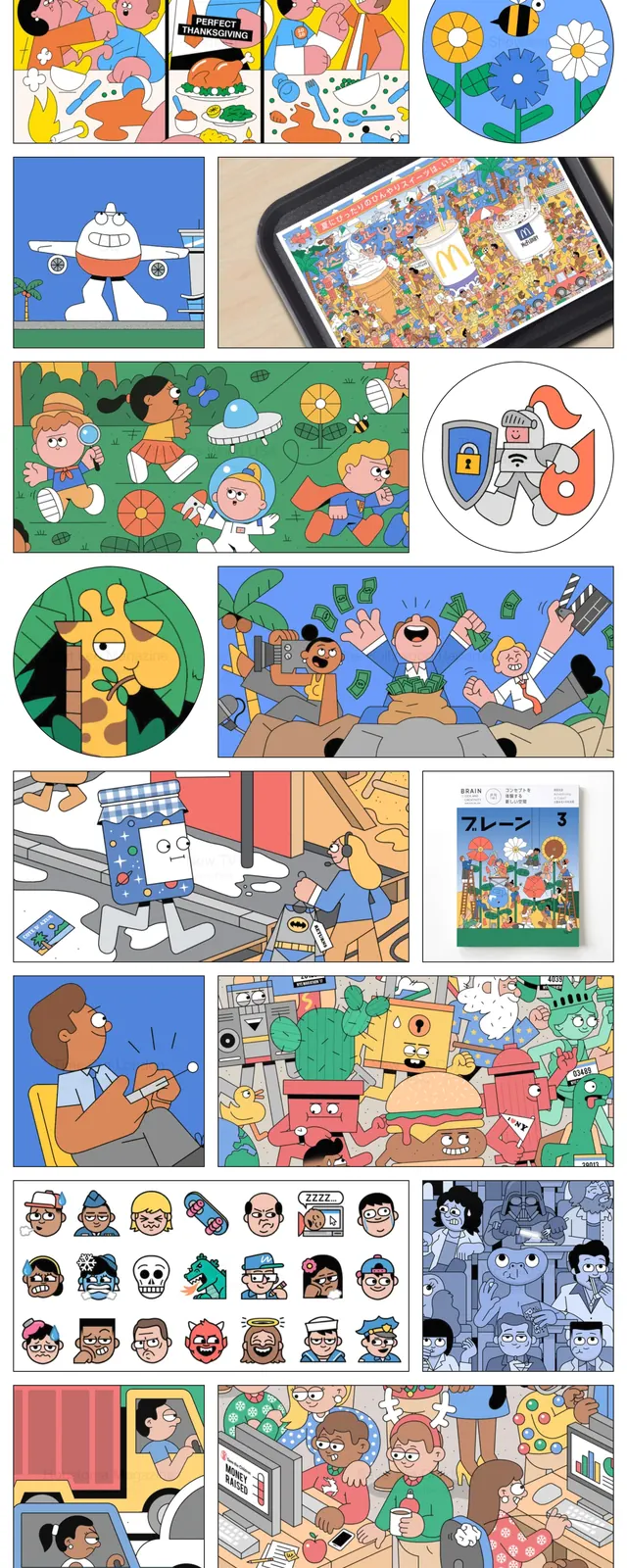
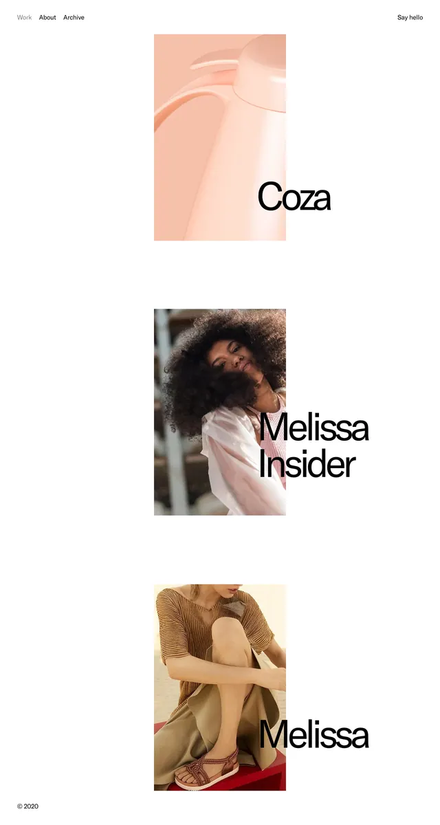
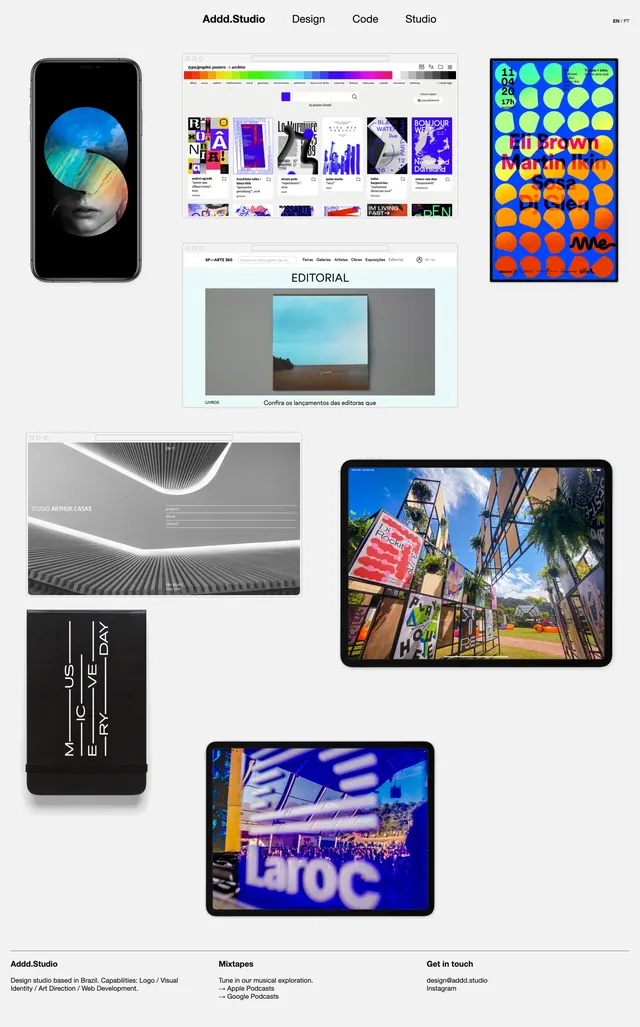
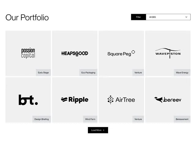
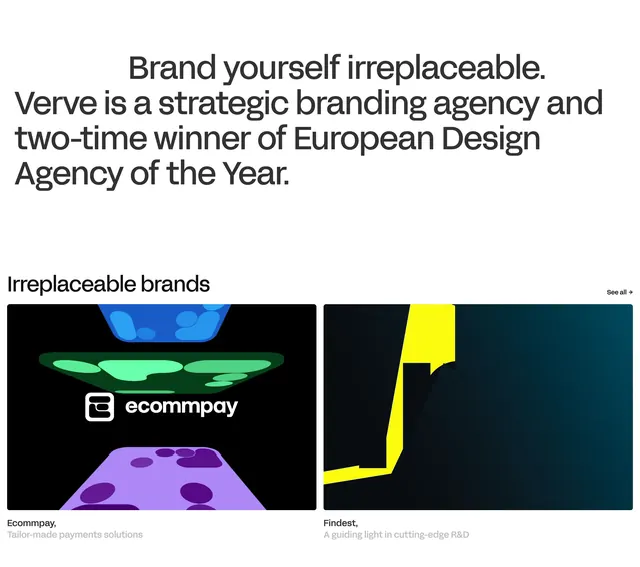
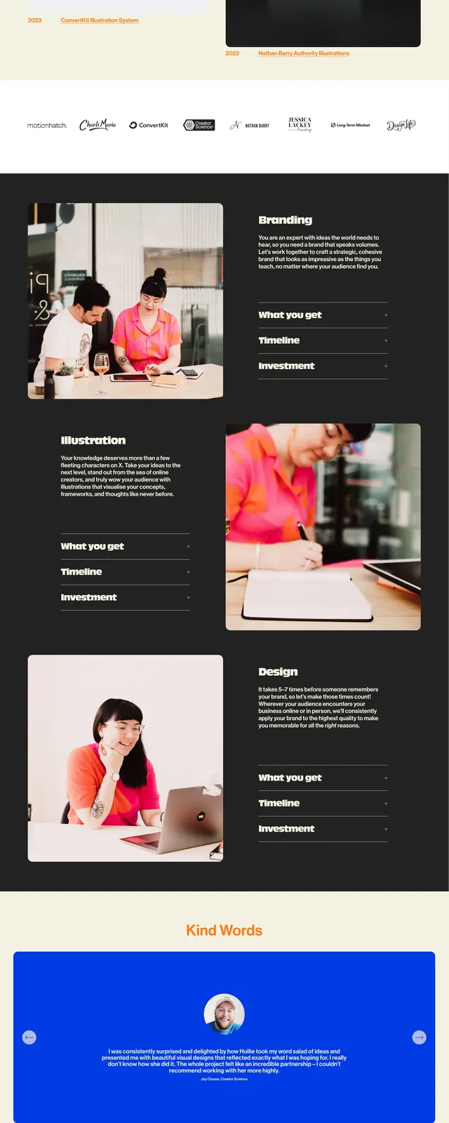
The page uses a clean off-white background with a compact top nav, followed by a collage-like grid of large image cards and project thumbnails. The first screen features a vivid orange graphic tile beside a large photographic artwork tile, then continues into alternating black-backed showcase cards, filters, and smaller content blocks. Lower on the page, a large centered call-to-action section repeats the brand's primary button in multiple styles. The overall composition feels like a curated visual library with strong contrast between minimal framing and loud project imagery.
Key takeaway
This layout works well for creative studios that want to showcase breadth quickly while keeping the interface simple and gallery-driven. The strongest pattern is the irregular masonry grid with oversized visual cards broken up by sparse UI chrome.
Reuse notes
Reuse the top mosaic grid for a portfolio or inspiration library where thumbnails are the main product. The repeated CTA block and minimal nav are easy to adapt for agency, studio, or creative services sites.