Preview image. Unlock full-res
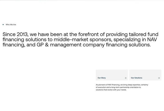
Asymmetric about intro with blue dot label, large left headline on fund financing history, and two gray link cards bottom right.
Summary
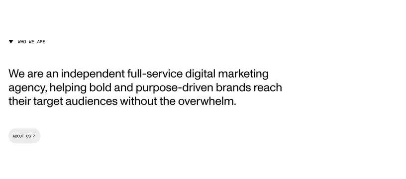
Who We Are section with oversized positioning statement left and paired Our Story / Our Solutions navigation cards anchored bottom right.
Visual description
White background with navy dot and Who We Are label top left. Large bold sans paragraph upper-left/center on providing tailored fund financing since 2013 for middle-market sponsors. Bottom right cluster: two light gray horizontal cards with Our Story and Our Solutions labels and right arrows, plus small gray supporting copy on NAV financing expertise below.
Key takeaway
Using most of the canvas for one declarative paragraph, then tucking navigation cards in the corner as next-step affordances. Single navy dot as the only color accent on an otherwise monochrome layout.
Reuse notes
Works for financial or advisory firms with two primary interior paths. Headline length must stay controlled or it dominates awkwardly.