Preview image. Unlock full-res
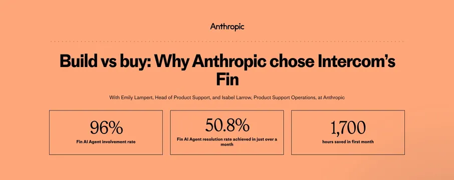
Peach case-study header with Anthropic logo, build-vs-buy headline, speaker credits, and three serif metric boxes.
Summary
Anthropic case study opener on peach with dotted rule, build-vs-buy headline, speaker attribution, and three bordered KPI boxes.
Visual description
Solid warm peach background. Centered black Anthropic wordmark, thin dotted horizontal rule, large sans headline "Build vs buy: Why Anthropic chose Intercom's Fin," smaller attribution for Emily Lampert and Isabel Larrow. Bottom row: three equal outlined boxes with large serif numbers 96%, 50.8%, and 1,700 and bold sans labels for Fin involvement rate, resolution rate in a month, and hours saved first month.
Key takeaway
Serif numerals inside sans framework for editorial data emphasis. Customer logo and stats share one color field so the story starts with proof immediately.
Reuse notes
Case study detail headers when three KPIs tell the story. Peach field is brand-specific; swap accent per customer. Keep metric count to three max.
More about sections
See all
More like this

Keep what you find
A free account saves references to boards and can send you a weekly email of picks based on what you save.
To see every result, go Pro.