Preview image. Unlock full-res
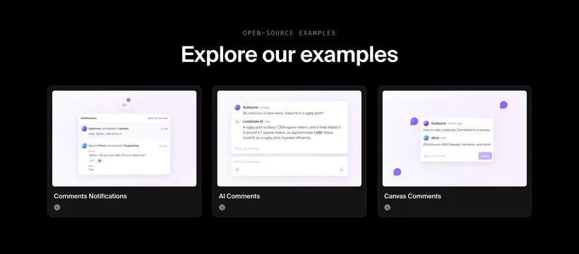
Dark three-card gallery showcasing Comments Notifications, AI Comments, and Canvas Comments example UIs.
Summary
Open-source examples row with three purple-accent comment pattern previews in dark framed cards.
Visual description
Black background. Gray OPEN-SOURCE EXAMPLES label and white headline "Explore our examples." Three dark rounded cards with light previews: Notifications modal with bell badge and thread list; AI Comments thread where Liveblocks AI answers a Tesla-on-rugby-pitch question; Canvas Comments with purple pin bubbles and expanded thread on a light canvas. White titles under each card and small circular logos in card corners.
Key takeaway
Showing three distinct comment UX patterns side by side helps developers pick a starting template fast. Keeping previews bright inside dark frames adds focus without a full page mockup.
Reuse notes
Use on docs or examples index pages. Each card needs a distinct interaction story. Purple accent should stay consistent across previews.
More gallery sections
See all


More like this




Keep what you find
A free account saves references to boards and can send you a weekly email of picks based on what you save.
To see every result, go Pro.