Preview image. Unlock full-res
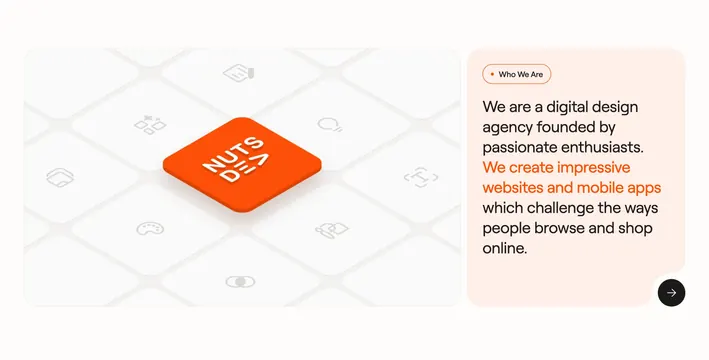
About split with isometric icon grid highlighting one orange NutsDev tile beside peach copy block.
Summary
Who We Are uses a left isometric tile grid with one elevated orange logo square and a right peach panel with highlighted mission copy.
Visual description
Two rounded containers side by side. Left light gray field shows isometric grid of rounded squares with faint design icons; center square is bright orange with white NUTSDEV wordmark and drop shadow. Right peach panel has bordered "Who We Are" pill, paragraph with orange middle phrase "We create impressive websites and mobile apps," and black circular arrow button bottom-right.
Key takeaway
Highlighting one tile in a field of quiet icons makes the brand mark the focal point without a literal logo hero. Orange inline emphasis in body copy mirrors the tile accent.
Reuse notes
Agency about snippets on homepages. Isometric grid needs enough tiles to feel intentional; peach panel requires sufficient contrast for body text.