Preview image. Unlock full-res
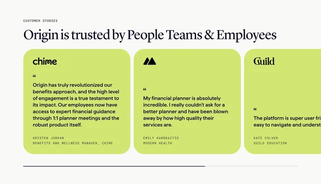
Light testimonials section with a large serif headline over a horizontal carousel of lime-green quote cards, each topped by a customer logo with the next card peeking off-edge.
Summary
A light testimonials section with a big editorial serif headline above a horizontal carousel of bright lime quote cards, each led by a customer logo and closed with a monospace attribution. The defining move is the saturated lime card color carrying the social proof against an otherwise neutral page.
Visual description
On a warm off-white ground, an all-caps "CUSTOMER STORIES" eyebrow sits above a large dark navy serif headline "Origin is trusted by People Teams & Employees." Below runs a row of rounded lime-green cards. Each card opens with a customer logo at the top (chime, a triangular mark, Guild), a large opening quote mark, a block of dark quote copy in sans-serif, and a small all-caps grey attribution line giving the person's name and role. Two full cards are visible and a third is clipped at the right edge. A thin partly-filled progress line below the row signals carousel position.
Key takeaway
Using one bold saturated card color across all testimonial cards so the quotes pop as a unit against a neutral page. Leading each card with the customer's own logo rather than a person photo to foreground recognizable brands. The serif headline against monospace attributions for an editorial type contrast, plus the edge-peek and progress line to imply more quotes.
Reuse notes
Best when your testimonials come from named, recognizable companies whose logos add weight. The lime is high-energy; swap to any single brand color if a calmer tone is needed. The clipped third card and progress line are genuine carousel cues, so a slider tag fits; keep quote lengths similar so cards stay balanced.
More testimonials sections
See all






More like this



Keep what you find
A free account saves references to boards and can send you a weekly email of picks based on what you save.
To see every result, go Pro.