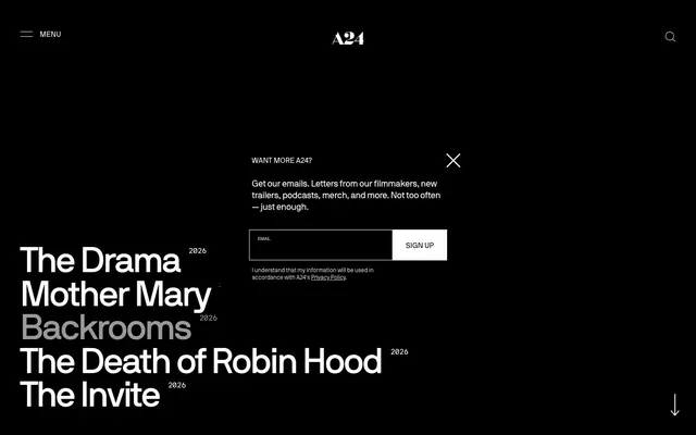
Preview image. Unlock full-res
Monochromatic cinematic gallery.
Color palette
Dark borders and separators for elevated surfaces and inverted UI. Do not promote it to the primary CTA color
Neutral form states, badge text, and quiet UI feedback where color should stay understated. Do not promote it to the primary CTA color
Page background (dominant canvas for light theme)
Medium-contrast borders, control outlines, and structural separators. Do not promote it to the primary CTA color
Subtle border accents, fine print text
Typography
- Weights
- 400, 500
- Sizes
- 10px, 11px, 12px, 13px, 15px, 18px, 21px, 74px
- Line height
- 0.92, 1, 1.07, 1.2, 1.23, 1.3, 1.32, 1.33, 1.5, 1.67, 1.92
- Letter spacing
- -0.0400em at 74px, -0.0120em at 21px, -0.0090em at 18px
- Fallback
- Inter
Primary typeface for all text content, including headings, body, and navigation. Its sans-serif geometry provides a crisp, modern feel, while varied letter spacing across sizes adapts its presence from impact to readability. The 'cpsp' feature indicates custom kerning for character spacing.
- Weights
- 400
- Sizes
- 15px
- Line height
- 0.92
- Letter spacing
- -0.0650em
- Fallback
- Space Mono
Monospaced typeface used for specific data points or stylistic elements, offering a technical, precise contrast to the main font. Its characteristic tight letter spacing at 15px emphasizes its distinct, ordered appearance.
Spacing & shape
Components
Transparent background, Canvas White text and border, 0px border-radius, 6px padding. This light theme ghost button allows text to stand out against a dark background, becoming a subtle call to action without being visually heavy.
Transparent background, Midnight Ink text and border, 0px border-radius, 6px padding. This dark theme ghost button maintains a minimal, unobtrusive interactive element against a light background.
Transparent background with Canvas White text, Midnight Ink border matching the modal's foreground, 0px border-radius, 22px vertical padding and 18px horizontal padding. Complements the dark modal aesthetic.
Transparent background with Canvas White text, Canvas White border, 0px border-radius, 6px padding. This accentuates the button against the dark modal background.
Text link using NB International Web, weight 500, with Midnight Ink for the light theme and Canvas White for the dark theme. Underlines appear on hover/active states, not as static elements.
Text link using NB International Web, weight 400, in Graphite. Used for less prominent navigation elements to provide a subtle hierarchy.
Solid Midnight Ink background, often appearing as an opaque layer over content. Provides a strong visual separation for focused interaction.
Guidelines
- Use Midnight Ink (#000000) as the primary text color on light backgrounds and Canvas White (#FFFFFF) for text on dark backgrounds to ensure high contrast.
- Apply NB International Web at weight 400 for all body copy and standard UI text, reserving weight 500 for bolder headings and key callouts.
- Maintain a 0px border-radius across all interactive elements, containers, and images to enforce a sharp, deliberate aesthetic.
- Utilize Ghost Buttons (transparent background, text matching its border color) for all primary actions, distinguishing them with text color and subtle borders rather than solid fills.
- Employ consistent vertical spacing of 96px for main section separation, establishing a clear rhythm and generous breathing room between content blocks.
- Prioritize text and bold typography as the primary means of conveying visual hierarchy; avoid decorative elements or heavy gradients.
- Use NB International Mono Web 15px with -0.0650em letter spacing for any stylized metadata or specific emphasis where a precise, technical tone is needed.
- Do not introduce saturated colors; the palette is strictly achromatic with black, white, and a range of grays.
- Avoid using box-shadows or other elevation techniques; the design relies on flat surfaces and high contrast for definition.
- Do not use default browser link styling; all links should be explicitly styled with NB International Web and only reveal an underline on hover/focus.
- Do not introduce rounded corners; all elements should adhere to the strict 0px border-radius.
- Avoid excessive imagery; when images are used, they should be high-contrast, often black and white, and serve a functional or editorial purpose within the gallery-like layout.
- Do not add heavy borders or background fills to buttons; maintain the ghost button aesthetic.
- Avoid centered text blocks for large content sections; prefer left-aligned typography for readability and structured presentation.
About this system
ShowHide
A24’s visual design is a stark, high-contrast exploration of cinematic black and white. It features an almost entirely achromatic palette, punctuated by bold, unapologetic typography that dictates hierarchy through size and placement rather than color. Layouts are spacious, almost sparse, creating a gallery-like feel where content commands attention. Interactive elements are minimal, often border-only or ghost-like, preserving the strong monochromatic aesthetic.
The page primarily uses a max-width contained layout, though some sections, particularly on dark backgrounds, appear full-bleed. The hero pattern often involves a centered headline over a dark background or a split text+visual approach. Section rhythm is driven by alternating light (#eeeeee) and dark (#000000) bands, creating a distinct visual flow. Content is arranged in flexible patterns, including centered stacks for headlines and calls to action, as well as alternating text-left/image-right compositions. The absence of heavy grids creates a spacious, almost architectural feel. Navigation is handled by a minimal sticky top header with a hamburger menu for more options, reinforcing the clean, uncluttered aesthetic.
Imagery treatment varies. On light backgrounds, product shots often appear as contained, slightly offset elements. For editorials or film promotion, imagery can be full-bleed, high-contrast, black and white photography. There are no consistent rounded corners or masking; images are presented with sharp, raw edges. Icons are typically minimalist, outlined, and monochromatic, with a thin stroke weight. Imagery primarily serves to showcase products, present film stills or talent, and establish an editorial atmosphere, often functioning as large, impactful visual breaks between text-heavy sections. The density is moderate, allowing visuals to occupy significant space without overwhelming the text.
Reminiscent of Apple (Product Pages), Acne Studios, The New York Times, SSENSE.
# A24 — Style Reference
> Monochromatic cinematic gallery.

**Theme:** light

**Site:** https://a24films.com

A24’s visual design is a stark, high-contrast exploration of cinematic black and white. It features an almost entirely achromatic palette, punctuated by bold, unapologetic typography that dictates hierarchy through size and placement rather than color. Layouts are spacious, almost sparse, creating a gallery-like feel where content commands attention. Interactive elements are minimal, often border-only or ghost-like, preserving the strong monochromatic aesthetic.

## Tokens — Colors

| Name | Value | Token | Role |
|------|------|------|------|
| Midnight Ink | `#000000` | `--color-midnight-ink` | Dark borders and separators for elevated surfaces and inverted UI. Do not promote it to the primary CTA color |
| Canvas White | `#ffffff` | `--color-canvas-white` | Neutral form states, badge text, and quiet UI feedback where color should stay understated. Do not promote it to the primary CTA color |
| Fog | `#eeeeee` | `--color-fog` | Page background (dominant canvas for light theme) |
| Graphite | `#888888` | `--color-graphite` | Medium-contrast borders, control outlines, and structural separators. Do not promote it to the primary CTA color |
| Ash Gray | `#cacaca` | `--color-ash-gray` | Subtle border accents, fine print text |

## Tokens — Typography

### NB International Web
- **Substitute:** Inter
- **Weights:** 400, 500
- **Sizes:** 10px, 11px, 12px, 13px, 15px, 18px, 21px, 74px
- **Line height:** 0.92, 1, 1.07, 1.2, 1.23, 1.3, 1.32, 1.33, 1.5, 1.67, 1.92
- **Letter spacing:** -0.0400em at 74px, -0.0120em at 21px, -0.0090em at 18px
- **Role:** Primary typeface for all text content, including headings, body, and navigation. Its sans-serif geometry provides a crisp, modern feel, while varied letter spacing across sizes adapts its presence from impact to readability. The 'cpsp' feature indicates custom kerning for character spacing.

### NB International Mono Web
- **Substitute:** Space Mono
- **Weights:** 400
- **Sizes:** 15px
- **Line height:** 0.92
- **Letter spacing:** -0.0650em
- **Role:** Monospaced typeface used for specific data points or stylistic elements, offering a technical, precise contrast to the main font. Its characteristic tight letter spacing at 15px emphasizes its distinct, ordered appearance.

## Tokens — Type Scale

| Role | Size | Line height | Letter spacing |
|------|------|------|------|
| caption | 10px | 1.5 | — |
| heading-lg | 18px | 1.07 | -0.009em |
| display | 74px | 0.92 | -0.04em |

## Tokens — Spacing

- **Section gap:** 96px
- **Card padding:** 22px
- **Element gap:** 9px

## Tokens — Radius

- **Default:** 0px

## Layout

The page primarily uses a max-width contained layout, though some sections, particularly on dark backgrounds, appear full-bleed. The hero pattern often involves a centered headline over a dark background or a split text+visual approach. Section rhythm is driven by alternating light (#eeeeee) and dark (#000000) bands, creating a distinct visual flow. Content is arranged in flexible patterns, including centered stacks for headlines and calls to action, as well as alternating text-left/image-right compositions. The absence of heavy grids creates a spacious, almost architectural feel. Navigation is handled by a minimal sticky top header with a hamburger menu for more options, reinforcing the clean, uncluttered aesthetic.

## Imagery

Imagery treatment varies. On light backgrounds, product shots often appear as contained, slightly offset elements. For editorials or film promotion, imagery can be full-bleed, high-contrast, black and white photography. There are no consistent rounded corners or masking; images are presented with sharp, raw edges. Icons are typically minimalist, outlined, and monochromatic, with a thin stroke weight. Imagery primarily serves to showcase products, present film stills or talent, and establish an editorial atmosphere, often functioning as large, impactful visual breaks between text-heavy sections. The density is moderate, allowing visuals to occupy significant space without overwhelming the text.

## Components

### Ghost Button - Light Theme
*Interactive element (e.g., 'Shop Now', 'Listen Now')*

Transparent background, Canvas White text and border, 0px border-radius, 6px padding. This light theme ghost button allows text to stand out against a dark background, becoming a subtle call to action without being visually heavy.

### Ghost Button - Dark Theme
*Interactive element (e.g., 'Shop Now', 'Listen Now')*

Transparent background, Midnight Ink text and border, 0px border-radius, 6px padding. This dark theme ghost button maintains a minimal, unobtrusive interactive element against a light background.

### Newsletter Modal Input
*Email input field within modals*

Transparent background with Canvas White text, Midnight Ink border matching the modal's foreground, 0px border-radius, 22px vertical padding and 18px horizontal padding. Complements the dark modal aesthetic.

### Newsletter Modal Button
*Submit button for newsletter signup*

Transparent background with Canvas White text, Canvas White border, 0px border-radius, 6px padding. This accentuates the button against the dark modal background.

### Navigation Link - Primary
*Main navigation items*

Text link using NB International Web, weight 500, with Midnight Ink for the light theme and Canvas White for the dark theme. Underlines appear on hover/active states, not as static elements.

### Navigation Link - Muted
*Secondary navigation items or footer links*

Text link using NB International Web, weight 400, in Graphite. Used for less prominent navigation elements to provide a subtle hierarchy.

### Modal Overlay
*Background for pop-up modals*

Solid Midnight Ink background, often appearing as an opaque layer over content. Provides a strong visual separation for focused interaction.

## Guidelines

### Do

- Use Midnight Ink (#000000) as the primary text color on light backgrounds and Canvas White (#FFFFFF) for text on dark backgrounds to ensure high contrast.
- Apply NB International Web at weight 400 for all body copy and standard UI text, reserving weight 500 for bolder headings and key callouts.
- Maintain a 0px border-radius across all interactive elements, containers, and images to enforce a sharp, deliberate aesthetic.
- Utilize Ghost Buttons (transparent background, text matching its border color) for all primary actions, distinguishing them with text color and subtle borders rather than solid fills.
- Employ consistent vertical spacing of 96px for main section separation, establishing a clear rhythm and generous breathing room between content blocks.
- Prioritize text and bold typography as the primary means of conveying visual hierarchy; avoid decorative elements or heavy gradients.
- Use NB International Mono Web 15px with -0.0650em letter spacing for any stylized metadata or specific emphasis where a precise, technical tone is needed.

### Don't

- Do not introduce saturated colors; the palette is strictly achromatic with black, white, and a range of grays.
- Avoid using box-shadows or other elevation techniques; the design relies on flat surfaces and high contrast for definition.
- Do not use default browser link styling; all links should be explicitly styled with NB International Web and only reveal an underline on hover/focus.
- Do not introduce rounded corners; all elements should adhere to the strict 0px border-radius.
- Avoid excessive imagery; when images are used, they should be high-contrast, often black and white, and serve a functional or editorial purpose within the gallery-like layout.
- Do not add heavy borders or background fills to buttons; maintain the ghost button aesthetic.
- Avoid centered text blocks for large content sections; prefer left-aligned typography for readability and structured presentation.

## Agent Prompt Guide

Quick Color Reference:
text: #000000 (Midnight Ink)
background: #eeeeee (Fog)
border: #000000 (Midnight Ink)
accent: no distinct accent color
primary action: no distinct CTA color

Example Component Prompts:
1. Create a hero section: Midnight Ink background. Display headline 'THE NEXT CHAPTER' in Canvas White, 74px NB International Web, weight 500, letter-spacing -0.04em, line-height 0.92. Subheading 'Coming Soon' in Canvas White, 18px NB International Web, weight 400, line-height 1.07.
2. Create a 'Shop Now' ghost button for a light section: 'SHOP NOW' text in Midnight Ink, 15px NB International Web, weight 400. Transparent background, 1px Midnight Ink border, 0px radius, 6px padding.
3. Create a dark theme newsletter modal: Midnight Ink background, Canvas White text. Title 'WANT MORE A24?' in Canvas White, 21px NB International Web, weight 500. Email input with transparent background, Canvas White text, 1px Canvas White border, 0px radius, 22px vertical, 18px horizontal padding. 'SIGN UP' button with Canvas White text, 1px Canvas White border, transparent background, 0px radius, 6px padding.
More like this






Keep what you find
A free account saves references to boards and can send you a weekly email of picks based on what you save.
To see every result, go Pro.