Preview image. Unlock full-res
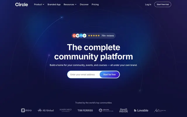
Galactic UI with soft glow.
Color palette
Background gradient accent, blending from bright blue to deep violet
Background gradient starting point, contributing to the ambient glow
Soft button backgrounds, subtle card accents
Soft button backgrounds, subtle card accents, hover states for inputs
Soft button backgrounds, subtle card accents
Soft button backgrounds, subtle card accents
Soft button backgrounds, subtle card accents
Blue supporting accent for decorative details and low-frequency emphasis. Do not promote it to the primary CTA color
Red text accent for links, tags, and emphasized short phrases. Use as a supporting accent, not as a status color
Red text accent for links, tags, and emphasized short phrases. Use as a supporting accent, not as a status color
Primary text, deep surface backgrounds, navigation bar text and icons
Page backgrounds, primary card surfaces, active input fills, essential text elements on dark backgrounds
Subtle borders, dividers, ghost button outlines, inactive input borders
Secondary text, muted headings, deep accent text on light backgrounds
Muted helper text, secondary navigation links, placeholder text
Typography
- Weights
- 400, 500, 600, 700
- Sizes
- 10px, 11px, 14px, 16px, 18px, 20px, 24px, 32px, 40px, 48px, 56px, 64px
- Line height
- 1.1, 1.2, 1.21, 1.25, 1.28, 1.29, 1.3, 1.33, 1.4, 1.43, 1.45, 1.5, 1.56
- Letter spacing
- -0.0500em at 64px, -0.0470em at 56px, -0.0370em at 48px, -0.0160em at 18px-24px, 0.0500em at 10px
- Fallback
- system-ui, sans-serif
The sole typeface, used across all elements from body text to large display headings. Its versatile weights and precise letter-spacing ensure compact and legible content, crucial for an information-dense UI.
Spacing & shape
Elevation
Components
Transparent background, text in Midnight Eclipse (#0a0a0a) against Canvas White (#ffffff) or Canvas White against a dark background. Border is solid 1px Slate Border (#e4e7eb). Padding is 14px vertical, 28px horizontal. Fully rounded with 9999px border-radius.
Background in one of the pastel Accent colors (e.g., Periwinkle Mist #e0eafc), text in Midnight Eclipse (#0a0a0a). Padding is 8px vertical, 16px horizontal. Fully rounded with 9999px border-radius. No explicit border.
Background in Canvas White (#ffffff), with an 8% opacity shadow from #a9a9a9 (rgba(169, 169, 169, 0.08)) offset 0px, 4px blur 8px. Border-radius is 20px. Internal padding is 32px on all sides.
Semi-transparent Canvas White background (rgba(255, 255, 255, 0.5)). Border-radius is 24px. Internal padding is 20px. No shadow is applied.
Background in Canvas White (#ffffff), text in Midnight Eclipse (#0a0a0a). Border is 1px solid Slate Border (#e2e9e0). Fully rounded with 9999px border-radius. Left padding 24px, vertical 4px. On focus, a 2px blue ring (Focus Blue #539cf2) outlines the input.
Ghost style with transparent background. Text is Midnight Eclipse (#0a0a0a) or Canvas White (#ffffff) on dark areas. No specific padding or border radius when inactive. Active state often utilizes an Accent Filled Button style.
Translucent background in rgba(255, 255, 255, 0.18). Border-radius is 20px. Internal padding is 8px. No shadow is applied.
Guidelines
- Use Inter for all typography, adjusting weight and letter-spacing according to semantic role and size.
- Apply 9999px border-radius to all interactive elements like buttons and input fields for a consistent soft-edged feel.
- Reserve Canvas White (#ffffff) for primary content surfaces and interactive elements to maintain high contrast and clarity.
- Employ the Deep Indigo to Sky Burst linear gradient as a primary background for hero sections and expressive areas, creating a sense of depth.
- Use Slate Border (#e4e7eb) for subtle dividers, non-essential borders, and outlines to avoid visual clutter.
- Maintain a clear visual hierarchy with Midnight Eclipse (#0a0a0a) for primary text and Silver Whisper (#737373) for secondary/helper text.
- Use an 8px element gap for comfortable spacing between most inline and block elements to ensure readability and comfortable density.
- Avoid using harsh, saturated colors as backgrounds to maintain the site's soft, futuristic aesthetic.
- Do not deviate from the Inter typeface; alternative fonts will disrupt the precise typographic harmony.
- Do not use square or sharp-cornered elements; all significant UI components should leverage the established border-radius values.
- Refrain from heavy, opaque shadows; utilize the transparent, diffused rgba(169, 169, 169, 0.08) 0px 4px 8px 0px for subtle elevation.
- Do not introduce new primary action colors; the design system favors accent-tinted light buttons for calls to action.
- Avoid excessive spacing or overly wide line lengths; keep text compact and content focused on the 1376px max-width constraint.
- Do not use plain solid backgrounds for large content blocks where a gradient or blurred backdrop could provide more visual interest and depth.
About this system
ShowHide
Circle utilizes a dark canvas with bright, soft UI elements to project an approachable, yet professional, digital community space. Typography is compact and precise, maintaining clarity against gradients and dark backgrounds. Components are fluid and often feature subtle shadows or blurred backdrops, giving them depth without harshness. The system leverages a rich, cool-toned gradient palette for a vibrant, modern feel, reserving pure white for interactive surfaces to highlight action.
The page primarily uses a max-width contained layout of 1376px, centered on the screen. The hero section is full-bleed, leveraging a dark, gradient background with a centered, prominent headline and a Call to Action block. Sections below often alternate between light (#ffffff) and darker gradient or tinted backgrounds, creating a clear vertical rhythm with consistent ~93px section gaps. Content is arranged using flexible column grids, commonly alternating text-left/image-right patterns, centered stacked content blocks, and 3-column card grids for features. The navigation is a sticky top bar, minimal and semi-transparent, evolving to a solid background on scroll.
The site favors illustrative, abstract graphics with soft glows and gradients, particularly in hero sections and background patterns. Product screenshots are clean, showcasing UI within contained, slightly rounded frames, often with a subtle shadow or translucent background. Photography, when used, tends to be professional portraits of individuals (e.g., testimonials) presented similarly to cards. Icons are typically outlined or filled, maintaining a consistent stroke weight, and monochrome to integrate seamlessly with the minimal UI.
Reminiscent of Discord, Notion, Gumroad, Linear.
# Circle — Style Reference
> Galactic UI with soft glow.

**Theme:** light

**Site:** https://www.circle.so

Circle utilizes a dark canvas with bright, soft UI elements to project an approachable, yet professional, digital community space. Typography is compact and precise, maintaining clarity against gradients and dark backgrounds. Components are fluid and often feature subtle shadows or blurred backdrops, giving them depth without harshness. The system leverages a rich, cool-toned gradient palette for a vibrant, modern feel, reserving pure white for interactive surfaces to highlight action.

## Tokens — Colors

| Name | Value | Token | Role |
|------|------|------|------|
| Deep Indigo | `#3e1bc9` | `--color-deep-indigo` | Background gradient accent, blending from bright blue to deep violet |
| Sky Burst | `#408fed` | `--color-sky-burst` | Background gradient starting point, contributing to the ambient glow |
| Periwinkle Mist | `#e0eafc` | `--color-periwinkle-mist` | Soft button backgrounds, subtle card accents |
| Lavender Haze | `#f2dbf5` | `--color-lavender-haze` | Soft button backgrounds, subtle card accents, hover states for inputs |
| Peach Cream | `#fff0d8` | `--color-peach-cream` | Soft button backgrounds, subtle card accents |
| Rose Blush | `#ffe0e2` | `--color-rose-blush` | Soft button backgrounds, subtle card accents |
| Ocean Mint | `#e4f6f4` | `--color-ocean-mint` | Soft button backgrounds, subtle card accents |
| Focus Blue | `#539cf2` | `--color-focus-blue` | Blue supporting accent for decorative details and low-frequency emphasis. Do not promote it to the primary CTA color |
| Crimson Alert | `#ef4444` | `--color-crimson-alert` | Red text accent for links, tags, and emphasized short phrases. Use as a supporting accent, not as a status color |
| Dark Crimson Alert | `#b91c1c` | `--color-dark-crimson-alert` | Red text accent for links, tags, and emphasized short phrases. Use as a supporting accent, not as a status color |
| Midnight Eclipse | `#0a0a0a` | `--color-midnight-eclipse` | Primary text, deep surface backgrounds, navigation bar text and icons |
| Canvas White | `#ffffff` | `--color-canvas-white` | Page backgrounds, primary card surfaces, active input fills, essential text elements on dark backgrounds |
| Slate Border | `#e4e7eb` | `--color-slate-border` | Subtle borders, dividers, ghost button outlines, inactive input borders |
| Dark Knight | `#191b1f` | `--color-dark-knight` | Secondary text, muted headings, deep accent text on light backgrounds |
| Silver Whisper | `#737373` | `--color-silver-whisper` | Muted helper text, secondary navigation links, placeholder text |

## Tokens — Typography

### Inter
- **Substitute:** system-ui, sans-serif
- **Weights:** 400, 500, 600, 700
- **Sizes:** 10px, 11px, 14px, 16px, 18px, 20px, 24px, 32px, 40px, 48px, 56px, 64px
- **Line height:** 1.1, 1.2, 1.21, 1.25, 1.28, 1.29, 1.3, 1.33, 1.4, 1.43, 1.45, 1.5, 1.56
- **Letter spacing:** -0.0500em at 64px, -0.0470em at 56px, -0.0370em at 48px, -0.0160em at 18px-24px, 0.0500em at 10px
- **Role:** The sole typeface, used across all elements from body text to large display headings. Its versatile weights and precise letter-spacing ensure compact and legible content, crucial for an information-dense UI.

## Tokens — Type Scale

Minor Third (1.2) from 16px base.

| Role | Size | Line height | Letter spacing |
|------|------|------|------|
| caption | 10px | 1.5 | 0.5px |
| body-sm | 14px | 1.43 | -0.14px |
| body | 16px | 1.5 | -0.16px |
| subheading | 20px | 1.3 | -0.42px |
| heading-sm | 24px | 1.25 | -0.58px |
| heading | 32px | 1.28 | -0.74px |
| heading-lg | 40px | 1.2 | -0.92px |
| display | 48px | 1.21 | -1.24px |
| display-lg | 56px | 1.2 | -1.45px |
| headline | 64px | 1.1 | -1.6px |

## Tokens — Spacing

- **Max width:** 1376px
- **Section gap:** 93px
- **Card padding:** 20px
- **Element gap:** 8px

## Tokens — Radius

- **Buttons:** 9999px
- **Inputs:** 9999px
- **Cards:** 24px
- **decorativeElements:** 32px

## Tokens — Elevation

- **Card:** `rgba(169, 169, 169, 0.08) 0px 4px 8px 0px`
- **Input Focus Ring:** `rgb(83, 156, 242) 0px 0px 0px 2px`

## Layout

The page primarily uses a max-width contained layout of 1376px, centered on the screen. The hero section is full-bleed, leveraging a dark, gradient background with a centered, prominent headline and a Call to Action block. Sections below often alternate between light (#ffffff) and darker gradient or tinted backgrounds, creating a clear vertical rhythm with consistent ~93px section gaps. Content is arranged using flexible column grids, commonly alternating text-left/image-right patterns, centered stacked content blocks, and 3-column card grids for features. The navigation is a sticky top bar, minimal and semi-transparent, evolving to a solid background on scroll.

## Imagery

The site favors illustrative, abstract graphics with soft glows and gradients, particularly in hero sections and background patterns. Product screenshots are clean, showcasing UI within contained, slightly rounded frames, often with a subtle shadow or translucent background. Photography, when used, tends to be professional portraits of individuals (e.g., testimonials) presented similarly to cards. Icons are typically outlined or filled, maintaining a consistent stroke weight, and monochrome to integrate seamlessly with the minimal UI.

## Components

### Ghost Navigation Button
*Primary navigation and secondary actions in headers and footers.*

Transparent background, text in Midnight Eclipse (#0a0a0a) against Canvas White (#ffffff) or Canvas White against a dark background. Border is solid 1px Slate Border (#e4e7eb). Padding is 14px vertical, 28px horizontal. Fully rounded with 9999px border-radius.

### Accent Filled Button
*Calls to action or categorical filters.*

Background in one of the pastel Accent colors (e.g., Periwinkle Mist #e0eafc), text in Midnight Eclipse (#0a0a0a). Padding is 8px vertical, 16px horizontal. Fully rounded with 9999px border-radius. No explicit border.

### Product Feature Card
*Displaying product features or content blocks.*

Background in Canvas White (#ffffff), with an 8% opacity shadow from #a9a9a9 (rgba(169, 169, 169, 0.08)) offset 0px, 4px blur 8px. Border-radius is 20px. Internal padding is 32px on all sides.

### Translucent Highlight Card
*Elevated, semi-transparent content areas within contrasting backgrounds.*

Semi-transparent Canvas White background (rgba(255, 255, 255, 0.5)). Border-radius is 24px. Internal padding is 20px. No shadow is applied.

### Input Field
*Standard text input for forms.*

Background in Canvas White (#ffffff), text in Midnight Eclipse (#0a0a0a). Border is 1px solid Slate Border (#e2e9e0). Fully rounded with 9999px border-radius. Left padding 24px, vertical 4px. On focus, a 2px blue ring (Focus Blue #539cf2) outlines the input.

### Category Tab Button
*Segmenting content or filtering categories within a section.*

Ghost style with transparent background. Text is Midnight Eclipse (#0a0a0a) or Canvas White (#ffffff) on dark areas. No specific padding or border radius when inactive. Active state often utilizes an Accent Filled Button style.

### Dark Themed Feature Card
*Presenting features or testimonials on dark background sections.*

Translucent background in rgba(255, 255, 255, 0.18). Border-radius is 20px. Internal padding is 8px. No shadow is applied.

## Guidelines

### Do

- Use Inter for all typography, adjusting weight and letter-spacing according to semantic role and size.
- Apply 9999px border-radius to all interactive elements like buttons and input fields for a consistent soft-edged feel.
- Reserve Canvas White (#ffffff) for primary content surfaces and interactive elements to maintain high contrast and clarity.
- Employ the Deep Indigo to Sky Burst linear gradient as a primary background for hero sections and expressive areas, creating a sense of depth.
- Use Slate Border (#e4e7eb) for subtle dividers, non-essential borders, and outlines to avoid visual clutter.
- Maintain a clear visual hierarchy with Midnight Eclipse (#0a0a0a) for primary text and Silver Whisper (#737373) for secondary/helper text.
- Use an 8px element gap for comfortable spacing between most inline and block elements to ensure readability and comfortable density.

### Don't

- Avoid using harsh, saturated colors as backgrounds to maintain the site's soft, futuristic aesthetic.
- Do not deviate from the Inter typeface; alternative fonts will disrupt the precise typographic harmony.
- Do not use square or sharp-cornered elements; all significant UI components should leverage the established border-radius values.
- Refrain from heavy, opaque shadows; utilize the transparent, diffused rgba(169, 169, 169, 0.08) 0px 4px 8px 0px for subtle elevation.
- Do not introduce new primary action colors; the design system favors accent-tinted light buttons for calls to action.
- Avoid excessive spacing or overly wide line lengths; keep text compact and content focused on the 1376px max-width constraint.
- Do not use plain solid backgrounds for large content blocks where a gradient or blurred backdrop could provide more visual interest and depth.

## Agent Prompt Guide

Quick Color Reference:
text: #0a0a0a
background: #ffffff
border: #e4e7eb
accent: #e0eafc
primary action: #f2dbf5 (filled action)

Example Component Prompts:
Create a hero section with a centered headline: Background with Deep Indigo to Sky Burst gradient. Headline 'The complete community platform' at 56px Inter weight 700, Canvas White text, letter-spacing -1.45px. Subtext 'Build a home for your community...' at 18px Inter weight 400, Canvas White text, letter-spacing -0.16px. Follow with an email input field and an Accent Filled Button 'Start for free' with Periwinkle Mist background (#e0eafc), Midnight Eclipse text (#0a0a0a), 9999px radius, 8px vertical, 16px horizontal padding.

Create a Product Feature Card: Background Canvas White (#ffffff), box-shadow rgba(169, 169, 169, 0.08) 0px 4px 8px 0px, 20px border-radius. Internal padding 32px. Place a subheading in Midnight Eclipse (#0a0a0a) 24px Inter weight 600, letter-spacing -0.58px, and body text in Silver Whisper (#737373) 16px Inter weight 400, letter-spacing -0.16px.

Create a Ghost Navigation Button: Transparent background. Text 'Product' in Midnight Eclipse (#0a0a0a) when on white background or Canvas White (#ffffff) on dark. 1px solid Slate Border (#e4e7eb) when outlined. 14px vertical, 28px horizontal padding. Fully rounded 9999px border-radius.
More like this










Keep what you find
A free account saves references to boards and can send you a weekly email of picks based on what you save.
To see every result, go Pro.