Preview image. Unlock full-res
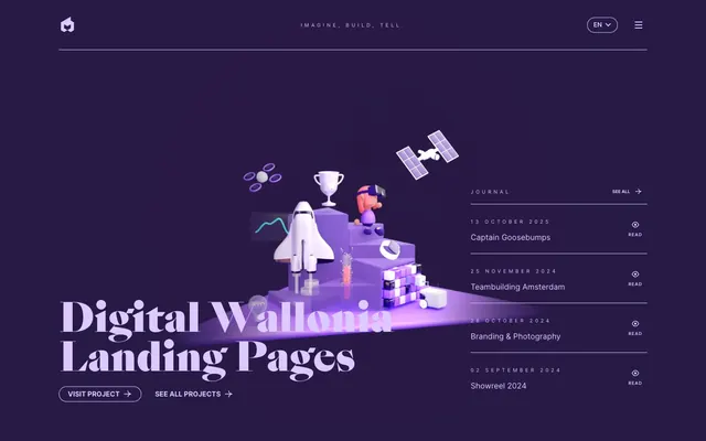
Deep-space command center. A shimmering violet expanse punctuated by crisp text and glowing 3D objects.
Color palette
Page backgrounds, section surfaces, primary interactive button fills.
Primary text color for headlines and body, interactive button text, icon outlines — providing high contrast against the dark background.
Used for specific interactive elements such as `Play Video` button background and text, creating isolated points of absolute darkness.
Typography
- Weights
- 400, 600, 700
- Sizes
- 10px, 11px, 13px, 14px, 16px, 18px
- Line height
- 1, 1.33, 1.4, 1.56, 1.65, 1.7, 3
- Letter spacing
- 0.0360em (10px), 0.1110em (13px), 0.5000em (smaller, all caps)
- Fallback
- Inter
Primary body text, navigation elements, button labels, and secondary interactive components. Its precise metrics ensure readability even at smaller sizes, contrasting with the more decorative display font.
- Weights
- 400, 700, 900
- Sizes
- 42px, 80px, 120px
- Line height
- 1, 1.2, 1.65
- Fallback
- Playfair Display
Display headlines and hero text. This custom, highly stylized serif font provides the primary visual identity, signaling sophistication and unique brand voice through its generous sizing and elegant forms.
Spacing & shape
Components
Outline-style button for 'Visit project' and similar calls to action. Text color: Stardust Shimmer (#dbc9ff). Border color: Stardust Shimmer (#dbc9ff). Background: transparent. Border radius: 30px. Padding around text: approximately 3.85px vertical, 13.75px horizontal. Font: Inter, semibold.
Used for 'See all projects' and similar secondary actions. Text color: Stardust Shimmer (#dbc9ff). Background: transparent. Border is absent, implicit interactiveness. Font: Inter, semibold.
Dropdown trigger, e.g., language selector. Text color: Nebula Violet (#271a47). Background: transparent. Padding: 10px on all sides. Border is absent. Font: Inter, normal.
Circular button for 'Play Video'. Background color: Nebula Violet (#271a47). Text color: Stardust Shimmer (#dbc9ff). Border radius: 20px. Padding around text: 4px vertical, 12px horizontal. Font: Inter, normal.
Lists individual journal entries. Text color: Stardust Shimmer (#dbc9ff) for title, Galactic Gold (#bc994e) for 'Read' link. Font: Inter at various weights.
Top-level menu items. Text color: Stardust Shimmer (#dbc9ff). Font: Inter, normal. Underline is absent on hover. Each item appears as simple text.
Guidelines
- Prioritize Nebula Violet (#271a47) for backgrounds to maintain the deep and immersive atmosphere.
- Use Stardust Shimmer (#dbc9ff) as the primary text and interactive element color for high contrast against dark elements.
- Employ Sang Bleu (substitute Playfair Display) for all display-size headlines (42px, 80px, 120px) to establish brand identity.
- Ensure all interactive components like buttons and links use either 20px or 30px border-radius, maintaining a soft, approachable feel.
- Utilize Galactic Gold (#bc994e) sparingly for secondary links or subtle accent details, preventing visual noise.
- Maintain a compact density with element gaps typically at 4px, 10px, or 15px to keep content focused.
- Avoid using bright or overly saturated colors that would disrupt the muted, celestial palette.
- Do not introduce sharp, angular radii on interactive elements; favor the established 20px or 30px curves.
- Refrain from heavy drop shadows or glows; depth is primarily achieved through color layering and 3D illustration rather than strong elevation.
- Do not use generic system fonts for headlines; the distinctiveness of Sang Bleu is paramount for brand recognition.
- Avoid large, open areas of white or light backgrounds; the dark theme is central to the visual identity.
- Do not mix 'Inter' with 'Sang Bleu' in body text or for secondary labels; their roles are strictly separated.
About this system
ShowHide
This design system is a deep-space exploration vehicle, navigating the cosmos with subtle ambient light. The rich, desaturated violet background creates an immediate sense of depth and luxury, providing a canvas for crisp typography and controlled luminance. Geometric 3D illustrations serve as glowing constellations, guiding the user through an experience that feels both futuristic and intimately crafted. Typography plays a central role; the elegant `Sang Bleu` display font is an immediate visual signature.
The page primarily follows a max-width contained model (around 1200px) with content centered. The hero section is full-bleed with a dark Nebula Violet background, featuring a large, centered headline and a complex 3D illustration that grounds the design. Subsequent sections maintain consistent vertical spacing, often presenting content in stacked blocks or simple two-column arrangements (e.g., journal list alongside a headline). There's no evident alternating light/dark banding; the dark theme is consistent. Navigation is a minimalist top bar with a logo and simple text links, becoming a dropdown menu on smaller breakpoints. The overall density is relatively compact.
The visual language is dominated by 3D rendered illustrations. These are geometric, abstract yet representational (rocket ships, trophies, drones, satellites), and feature soft, diffused light against the dark background. Their role is primarily decorative and atmospheric, creating a sense of wonder and advanced technology without being photorealistic. Icons, where present, are typically outlined or filled in Stardust Shimmer (#dbc9ff), maintaining the UI's color palette. There is a high density of imagery in the hero section, framing the text, but later sections become more text-dominant while retaining illustrative flourishes. Imagery is contained, not full-bleed, and often integrates with the layout rather than overlapping elements.
Reminiscent of Linear, Framer, Awwwards Nominees (many).
# EPIC agency — Style Reference
> Deep-space command center. A shimmering violet expanse punctuated by crisp text and glowing 3D objects.

**Theme:** dark

**Site:** https://epic.net

This design system is a deep-space exploration vehicle, navigating the cosmos with subtle ambient light. The rich, desaturated violet background creates an immediate sense of depth and luxury, providing a canvas for crisp typography and controlled luminance. Geometric 3D illustrations serve as glowing constellations, guiding the user through an experience that feels both futuristic and intimately crafted. Typography plays a central role; the elegant `Sang Bleu` display font is an immediate visual signature.

## Tokens — Colors

| Name | Value | Token | Role |
|------|------|------|------|
| Nebula Violet | `#271a47` | `--color-nebula-violet` | Page backgrounds, section surfaces, primary interactive button fills. |
| Stardust Shimmer | `#dbc9ff` | `--color-stardust-shimmer` | Primary text color for headlines and body, interactive button text, icon outlines — providing high contrast against the dark background. |
| Cosmos Black | `#000000` | `--color-cosmos-black` | Used for specific interactive elements such as `Play Video` button background and text, creating isolated points of absolute darkness. |

## Tokens — Typography

### Inter
- **Substitute:** Inter
- **Weights:** 400, 600, 700
- **Sizes:** 10px, 11px, 13px, 14px, 16px, 18px
- **Line height:** 1, 1.33, 1.4, 1.56, 1.65, 1.7, 3
- **Letter spacing:** 0.0360em (10px), 0.1110em (13px), 0.5000em (smaller, all caps)
- **Role:** Primary body text, navigation elements, button labels, and secondary interactive components. Its precise metrics ensure readability even at smaller sizes, contrasting with the more decorative display font.

### Sang Bleu
- **Substitute:** Playfair Display
- **Weights:** 400, 700, 900
- **Sizes:** 42px, 80px, 120px
- **Line height:** 1, 1.2, 1.65
- **Role:** Display headlines and hero text. This custom, highly stylized serif font provides the primary visual identity, signaling sophistication and unique brand voice through its generous sizing and elegant forms.

## Tokens — Spacing

- **Max width:** 1200px
- **Section gap:** 32px
- **Card padding:** 12-18px

## Tokens — Radius

- **General:** 10px
- **Buttons:** 20px, 30px
- **menu-items:** 0px

## Layout

The page primarily follows a max-width contained model (around 1200px) with content centered. The hero section is full-bleed with a dark Nebula Violet background, featuring a large, centered headline and a complex 3D illustration that grounds the design. Subsequent sections maintain consistent vertical spacing, often presenting content in stacked blocks or simple two-column arrangements (e.g., journal list alongside a headline). There's no evident alternating light/dark banding; the dark theme is consistent. Navigation is a minimalist top bar with a logo and simple text links, becoming a dropdown menu on smaller breakpoints. The overall density is relatively compact.

## Imagery

The visual language is dominated by 3D rendered illustrations. These are geometric, abstract yet representational (rocket ships, trophies, drones, satellites), and feature soft, diffused light against the dark background. Their role is primarily decorative and atmospheric, creating a sense of wonder and advanced technology without being photorealistic. Icons, where present, are typically outlined or filled in Stardust Shimmer (#dbc9ff), maintaining the UI's color palette. There is a high density of imagery in the hero section, framing the text, but later sections become more text-dominant while retaining illustrative flourishes. Imagery is contained, not full-bleed, and often integrates with the layout rather than overlapping elements.

## Components

### Journal Entry List

### Button Group

### Showreel Section

### Primary Ghost Button
*Interactive element*

Outline-style button for 'Visit project' and similar calls to action. Text color: Stardust Shimmer (#dbc9ff). Border color: Stardust Shimmer (#dbc9ff). Background: transparent. Border radius: 30px. Padding around text: approximately 3.85px vertical, 13.75px horizontal. Font: Inter, semibold.

### Secondary Ghost Button
*Interactive element*

Used for 'See all projects' and similar secondary actions. Text color: Stardust Shimmer (#dbc9ff). Background: transparent. Border is absent, implicit interactiveness. Font: Inter, semibold.

### Nav Dropdown Button
*Interactive element*

Dropdown trigger, e.g., language selector. Text color: Nebula Violet (#271a47). Background: transparent. Padding: 10px on all sides. Border is absent. Font: Inter, normal.

### Filled Play Button
*Interactive element*

Circular button for 'Play Video'. Background color: Nebula Violet (#271a47). Text color: Stardust Shimmer (#dbc9ff). Border radius: 20px. Padding around text: 4px vertical, 12px horizontal. Font: Inter, normal.

### Journal Entry Link
*Navigation/information*

Lists individual journal entries. Text color: Stardust Shimmer (#dbc9ff) for title, Galactic Gold (#bc994e) for 'Read' link. Font: Inter at various weights.

### Header Navigation Item
*Global navigation*

Top-level menu items. Text color: Stardust Shimmer (#dbc9ff). Font: Inter, normal. Underline is absent on hover. Each item appears as simple text.

## Guidelines

### Do

- Prioritize Nebula Violet (#271a47) for backgrounds to maintain the deep and immersive atmosphere.
- Use Stardust Shimmer (#dbc9ff) as the primary text and interactive element color for high contrast against dark elements.
- Employ Sang Bleu (substitute Playfair Display) for all display-size headlines (42px, 80px, 120px) to establish brand identity.
- Ensure all interactive components like buttons and links use either 20px or 30px border-radius, maintaining a soft, approachable feel.
- Utilize Galactic Gold (#bc994e) sparingly for secondary links or subtle accent details, preventing visual noise.
- Maintain a compact density with element gaps typically at 4px, 10px, or 15px to keep content focused.

### Don't

- Avoid using bright or overly saturated colors that would disrupt the muted, celestial palette.
- Do not introduce sharp, angular radii on interactive elements; favor the established 20px or 30px curves.
- Refrain from heavy drop shadows or glows; depth is primarily achieved through color layering and 3D illustration rather than strong elevation.
- Do not use generic system fonts for headlines; the distinctiveness of Sang Bleu is paramount for brand recognition.
- Avoid large, open areas of white or light backgrounds; the dark theme is central to the visual identity.
- Do not mix 'Inter' with 'Sang Bleu' in body text or for secondary labels; their roles are strictly separated.

## Agent Prompt Guide

### Quick Color Reference
- Text (Primary): #dbc9ff
- Background (Primary): #271a47
- CTA Button (Outline/Text): #dbc9ff
- Accent (Links): #bc994e
- Interactive Fill (Secondary): #000000

### Example Component Prompts
1. Create a hero section with a Nebula Violet (#271a47) background. Place a hero headline 'Digital Wallonia Landing Pages' using Sang Bleu (Playfair Display) at 120px weight 900, color Stardust Shimmer (#dbc9ff). Below this, add a ghost button 'Visit project' with text color #dbc9ff, 30px border-radius, transparent background, and a #dbc9ff border around the text, using Inter font at 16px. Ensure compact padding.
2. Design a journal entry block: Background Nebula Violet (#271a47). Title 'Captain Goosebumps' using Inter 16px weight 700, color #dbc9ff. Date '13 October 2025' using Inter 13px weight 400, color #dbc9ff. Add a right-aligned 'Read' link in Galactic Gold (#bc994e) using Inter 13px weight 400.
3. Implement a primary CTA button component: Text 'Learn More' using Inter 14px weight 600, color #dbc9ff. Background Nebula Violet (#271a47). Border radius: 20px. Padding: 4px vertical, 12px horizontal.
4. Create a top navigation bar. Background Nebula Violet (#271a47). Left-aligned logo placeholder. Right-aligned text link 'Imagine, Build, Tell.' using Inter 14px weight 400, color #dbc9ff. Next to it, an 'EN' language dropdown button, with text 'EN' using Inter 14px, #dbc9ff, transparent background, and 10px padding all around. No borders.
More like this










Keep what you find
A free account saves references to boards and can send you a weekly email of picks based on what you save.
To see every result, go Pro.