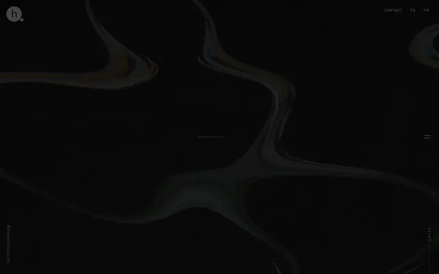
Preview image. Unlock full-res
Shimmering digital night
Color palette
Page background, primary surface, deep shadow base for visual elements
Hairline borders, dividers, input outlines, and card edges on light surfaces. Do not promote it to the primary CTA color
Secondary background layer, subtle surface elevation, muted text
Tertiary text, subtle dividers, inactive states
Subtle background accents, very faint borders, ghost element outlines
Typography
- Weights
- 400
- Sizes
- 16px
- Line height
- 1.2
- Letter spacing
- normal
- Fallback
- serif
Standard body text, often used for content and paragraphs where traditional readability is key. Its serif nature provides a classic counterpoint to the site's modern structure.
- Weights
- 400
- Sizes
- 12px, 13px, 14px
- Line height
- 1.2
- Letter spacing
- -0.08em at 12px, 0.20em at 14px
- Fallback
- Segoe UI, Arial, sans-serif
Functional text for navigation, labels, and small UI details. Its consistent, condensed letterforms enable a compact and precise display across varying sizes. Some uses feature increased letter-spacing to emphasize small, all-caps elements.
Spacing & shape
Components
Uses 'Ghost' text color (#ffffff) with 'urw-din' font at 13px (0.20em letter-spacing) for primary nav and 12px (0.08em letter-spacing) for social links. The active or hovered state typically involves a subtle border or underline animation, derived from primary elements.
A 'Ghost' colored (#ffffff) circular shape containing a stylized 'h' in 'urw-din' font, typically positioned at the top-left of the viewport. A primary, unobtrusive visual anchor.
A single hairline stroke, using 'Ghost' color (#ffffff) or 'Light Asphalt' (#6f6f6f), acting as a minimal horizontal or vertical separator. Used for visual rhythm without heavy framing.
Minimal text 'scroll' in 'Ghost' color (#ffffff) using 'urw-din' font, accompanied by a subtle animated visual cue like a downward arrow or line animation. Often placed vertically and subtly.
Guidelines
- Prioritize 'Midnight Base' (#000000) for all large background areas to maintain the dark, immersive aesthetic.
- Use 'Ghost' (#ffffff) for all primary text and interactive elements to ensure high contrast and legibility.
- Apply 'urw-din' at 13px with 0.20em letter-spacing for prominent UI text like navigation, and 12px with 0.08em letter-spacing for secondary labels like social links.
- Introduce white or light gray hairline borders (1px solid #ffffff or #dddddd) for subtle content division and element outlining.
- Maintain a compact horizontal spacing of 10px between inline elements like navigation links.
- When placing small elements within a larger container, ensure 8px vertical padding to create minimal breathing room.
- Avoid introducing bright or saturated colors except for the organic graphic elements or as very subtle, functional accents.
- Do not use heavy shadows or gradients on UI elements; the design emphasizes flatness and subtle contrast.
- Refrain from using traditional serif fonts for functional UI elements; 'Times' is reserved for body text to distinguish content from interface.
- Do not use large, multi-column grids for content where fluid, single-axis scrolling is intended; prioritize stacking for narrative flow.
- Avoid complex, multi-level card structures or panels that add visual bulk; surfaces should remain understated.
- Do not employ radii on UI elements; corners should remain sharp to maintain a precise, technical feel.
About this system
ShowHide
Homunculus operates as a nocturnal canvas, utilizing deep charcoal and stark black surfaces as its primary landscape. Text and interactive elements are rendered in crisp white, creating sharp, high-contrast points of interest. Typography is compact and precise, emphasizing an understated, almost technical aesthetic. Visual interest is introduced through subtle, organic, iridescent forms that hint at movement and depth, acting as the site's sole chromatic accent.
The page uses a full-bleed layout, stretching content to the viewport edges without a dedicated max-width container, creating an immersive experience. The hero section is full-viewport, featuring the subtle, dark-on-dark branding and abstract graphics with minimal text elements positioned for high impact. Overall section rhythm is fluid and seamless, with subtle horizontal lines serving as dividers. Content typically stacks in a single, focused column or uses implicit spacing for element arrangement. Navigation is a minimalist top-right cluster of 'CONTACT' and social links, alongside a top-left brand mark. Density is spacious, emphasizing the abstract background rather than information overload.
This site features abstract, organic, fluid forms with iridescent, swirling colors. These visuals serve as atmospheric, decorative elements rather than explanatory content. They are full-bleed against the dark background, with soft, undefined edges, creating a sense of subtle movement and depth. There is no traditional photography, illustration, or product imagery. Icons are minimal, represented by the 'h' logo and simple lines for navigation.
Reminiscent of Stripe (early dark mode), Awwwards Nominees (some portfolios), Active Theory.
# homunculus Inc. — Style Reference
> Shimmering digital night

**Theme:** dark

**Site:** https://homunculus.jp

Homunculus operates as a nocturnal canvas, utilizing deep charcoal and stark black surfaces as its primary landscape. Text and interactive elements are rendered in crisp white, creating sharp, high-contrast points of interest. Typography is compact and precise, emphasizing an understated, almost technical aesthetic. Visual interest is introduced through subtle, organic, iridescent forms that hint at movement and depth, acting as the site's sole chromatic accent.

## Tokens — Colors

| Name | Value | Token | Role |
|------|------|------|------|
| Midnight Base | `#000000` | `--color-midnight-base` | Page background, primary surface, deep shadow base for visual elements |
| Ghost | `#ffffff` | `--color-ghost` | Hairline borders, dividers, input outlines, and card edges on light surfaces. Do not promote it to the primary CTA color |
| Dark Slate | `#383838` | `--color-dark-slate` | Secondary background layer, subtle surface elevation, muted text |
| Light Asphalt | `#6f6f6f` | `--color-light-asphalt` | Tertiary text, subtle dividers, inactive states |
| Silver Dust | `#dddddd` | `--color-silver-dust` | Subtle background accents, very faint borders, ghost element outlines |

## Tokens — Typography

### Times
- **Substitute:** serif
- **Weights:** 400
- **Sizes:** 16px
- **Line height:** 1.2
- **Letter spacing:** normal
- **Role:** Standard body text, often used for content and paragraphs where traditional readability is key. Its serif nature provides a classic counterpoint to the site's modern structure.

### urw-din
- **Substitute:** Segoe UI, Arial, sans-serif
- **Weights:** 400
- **Sizes:** 12px, 13px, 14px
- **Line height:** 1.2
- **Letter spacing:** -0.08em at 12px, 0.20em at 14px
- **Role:** Functional text for navigation, labels, and small UI details. Its consistent, condensed letterforms enable a compact and precise display across varying sizes. Some uses feature increased letter-spacing to emphasize small, all-caps elements.

## Tokens — Type Scale

| Role | Size | Line height | Letter spacing |
|------|------|------|------|
| caption | 12px | 1.2 | -0.96px |
| body | 14px | 1.2 | 2.8px |
| body-lg | 16px | 1.2 | — |

## Tokens — Spacing

- **Card padding:** 8px
- **Element gap:** 10px

## Tokens — Radius

- **Default:** 0px

## Layout

The page uses a full-bleed layout, stretching content to the viewport edges without a dedicated max-width container, creating an immersive experience. The hero section is full-viewport, featuring the subtle, dark-on-dark branding and abstract graphics with minimal text elements positioned for high impact. Overall section rhythm is fluid and seamless, with subtle horizontal lines serving as dividers. Content typically stacks in a single, focused column or uses implicit spacing for element arrangement. Navigation is a minimalist top-right cluster of 'CONTACT' and social links, alongside a top-left brand mark. Density is spacious, emphasizing the abstract background rather than information overload.

## Imagery

This site features abstract, organic, fluid forms with iridescent, swirling colors. These visuals serve as atmospheric, decorative elements rather than explanatory content. They are full-bleed against the dark background, with soft, undefined edges, creating a sense of subtle movement and depth. There is no traditional photography, illustration, or product imagery. Icons are minimal, represented by the 'h' logo and simple lines for navigation.

## Components

### Navigation Link
*Interactive text link for site navigation and social media.*

Uses 'Ghost' text color (#ffffff) with 'urw-din' font at 13px (0.20em letter-spacing) for primary nav and 12px (0.08em letter-spacing) for social links. The active or hovered state typically involves a subtle border or underline animation, derived from primary elements.

### Logo / Site Identity
*Brand mark for the website.*

A 'Ghost' colored (#ffffff) circular shape containing a stylized 'h' in 'urw-din' font, typically positioned at the top-left of the viewport. A primary, unobtrusive visual anchor.

### Section Divider / Rule
*Subtle visual separation between content blocks.*

A single hairline stroke, using 'Ghost' color (#ffffff) or 'Light Asphalt' (#6f6f6f), acting as a minimal horizontal or vertical separator. Used for visual rhythm without heavy framing.

### Scroll Indicator
*Call-to-action for scrolling down the page.*

Minimal text 'scroll' in 'Ghost' color (#ffffff) using 'urw-din' font, accompanied by a subtle animated visual cue like a downward arrow or line animation. Often placed vertically and subtly.

## Guidelines

### Do

- Prioritize 'Midnight Base' (#000000) for all large background areas to maintain the dark, immersive aesthetic.
- Use 'Ghost' (#ffffff) for all primary text and interactive elements to ensure high contrast and legibility.
- Apply 'urw-din' at 13px with 0.20em letter-spacing for prominent UI text like navigation, and 12px with 0.08em letter-spacing for secondary labels like social links.
- Introduce white or light gray hairline borders (1px solid #ffffff or #dddddd) for subtle content division and element outlining.
- Maintain a compact horizontal spacing of 10px between inline elements like navigation links.
- When placing small elements within a larger container, ensure 8px vertical padding to create minimal breathing room.

### Don't

- Avoid introducing bright or saturated colors except for the organic graphic elements or as very subtle, functional accents.
- Do not use heavy shadows or gradients on UI elements; the design emphasizes flatness and subtle contrast.
- Refrain from using traditional serif fonts for functional UI elements; 'Times' is reserved for body text to distinguish content from interface.
- Do not use large, multi-column grids for content where fluid, single-axis scrolling is intended; prioritize stacking for narrative flow.
- Avoid complex, multi-level card structures or panels that add visual bulk; surfaces should remain understated.
- Do not employ radii on UI elements; corners should remain sharp to maintain a precise, technical feel.

## Agent Prompt Guide

Quick Color Reference:
text: #ffffff
background: #000000
border: #ffffff
primary action: no distinct CTA color

Example Component Prompts:
1. Create a minimalist page header: 'Midnight Base' (#000000) background. Left-aligned logo area contains a 'Ghost' (#ffffff) 'h.' brand mark (urw-din, 16px). Right-aligned navigation with 'CONTACT' (urw-din, 13px, #ffffff, 0.20em letter-spacing) and social links 'FB' 'TW' (urw-din, 12px, #ffffff, 0.08em letter-spacing). Elements within navigation are spaced 10px horizontally.
2. Design a primary page section: Full-width, 'Midnight Base' (#000000) background. Center-aligned, subtle animated organic graphic. A 'scroll' indicator (urw-din, 13px, #ffffff, 0.20em letter-spacing) is vertically oriented on the right edge, 8px from the bottom.
3. Create a descriptive text block: 'Dark Slate' (#383838) background (if part of a layered surface). Body text uses 'Times' font, 16px, #ffffff, with standard letter-spacing. Hairline divider beneath the text 1px solid #ffffff.
More like this









Keep what you find
A free account saves references to boards and can send you a weekly email of picks based on what you save.
To see every result, go Pro.