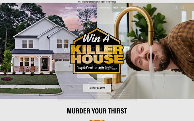
Preview image. Unlock full-res
Heavy Metal Vending Machine
Color palette
Accents, special links, logotype details — a premium, metallic highlight against the stark monochrome.
Hover state for gold accents, secondary logotype details.
Primary text, core UI backgrounds, filled buttons. Establishes the dominant, aggressive tone.
Text on dark backgrounds, primary page backgrounds.
Body copy on light backgrounds, secondary UI elements.
Product grid background, subtle dividers.
Secondary text, disabled states, placeholder text.
Alternative light background color for section differentiation.
Hover states on dark elements.
Default border color for text input fields.
Typography
- Weights
- 400, 500, 700
- Sizes
- 12px, 14px, 16px, 18px, 20px, 24px, 32px, 36px, 40px, 56px, 60px
- Line height
- 1, 1.05, 1.13, 1.2, 1.29, 1.5, 1.67, 2
- Letter spacing
- 0.0200em, 0.0310em, 0.0560em, 0.0630em
- Fallback
- 'Inter', 'Roboto', sans-serif
The single, dominant typeface used for everything from massive uppercase headlines to body copy. Its clean, geometric form provides a brutalist, no-nonsense foundation. Extensive use of uppercase at 700 weight for headings is the brand's signature voice.
- Weights
- 400, 700
- Sizes
- 10px, 16px, 18px, 20px, 45px
- Line height
- 1, 1.05, 1.2, 1.3
- Letter spacing
- 0.0560em
- Fallback
- 'Roboto Condensed', sans-serif
Used sparingly for subtitles and calorie counts where horizontal space is limited. Maintains the core Acumin feel in a more compact format.
Spacing & shape
Components
A solid rectangle with background: `Death Black` (#000000), text: `Bone White` (#ffffff), padding: 8px 16px, and border-radius: 0px. Text is uppercase `Acumin Pro`.
An outlined rectangle with background: transparent, text & 1px border: `Death Black` (#000000), padding: 13px, and border-radius: 0px. Text is uppercase `Acumin Pro`.
A full-width block link with background: `Death Black` (#000000), text: `Bone White` (#ffffff), and a right-aligned chevron. It is always rectangular with a 0px radius.
A sharp-cornered field with background: `Bone White` (#ffffff), text: `Death Black` (#000000), and a 1px border in `Input Border` (#999999). Padding is typically 8px 12px with 0px radius.
Uppercase text in `Acumin Pro` 500, color `Off-Black` (#151515). No underline or background decoration on hover.
A semi-transparent `Gravel Gray` (#727272) layer covers the page, with a centered rectangular container in `Ash Gray` (#e3e3e3) holding the content. All corners are sharp (0px radius).
Guidelines
- Use 0px border-radius for all buttons, inputs, cards, and containers.
- Set all major headlines in uppercase `Acumin Pro`.
- Rely on stark `Death Black` and `Bone White` for primary backgrounds and text.
- Use full-bleed, high-contrast black and white sections to structure the page.
- Reserve `Polished Gold` and `Antique Gold` for logotypes and hyper-specific accents.
- Maintain high-contrast text accessibility (AAA) for all body copy.
- Use sharp, rectangular product imagery on solid `Ash Gray` backgrounds.
- Never use rounded corners on any element.
- Do not use drop shadows or gradients for elevation.
- Avoid using sentence case for primary headlines.
- Don't use the gold colors for standard UI components like buttons or inputs.
- Do not introduce any soft or playful colors into the palette.
- Avoid subtle gray-on-gray text combinations.
- Don't use lifestyle photography; focus on the product or provocative concepts.
About this system
ShowHide
This design system feels like a heavy metal concert flyer brought to life as a direct-to-consumer brand. The aesthetic is built on brutalist principles: a stark palette of pure black and white, zero rounded corners, and aggressive, uppercase typography. This creates a hard, confrontational edge, deliberately rejecting the soft, approachable look of typical beverage companies. Splashes of antique gold in logos and links are the only moments of warmth, acting like a glint of metal on a matte black surface. The layout uses full-bleed, high-contrast sections, creating a jarring, powerful rhythm that mirrors the brand's 'Murder Your Thirst' tagline.
The layout is built on a foundation of alternating, full-bleed content bands. The page structure often starts with a complex hero and transitions into a series of stark black, white, or light gray sections with a strong vertical rhythm. Content within sections is typically centered and max-width, creating a pillar of text and visuals down the screen. Grids are used for product listings, following a simple, rigid 3 or 4-column structure with no frills. The overall impression is one of powerful, rhythmic, and confrontational organization.
The visual language is provocative and product-focused, mirroring a heavy-metal aesthetic. Photography is high-contrast, often featuring stark product shots on plain backgrounds, or humorous, slightly absurd concepts (like drinking from a faucet). Imagery is used in full-bleed sections or as contained, sharp-edged blocks. There are no lifestyle photos; the can is the hero. Graphic elements include detailed, skull-based logotypes reminiscent of band art, rendered in black, white, and gold.
Reminiscent of MSCHF, Thrasher Magazine, Balenciaga (under Demna), Kith.
# Liquid Death — Style Reference
> Heavy Metal Vending Machine

**Theme:** mixed

**Site:** https://liquiddeath.com

This design system feels like a heavy metal concert flyer brought to life as a direct-to-consumer brand. The aesthetic is built on brutalist principles: a stark palette of pure black and white, zero rounded corners, and aggressive, uppercase typography. This creates a hard, confrontational edge, deliberately rejecting the soft, approachable look of typical beverage companies. Splashes of antique gold in logos and links are the only moments of warmth, acting like a glint of metal on a matte black surface. The layout uses full-bleed, high-contrast sections, creating a jarring, powerful rhythm that mirrors the brand's 'Murder Your Thirst' tagline.

## Tokens — Colors

| Name | Value | Token | Role |
|------|------|------|------|
| Polished Gold | `#d2ac5a` | `--color-polished-gold` | Accents, special links, logotype details — a premium, metallic highlight against the stark monochrome. |
| Antique Gold | `#8a6d35` | `--color-antique-gold` | Hover state for gold accents, secondary logotype details. |
| Death Black | `#000000` | `--color-death-black` | Primary text, core UI backgrounds, filled buttons. Establishes the dominant, aggressive tone. |
| Bone White | `#ffffff` | `--color-bone-white` | Text on dark backgrounds, primary page backgrounds. |
| Off-Black | `#151515` | `--color-off-black` | Body copy on light backgrounds, secondary UI elements. |
| Ash Gray | `#e3e3e3` | `--color-ash-gray` | Product grid background, subtle dividers. |
| Gravel Gray | `#727272` | `--color-gravel-gray` | Secondary text, disabled states, placeholder text. |
| Light Ash | `#f5f5f5` | `--color-light-ash` | Alternative light background color for section differentiation. |
| Charcoal | `#232323` | `--color-charcoal` | Hover states on dark elements. |
| Input Border | `#999999` | `--color-input-border` | Default border color for text input fields. |

## Tokens — Typography

### Acumin Pro
- **Substitute:** 'Inter', 'Roboto', sans-serif
- **Weights:** 400, 500, 700
- **Sizes:** 12px, 14px, 16px, 18px, 20px, 24px, 32px, 36px, 40px, 56px, 60px
- **Line height:** 1, 1.05, 1.13, 1.2, 1.29, 1.5, 1.67, 2
- **Letter spacing:** 0.0200em, 0.0310em, 0.0560em, 0.0630em
- **Role:** The single, dominant typeface used for everything from massive uppercase headlines to body copy. Its clean, geometric form provides a brutalist, no-nonsense foundation. Extensive use of uppercase at 700 weight for headings is the brand's signature voice.

### acumin-pro-condensed
- **Substitute:** 'Roboto Condensed', sans-serif
- **Weights:** 400, 700
- **Sizes:** 10px, 16px, 18px, 20px, 45px
- **Line height:** 1, 1.05, 1.2, 1.3
- **Letter spacing:** 0.0560em
- **Role:** Used sparingly for subtitles and calorie counts where horizontal space is limited. Maintains the core Acumin feel in a more compact format.

## Tokens — Type Scale

Perfect Fourth (1.333) from 16px base.

| Role | Size | Line height | Letter spacing |
|------|------|------|------|
| caption | 10px | 1 | — |
| body-sm | 14px | 1.5 | — |
| body | 16px | 1.67 | — |
| subheading | 24px | 1.2 | — |
| heading-sm | 36px | 1.13 | — |
| heading | 45px | 1.05 | — |
| display | 60px | 1 | — |

## Tokens — Spacing

- **Card padding:** 24px

## Tokens — Radius

- **Buttons:** 0px
- **Inputs:** 0px
- **Cards:** 0px
- **tags:** 0px

## Layout

The layout is built on a foundation of alternating, full-bleed content bands. The page structure often starts with a complex hero and transitions into a series of stark black, white, or light gray sections with a strong vertical rhythm. Content within sections is typically centered and max-width, creating a pillar of text and visuals down the screen. Grids are used for product listings, following a simple, rigid 3 or 4-column structure with no frills. The overall impression is one of powerful, rhythmic, and confrontational organization.

## Imagery

The visual language is provocative and product-focused, mirroring a heavy-metal aesthetic. Photography is high-contrast, often featuring stark product shots on plain backgrounds, or humorous, slightly absurd concepts (like drinking from a faucet). Imagery is used in full-bleed sections or as contained, sharp-edged blocks. There are no lifestyle photos; the can is the hero. Graphic elements include detailed, skull-based logotypes reminiscent of band art, rendered in black, white, and gold.

## Components

### Product Cards — Beverage Grid

### Merch Product Card Row

### Full-Width Banner CTAs + Email Capture

### Primary Action Button
*Key CTAs like 'Shop Now' or 'Add to Cart'.*

A solid rectangle with background: `Death Black` (#000000), text: `Bone White` (#ffffff), padding: 8px 16px, and border-radius: 0px. Text is uppercase `Acumin Pro`.

### Secondary Action Button
*Less prominent actions like 'Join the Contest'.*

An outlined rectangle with background: transparent, text & 1px border: `Death Black` (#000000), padding: 13px, and border-radius: 0px. Text is uppercase `Acumin Pro`.

### Full-Width Banner CTA
*Major section-level calls to action, e.g., 'Join the Club'.*

A full-width block link with background: `Death Black` (#000000), text: `Bone White` (#ffffff), and a right-aligned chevron. It is always rectangular with a 0px radius.

### Text Input Field
*For email capture and forms.*

A sharp-cornered field with background: `Bone White` (#ffffff), text: `Death Black` (#000000), and a 1px border in `Input Border` (#999999). Padding is typically 8px 12px with 0px radius.

### Navigation Link
*Main site navigation items.*

Uppercase text in `Acumin Pro` 500, color `Off-Black` (#151515). No underline or background decoration on hover.

### Modal Overlay
*Popup for email signup or promotions.*

A semi-transparent `Gravel Gray` (#727272) layer covers the page, with a centered rectangular container in `Ash Gray` (#e3e3e3) holding the content. All corners are sharp (0px radius).

## Guidelines

### Do

- Use 0px border-radius for all buttons, inputs, cards, and containers.
- Set all major headlines in uppercase `Acumin Pro`.
- Rely on stark `Death Black` and `Bone White` for primary backgrounds and text.
- Use full-bleed, high-contrast black and white sections to structure the page.
- Reserve `Polished Gold` and `Antique Gold` for logotypes and hyper-specific accents.
- Maintain high-contrast text accessibility (AAA) for all body copy.
- Use sharp, rectangular product imagery on solid `Ash Gray` backgrounds.

### Don't

- Never use rounded corners on any element.
- Do not use drop shadows or gradients for elevation.
- Avoid using sentence case for primary headlines.
- Don't use the gold colors for standard UI components like buttons or inputs.
- Do not introduce any soft or playful colors into the palette.
- Avoid subtle gray-on-gray text combinations.
- Don't use lifestyle photography; focus on the product or provocative concepts.

## Agent Prompt Guide

### Quick Color Reference
- **Page Background**: `#ffffff` (Bone White) / `#e3e3e3` (Ash Gray)
- **Dark Section Background**: `#000000` (Death Black)
- **Text**: `#151515` (Off-Black) on light, `#ffffff` (Bone White) on dark
- **CTA Button**: `#000000` background, `#ffffff` text
- **Accent**: `#d2ac5a` (Polished Gold)

### Example Component Prompts
1.  **"Create a primary CTA button with the text 'MURDER NOW'. It must have a `Death Black` (#000000) background, `Bone White` (#ffffff) uppercase text, 0px border-radius, and padding of 8px 16px. Use the `Acumin Pro` font at 700 weight."**
2.  **"Generate a product grid section on an `Ash Gray` (#e3e3e3) background. Each card should have 0px radius, no border, and no shadow. The product title should be uppercase `Acumin Pro` weight 700 in `Death Black` (#000000)."**
3.  **"Design a full-width promotional banner. The background is `Death Black` (#000000). The headline 'JOIN THE CLUB' should be in `Bone White` (#ffffff), uppercase `Acumin Pro` font, centered, with a small white chevron to the right."**
More like this










Keep what you find
A free account saves references to boards and can send you a weekly email of picks based on what you save.
To see every result, go Pro.