Preview image. Unlock full-res
Vibrant blue precision on a soft canvas.
Color palette
Primary brand color, used for prominent call-to-action buttons, active navigation states, and key interactive elements. Creates immediate visual focus and a sense of action.
Background for accent cards and sections, providing a rich, darker counterpoint to the primary Loom Blue.
Accent shade of blue, used for subtle background elements and less prominent interactive details.
Used for distinctive, moderate contrast backgrounds on specific cards, hinting at a secondary brand accent.
Light, muted violet background tint, used for subtle visual separation of content blocks or as a cheerful accent.
Light, muted green background tint, often for informational or success-oriented card sections.
High-visibility accent, used for 'Record' indicators or urgent calls to attention, signaling activity.
Pale yellow background tint, used for cards or sections to create a warm, inviting feel.
Icon fill color, providing a touch of warmth.
Stroke color for specific icons or UI elements, for a vibrant pop.
Dominant page background, card surfaces, and primary text color on dark backgrounds, offering maximum contrast and visual space.
Primary heading and body text color on light backgrounds, ensuring strong readability and presence.
Secondary text and icon color, providing a softer contrast than Carbon Black while maintaining clarity.
Subtle light blue background tint, used for alternating section backgrounds and light interactive states.
Used for specific high-contrast text elements and icons.
Border colors, subtle dividers, and inactive states.
Used for subtle elevation on cards and images, with an alpha of 0.04-0.1 for a soft, diffused effect.
Used for specific highlights or as a semantic positive indicator, highly saturated.
Typography
- Weights
- 400, 500, 700
- Sizes
- 13px, 15px, 16px, 18px, 19px, 27px
- Line height
- 1, 1.45, 1.5, 1.52, 1.65, 1.71
- Fallback
- Inter
Used for body text, paragraphs, internal links, icons, and less prominent UI elements. Its range of weights and sizes provides flexibility for detailed content while maintaining brand voice.
- Weights
- 700
- Sizes
- 25px, 33px, 44px, 63px
- Line height
- 1.03, 1.14, 1.27, 1.33
- Fallback
- Inter
Dedicated to prominent headings, hero titles, and section titles. Its bold weight ensures impact at larger sizes, critical for conveying key messages.
Spacing & shape
Elevation
Components
Filled with Loom Blue (#1868db), white text, and a full pill-shaped radius (9999px). Padding is generous at 15.6154px vertical, 23.4231px horizontal, signaling importance and clickability.
Transparent background with Ink Slate (#292a2e) text and 1px border. Uses a pill-shaped radius (9999px) and lighter padding of 8px vertical, 16px horizontal, indicating a less dominant action.
Filled with Carbon Black (#101214), white text, and a full pill-shaped radius (9999px). Uses the same spacious padding as the Primary CTA (15.6154px vertical, 23.4231px horizontal), for calls-to-action on lighter backgrounds.
Transparent background with Ink Slate (#292a2e) text, 6px radius, and zero padding, used for inline actions or subtle prompts that act like text links.
Crisp White (#ffffff) background, large radius of 41.6923px, and generous internal padding (90.88px vertical, 111.04px horizontal). No distinct border, relies on shadow for elevation.
Loom Blue (#1868db) background with an extra-large radius of 68.9231px. Features substantial internal padding (111.04px all sides), used for high-impact content blocks.
Crisp White (#ffffff) background with a specific border-radius of 41.6923px on the top-left and bottom-left, with zero on the right, suggesting a visual cut-off for embedded content like videos. Zero padding.
Deep Sea Blue (#123263) background with a 41.6923px radius, typically used for containing imagery or specific product features. Zero padding.
Any background color, but features a multi-layer shadow: `rgba(0, 0, 0, 0.04) 0px 2px 6px 0px, rgba(0, 0, 0, 0.06) 0px 5px 18px 0px, rgba(0, 0, 0, 0.1) 0px 24px 83px 0px`, providing depth without harshness.
Guidelines
- Prioritize Loom Blue (#1868db) for all primary calls-to-action to establish a clear visual hierarchy.
- Use pill-shaped 9999px radii exclusively for interactive buttons and navigation items to convey approachability and distinguish them from content blocks.
- Employ the Charlie Display font (weight 700) for all main section headings and hero text to ensure prominence and brand consistency.
- Alternate subtle background tints like Sky Dust (#e9f2fe), Lavender Mist (#eed7fc), Spring Bud (#efffd6), and Honey Dew (#fff5d4) for different sections to add visual interest and segmentation without harsh dividers.
- Apply the multi-layer shadow `rgba(0, 0, 0, 0.04) 0px 2px 6px 0px, rgba(0, 0, 0, 0.06) 0px 5px 18px 0px, rgba(0, 0, 0, 0.1) 0px 24px 83px 0px` for elevating cards and images, maintaining a soft, diffused lift.
- Maintain a default element and card padding of 16px to ensure comfortable information density.
- Ensure all text uses the Charlie Text or Charlie Display font families with their specified OpenType stylistic sets to preserve the unique typographic character.
- Avoid using harsh, high-contrast borders on cards; rely on subtle background colors and soft shadows for visual separation and depth.
- Do not introduce new color hues for primary interactive elements; restrict these to Loom Blue (#1868db) and its darker/lighter variants for consistency.
- Do not use sharp corners for buttons or primary content cards; maintain the brand's rounded aesthetic with 9999px or 41.6923px radii.
- Avoid excessive text styling within body paragraphs; stick to Charlie Text regular and medium weights for readability.
- Do not deviate from the defined letter spacing for headlines (normal) and body text; consistent tracking is crucial for the custom typeface's appearance.
- Resist using highly saturated colors for large background areas unless it's a dedicated feature highlight card with a specific content purpose.
- Do not implement complex gradient patterns beyond the subtle, directional background gradient example; the aesthetic focuses on solid colors and tinted surfaces.
About this system
ShowHide
Loom's visual design is a study in confident clarity, balancing a vibrant, highly saturated brand blue against clean, bright surfaces. The use of custom typography, Charlie Text and Charlie Display, with specific OpenType features like stylistic sets, imbues the interface with a distinct personality. Generous rounded corners, reaching up to 9999px for buttons and a significant 68.9231px for cards, create an approachable, fluid aesthetic, contrasting with the precise content delivery. Subtle background tints add a layered depth without heavy shadows.
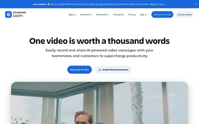
The page uses a contained layout with a maximum explicit width of approximately 1200px, centering content within a generous white background. The hero section features a prominent, centered headline and subtext, followed by two call-to-action buttons, then a large, centrally placed video player card. Sections alternate visual patterns, moving from centered headlines to two-column layouts (text left, image/video right, or vice versa). Vertical spacing between sections is comfortable, with subtle background color changes (e.g., Crisp White, Sky Dust) often serving as soft visual dividers. Content blocks typically use the brand's large rounded card radii, giving a playful yet structured feel.
The visual language comprises primarily product screenshots and occasional abstract, brand-colored graphics. Product screenshots are typically contained within cards with large rounded corners (41.6923px-68.9231px), often with an asymmetric border-radius, giving them a softened, friendly appearance. They are presented without strong borders, relying on background color or subtle shadows for definition. Iconography is primarily outlined or filled in Loom Blue or Ink Slate, with a minimal, functional aesthetic. Imagery serves to explain product functionality or illustrate concepts, rather than being purely decorative.
Reminiscent of Slack, Figma, Notion, Mailchimp.
# Loom — Style Reference
> Vibrant blue precision on a soft canvas.

**Theme:** light

**Site:** https://loom.com

Loom's visual design is a study in confident clarity, balancing a vibrant, highly saturated brand blue against clean, bright surfaces. The use of custom typography, Charlie Text and Charlie Display, with specific OpenType features like stylistic sets, imbues the interface with a distinct personality. Generous rounded corners, reaching up to 9999px for buttons and a significant 68.9231px for cards, create an approachable, fluid aesthetic, contrasting with the precise content delivery. Subtle background tints add a layered depth without heavy shadows.

## Tokens — Colors

| Name | Value | Token | Role |
|------|------|------|------|
| Loom Blue | `#1868db` | `--color-loom-blue` | Primary brand color, used for prominent call-to-action buttons, active navigation states, and key interactive elements. Creates immediate visual focus and a sense of action. |
| Deep Sea Blue | `#123263` | `--color-deep-sea-blue` | Background for accent cards and sections, providing a rich, darker counterpoint to the primary Loom Blue. |
| Bright Blue | `#1558bc` | `--color-bright-blue` | Accent shade of blue, used for subtle background elements and less prominent interactive details. |
| Violet Berry | `#48245d` | `--color-violet-berry` | Used for distinctive, moderate contrast backgrounds on specific cards, hinting at a secondary brand accent. |
| Lavender Mist | `#eed7fc` | `--color-lavender-mist` | Light, muted violet background tint, used for subtle visual separation of content blocks or as a cheerful accent. |
| Spring Bud | `#efffd6` | `--color-spring-bud` | Light, muted green background tint, often for informational or success-oriented card sections. |
| Sunset Orange | `#ff613d` | `--color-sunset-orange` | High-visibility accent, used for 'Record' indicators or urgent calls to attention, signaling activity. |
| Honey Dew | `#fff5d4` | `--color-honey-dew` | Pale yellow background tint, used for cards or sections to create a warm, inviting feel. |
| Warm Ochre | `#a36700` | `--color-warm-ochre` | Icon fill color, providing a touch of warmth. |
| Yellow Burst | `#ffc716` | `--color-yellow-burst` | Stroke color for specific icons or UI elements, for a vibrant pop. |
| Crisp White | `#ffffff` | `--color-crisp-white` | Dominant page background, card surfaces, and primary text color on dark backgrounds, offering maximum contrast and visual space. |
| Carbon Black | `#101214` | `--color-carbon-black` | Primary heading and body text color on light backgrounds, ensuring strong readability and presence. |
| Ink Slate | `#292a20` | `--color-ink-slate` | Secondary text and icon color, providing a softer contrast than Carbon Black while maintaining clarity. |
| Sky Dust | `#e9f2fe` | `--color-sky-dust` | Subtle light blue background tint, used for alternating section backgrounds and light interactive states. |
| Pure Black | `#000000` | `--color-pure-black` | Used for specific high-contrast text elements and icons. |
| Soft Gray | `#bfbfbf` | `--color-soft-gray` | Border colors, subtle dividers, and inactive states. |
| Shadow | `#bfbfbf` | `--color-shadow` | Used for subtle elevation on cards and images, with an alpha of 0.04-0.1 for a soft, diffused effect. |
| Vivid Green | `#82b536` | `--color-vivid-green` | Used for specific highlights or as a semantic positive indicator, highly saturated. |

## Tokens — Typography

### Charlie Text
- **Substitute:** Inter
- **Weights:** 400, 500, 700
- **Sizes:** 13px, 15px, 16px, 18px, 19px, 27px
- **Line height:** 1, 1.45, 1.5, 1.52, 1.65, 1.71
- **Role:** Used for body text, paragraphs, internal links, icons, and less prominent UI elements. Its range of weights and sizes provides flexibility for detailed content while maintaining brand voice.

### Charlie Display
- **Substitute:** Inter
- **Weights:** 700
- **Sizes:** 25px, 33px, 44px, 63px
- **Line height:** 1.03, 1.14, 1.27, 1.33
- **Role:** Dedicated to prominent headings, hero titles, and section titles. Its bold weight ensures impact at larger sizes, critical for conveying key messages.

## Tokens — Type Scale

Perfect Fourth (1.333) from 13px base.

| Role | Size | Line height | Letter spacing |
|------|------|------|------|
| caption | 13px | 1.71 | — |
| body-sm | 15px | 1.65 | — |
| subheading | 19px | 1.52 | — |
| heading-sm | 25px | 1.33 | — |
| heading | 33px | 1.27 | — |
| heading-lg | 44px | 1.14 | — |
| display | 63px | 1.03 | — |

## Tokens — Spacing

- **Max width:** 1200px
- **Section gap:** 36px
- **Card padding:** 16px
- **Element gap:** 16px

## Tokens — Radius

- **Buttons:** 9999px
- **Cards:** 41.6923px
- **Images:** 41.6923px
- **links:** 9999px

## Tokens — Elevation

- **Card:** `rgba(0, 0, 0, 0.04) 0px 2px 6px 0px, rgba(0, 0, 0, 0.06) 0px 5px 18px 0px, rgba(0, 0, 0, 0.1) 0px 24px 83px 0px`
- **Image:** `rgba(0, 0, 0, 0.04) 0px 2px 6px 0px, rgba(0, 0, 0, 0.06) 0px 5px 18px 0px, rgba(0, 0, 0, 0.1) 0px 24px 83px 0px`

## Layout

The page uses a contained layout with a maximum explicit width of approximately 1200px, centering content within a generous white background. The hero section features a prominent, centered headline and subtext, followed by two call-to-action buttons, then a large, centrally placed video player card. Sections alternate visual patterns, moving from centered headlines to two-column layouts (text left, image/video right, or vice versa). Vertical spacing between sections is comfortable, with subtle background color changes (e.g., Crisp White, Sky Dust) often serving as soft visual dividers. Content blocks typically use the brand's large rounded card radii, giving a playful yet structured feel.

## Imagery

The visual language comprises primarily product screenshots and occasional abstract, brand-colored graphics. Product screenshots are typically contained within cards with large rounded corners (41.6923px-68.9231px), often with an asymmetric border-radius, giving them a softened, friendly appearance. They are presented without strong borders, relying on background color or subtle shadows for definition. Iconography is primarily outlined or filled in Loom Blue or Ink Slate, with a minimal, functional aesthetic. Imagery serves to explain product functionality or illustrate concepts, rather than being purely decorative.

## Components

### Primary Call-to-Action Button
*Interactive*

Filled with Loom Blue (#1868db), white text, and a full pill-shaped radius (9999px). Padding is generous at 15.6154px vertical, 23.4231px horizontal, signaling importance and clickability.

### Secondary Outline Button
*Interactive*

Transparent background with Ink Slate (#292a2e) text and 1px border. Uses a pill-shaped radius (9999px) and lighter padding of 8px vertical, 16px horizontal, indicating a less dominant action.

### Dark Primary Button
*Interactive*

Filled with Carbon Black (#101214), white text, and a full pill-shaped radius (9999px). Uses the same spacious padding as the Primary CTA (15.6154px vertical, 23.4231px horizontal), for calls-to-action on lighter backgrounds.

### Minimal Link Button
*Interactive*

Transparent background with Ink Slate (#292a2e) text, 6px radius, and zero padding, used for inline actions or subtle prompts that act like text links.

### Default Content Card
*Display*

Crisp White (#ffffff) background, large radius of 41.6923px, and generous internal padding (90.88px vertical, 111.04px horizontal). No distinct border, relies on shadow for elevation.

### Feature Highlight Card (Blue)
*Display*

Loom Blue (#1868db) background with an extra-large radius of 68.9231px. Features substantial internal padding (111.04px all sides), used for high-impact content blocks.

### Asymmetric Image Card
*Display*

Crisp White (#ffffff) background with a specific border-radius of 41.6923px on the top-left and bottom-left, with zero on the right, suggesting a visual cut-off for embedded content like videos. Zero padding.

### Deep Blue Content Card
*Display*

Deep Sea Blue (#123263) background with a 41.6923px radius, typically used for containing imagery or specific product features. Zero padding.

### Subtle Shadow Card
*Display*

Any background color, but features a multi-layer shadow: `rgba(0, 0, 0, 0.04) 0px 2px 6px 0px, rgba(0, 0, 0, 0.06) 0px 5px 18px 0px, rgba(0, 0, 0, 0.1) 0px 24px 83px 0px`, providing depth without harshness.

## Guidelines

### Do

- Prioritize Loom Blue (#1868db) for all primary calls-to-action to establish a clear visual hierarchy.
- Use pill-shaped 9999px radii exclusively for interactive buttons and navigation items to convey approachability and distinguish them from content blocks.
- Employ the Charlie Display font (weight 700) for all main section headings and hero text to ensure prominence and brand consistency.
- Alternate subtle background tints like Sky Dust (#e9f2fe), Lavender Mist (#eed7fc), Spring Bud (#efffd6), and Honey Dew (#fff5d4) for different sections to add visual interest and segmentation without harsh dividers.
- Apply the multi-layer shadow `rgba(0, 0, 0, 0.04) 0px 2px 6px 0px, rgba(0, 0, 0, 0.06) 0px 5px 18px 0px, rgba(0, 0, 0, 0.1) 0px 24px 83px 0px` for elevating cards and images, maintaining a soft, diffused lift.
- Maintain a default element and card padding of 16px to ensure comfortable information density.
- Ensure all text uses the Charlie Text or Charlie Display font families with their specified OpenType stylistic sets to preserve the unique typographic character.

### Don't

- Avoid using harsh, high-contrast borders on cards; rely on subtle background colors and soft shadows for visual separation and depth.
- Do not introduce new color hues for primary interactive elements; restrict these to Loom Blue (#1868db) and its darker/lighter variants for consistency.
- Do not use sharp corners for buttons or primary content cards; maintain the brand's rounded aesthetic with 9999px or 41.6923px radii.
- Avoid excessive text styling within body paragraphs; stick to Charlie Text regular and medium weights for readability.
- Do not deviate from the defined letter spacing for headlines (normal) and body text; consistent tracking is crucial for the custom typeface's appearance.
- Resist using highly saturated colors for large background areas unless it's a dedicated feature highlight card with a specific content purpose.
- Do not implement complex gradient patterns beyond the subtle, directional background gradient example; the aesthetic focuses on solid colors and tinted surfaces.

## Agent Prompt Guide

### Quick Color Reference
- Text (primary): #101214 (Carbon Black)
- Background (canvas): #ffffff (Crisp White)
- CTA Button (fill): #1868db (Loom Blue)
- Border (subtle): #bfbfbf (Soft Gray)
- Accent (secondary bg): #e9f2fe (Sky Dust)

### 3-5 Example Component Prompts
1. Create a hero section: Crisp White (#ffffff) background. Headline 'One video is worth a thousand words' using Charlie Display, size 63px, lineHeight 1.03, weight 700, #101214. Subtext 'Easily record and share AI-powered video messages...' using Charlie Text, size 19px, lineHeight 1.52, weight 400, #292a2e. Primary CTA button 'Get Loom for free' with Loom Blue (#1868db) background, Crisp White (#ffffff) text, 9999px radius, padding 15.6154px 23.4231px. Secondary button 'Install Chrome Extension' with transparent background, #292a2 text, 9999px radius, 1px #292a2 border, padding 8px 16px.
2. Create a content card for 'Customer Testimonial' section: Honey Dew (#fff5d4) background, 41.6923px radius, padding 90.88px 111.04px. Inside, a quote in Charlie Text, size 27px, lineHeight 1.45, weight 500, #101214. Author name in Charlie Text, size 16px, lineHeight 1.5, weight 400, #292a2e.
3. Design a feature block: Sky Dust (#e9f2fe) background section. Heading 'Lightning fast screen recording' using Charlie Display, size 44px, lineHeight 1.14, weight 700, #101214. Feature description text in Charlie Text, size 18px, lineHeight 1.5, weight 400, #292a2e. Each feature point uses an icon in Ink Slate (#292a2e) followed by Charlie Text, size 16px, weight 400, #101214.
More like this










Keep what you find
A free account saves references to boards and can send you a weekly email of picks based on what you save.
To see every result, go Pro.