
Preview image. Unlock full-res
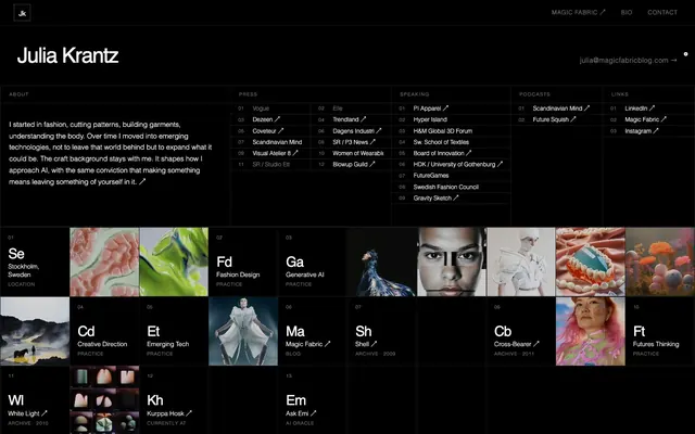
Shadowy Gallery Canvas
Color palette
Subtle surface accents, potentially for card backgrounds or specific content areas
Page backgrounds, section backgrounds, hero areas — this deep black provides high contrast for all content
Hairline borders, dividers, input outlines, and card edges on light surfaces. Do not promote it to the primary CTA color
Subtle borders, secondary navigation elements
Typography
- Weights
- 400, 700
- Sizes
- 12px, 13px, 15px, 25px, 54px, 74px
- Line height
- 1, 1.2, 1.5, 2
- Letter spacing
- normal
- Fallback
- Inter
Primary font for all text from headings to body, and navigation. Its clean, sans-serif structure alongside the high contrast background ensures clarity while maintaining a contemporary feel.
Spacing & shape
Components
Text in Ghost White (#ffffff), bordered by 1px solid Ghost White (#ffffff). Features minimal padding of 1px vertical and 6px horizontal, with a 0px border-radius, giving it a sharp, understated outline against the dark background.
Transparent background (rgba(0,0,0,0)) with no border, shadow, or border-radius. Content within the card is responsible for its own styling, maintaining the minimalist dark aesthetic. Padding is 0px.
Ghost White (#ffffff) text using aktiv-web font, weight 400. Features small bottom padding of 3px, creating a subtle visual space under the text, often appearing as an underline on hover without being explicitly declared.
Guidelines
- Prioritize Canvas Black (#111111) as the default background for all sections to maintain a high-contrast dark theme.
- Use Ghost White (#ffffff) for all primary text, headlines, and interactive element outlines.
- Apply aktiv-web (or Inter) font at various sizes, ensuring body text remains legible on the dark background.
- Maintain a spacious layout with a section gap of 99px to emphasize content separation and visual breathing room.
- Utilize 0px border-radius for all elements, including buttons and cards, to enforce the sharp, modern aesthetic.
- Employ minimal borders of 1px solid Ghost White (#ffffff) for interactive elements, focusing on subtle visual cues.
- Leverage large-scale, striking imagery as primary visual content within sections, allowing them to bleed to the edges.
- Do not introduce overt border-radius on any components; adhere to the sharp, angular aesthetic with 0px radius.
- Avoid using drop shadows or heavy box-shadows, as the design relies on flat surfaces and high contrast.
- Refrain from adding vibrant or numerous accent colors; the system is built on a restrained, monochromatic palette with minimal accentuation.
- Do not use generic system fonts when aktiv-web (or Inter) is available, as the specific font style contributes significantly to brand identity.
- Avoid tight spacing; maintain the generous sectionGap of 99px and general spaciousness.
- Do not add filled button variants; interactive elements should primarily be ghosted outlines or text links.
- Do not introduce unnecessary dividers or heavy visual separators between content blocks; rely on background color changes and generous spacing.
About this system
ShowHide
Numbered employs a deep, high-contrast visual system, where stark black canvases provide a dramatic backdrop for crisp white typography and subtle, refined interactions. The design uses spacious layouts and minimal ornamentation, allowing large-scale imagery and bold headlines to dominate. Interactive elements are understated, relying on elegant hover states rather than overt visual cues, contributing to a premium, editorial aesthetic.
The page primarily uses a full-bleed layout, particularly for hero sections and large image blocks, filling the entire viewport horizontally. Content within sections, when not full-bleed imagery, is typically constrained by a maximum width and centered, allowing for visual breathing room on the sides. The hero pattern often involves large, striking photography with white, often serif, text overlaid, creating an editorial masthead feel. Sections generally flow vertically with consistent, generous spacing (99px section gap), providing a clean rhythm. Content arrangement frequently alternates between large visual blocks and stacked text sections, sometimes with implied two-column structures for text-heavy areas. There is no explicit grid for cards but content blocks are large and distinct. Navigation is a minimal top-right 'Contact' button, with a full-page menu invoked for comprehensive navigation.
The site features high-quality, large-format photography and product shots, often full-bleed or occupying significant visual space. Imagery is treated realistically, focusing on natural light and candid moments for lifestyle shots, or clean, well-lit product focus for case studies. There are no overt graphic treatments like duotones or heavy filters; images maintain their natural color and detail. The role of imagery is primarily decorative atmosphere and showcasing client work, rather than explanatory diagrams or abstract graphics. Density is image-heavy, with full-screen visuals interspersed with text.
Reminiscent of Basic. Space, Locomotive Agency, Work & Co.
# Numbered — Style Reference
> Shadowy Gallery Canvas

**Theme:** dark

**Site:** https://numbered.studio

Numbered employs a deep, high-contrast visual system, where stark black canvases provide a dramatic backdrop for crisp white typography and subtle, refined interactions. The design uses spacious layouts and minimal ornamentation, allowing large-scale imagery and bold headlines to dominate. Interactive elements are understated, relying on elegant hover states rather than overt visual cues, contributing to a premium, editorial aesthetic.

## Tokens — Colors

| Name | Value | Token | Role |
|------|------|------|------|
| Desert Sand | `#bc9873` | `--color-desert-sand` | Subtle surface accents, potentially for card backgrounds or specific content areas |
| Canvas Black | `#111111` | `--color-canvas-black` | Page backgrounds, section backgrounds, hero areas — this deep black provides high contrast for all content |
| Ghost White | `#ffffff` | `--color-ghost-white` | Hairline borders, dividers, input outlines, and card edges on light surfaces. Do not promote it to the primary CTA color |
| Muted Ash | `#4f4f4f` | `--color-muted-ash` | Subtle borders, secondary navigation elements |

## Tokens — Typography

### aktiv-web
- **Substitute:** Inter
- **Weights:** 400, 700
- **Sizes:** 12px, 13px, 15px, 25px, 54px, 74px
- **Line height:** 1, 1.2, 1.5, 2
- **Letter spacing:** normal
- **Role:** Primary font for all text from headings to body, and navigation. Its clean, sans-serif structure alongside the high contrast background ensures clarity while maintaining a contemporary feel.

## Tokens — Type Scale

Augmented Fourth (1.414) from 15px base.

| Role | Size | Line height | Letter spacing |
|------|------|------|------|
| caption | 12px | 1.5 | — |
| body-sm | 13px | 1.5 | — |
| body | 15px | 1.5 | — |
| body-lg | 25px | 1.3 | — |
| heading-sm | 54px | 1.3 | — |
| heading | 74px | 1.3 | — |

## Tokens — Spacing

- **Section gap:** 99px
- **Card padding:** 0px
- **Element gap:** 20px

## Tokens — Radius

- **Buttons:** 0px
- **Cards:** 0px

## Layout

The page primarily uses a full-bleed layout, particularly for hero sections and large image blocks, filling the entire viewport horizontally. Content within sections, when not full-bleed imagery, is typically constrained by a maximum width and centered, allowing for visual breathing room on the sides. The hero pattern often involves large, striking photography with white, often serif, text overlaid, creating an editorial masthead feel. Sections generally flow vertically with consistent, generous spacing (99px section gap), providing a clean rhythm. Content arrangement frequently alternates between large visual blocks and stacked text sections, sometimes with implied two-column structures for text-heavy areas. There is no explicit grid for cards but content blocks are large and distinct. Navigation is a minimal top-right 'Contact' button, with a full-page menu invoked for comprehensive navigation.

## Imagery

The site features high-quality, large-format photography and product shots, often full-bleed or occupying significant visual space. Imagery is treated realistically, focusing on natural light and candid moments for lifestyle shots, or clean, well-lit product focus for case studies. There are no overt graphic treatments like duotones or heavy filters; images maintain their natural color and detail. The role of imagery is primarily decorative atmosphere and showcasing client work, rather than explanatory diagrams or abstract graphics. Density is image-heavy, with full-screen visuals interspersed with text.

## Components

### Ghost Border Button
*Call to action or navigation links.*

Text in Ghost White (#ffffff), bordered by 1px solid Ghost White (#ffffff). Features minimal padding of 1px vertical and 6px horizontal, with a 0px border-radius, giving it a sharp, understated outline against the dark background.

### Content Card
*Displaying featured work or case studies.*

Transparent background (rgba(0,0,0,0)) with no border, shadow, or border-radius. Content within the card is responsible for its own styling, maintaining the minimalist dark aesthetic. Padding is 0px.

### Navigation Link
*Top-level navigation items or footer links.*

Ghost White (#ffffff) text using aktiv-web font, weight 400. Features small bottom padding of 3px, creating a subtle visual space under the text, often appearing as an underline on hover without being explicitly declared.

## Guidelines

### Do

- Prioritize Canvas Black (#111111) as the default background for all sections to maintain a high-contrast dark theme.
- Use Ghost White (#ffffff) for all primary text, headlines, and interactive element outlines.
- Apply aktiv-web (or Inter) font at various sizes, ensuring body text remains legible on the dark background.
- Maintain a spacious layout with a section gap of 99px to emphasize content separation and visual breathing room.
- Utilize 0px border-radius for all elements, including buttons and cards, to enforce the sharp, modern aesthetic.
- Employ minimal borders of 1px solid Ghost White (#ffffff) for interactive elements, focusing on subtle visual cues.
- Leverage large-scale, striking imagery as primary visual content within sections, allowing them to bleed to the edges.

### Don't

- Do not introduce overt border-radius on any components; adhere to the sharp, angular aesthetic with 0px radius.
- Avoid using drop shadows or heavy box-shadows, as the design relies on flat surfaces and high contrast.
- Refrain from adding vibrant or numerous accent colors; the system is built on a restrained, monochromatic palette with minimal accentuation.
- Do not use generic system fonts when aktiv-web (or Inter) is available, as the specific font style contributes significantly to brand identity.
- Avoid tight spacing; maintain the generous sectionGap of 99px and general spaciousness.
- Do not add filled button variants; interactive elements should primarily be ghosted outlines or text links.
- Do not introduce unnecessary dividers or heavy visual separators between content blocks; rely on background color changes and generous spacing.

## Agent Prompt Guide

Quick Color Reference:
text: #ffffff
background: #111111
border: #ffffff
accent: #bc9873
primary action: no distinct CTA color

Example Component Prompts:
Create a hero section: Canvas Black background. Headline "Numbered" in large aktiv-web (74px, 1.0 lineHeight) Ghost White text. Subtext 'Design, Content Production & Technology' inaktiv-web (15px, 1.2 lineHeight) Ghost White text at the bottom-center. No padding.
Create a section with a large headline: Canvas Black background. Headline 'CASES STUDIES' in aktiv-web (54px, 1.2 lineHeight) Ghost White text, left-aligned. Follow with a 'View all' link in Ghost White (#ffffff) text, aktiv-web (13px, 1.2 lineHeight).
Create a ghost button: Text 'CONTACT' in Ghost White (#ffffff), aktiv-web font (13px, 1.2 lineHeight), with a 1px solid Ghost White (#ffffff) border, 0px border-radius, 1px vertical and 6px horizontal padding.
More like this









Keep what you find
A free account saves references to boards and can send you a weekly email of picks based on what you save.
To see every result, go Pro.