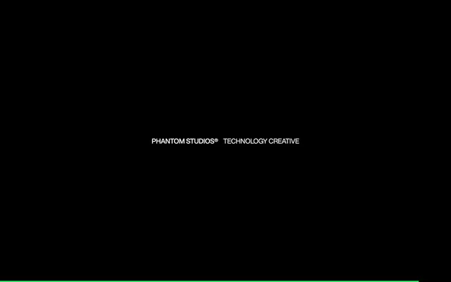
Preview image. Unlock full-res
Black canvas, vivid pixel shimmer
Color palette
Green wash for highlight backgrounds, decorative bands, and soft emphasis behind content. Do not promote it to the primary CTA color
Primary page and component backgrounds, creating a deep, immersive canvas for content
Hairline borders, dividers, input outlines, and card edges on light surfaces. Do not promote it to the primary CTA color
Subtle borders for content dividers and links, offering minimal visual separation
Supporting text and heading borders where a softer presence is required
Typography
- Weights
- 400, 500, 700
- Sizes
- 16px, 18px, 22px, 24px, 56px
- Line height
- 0.93, 1.2
- Letter spacing
- normal
- Fallback
- Arial, sans-serif
Primary typeface for headings, body text, and UI elements. Its clean, sans-serif form maintains clarity and a contemporary feel, especially at large display sizes and tight line heights.
- Weights
- 400
- Sizes
- 11px
- Line height
- 1.1
- Letter spacing
- normal
- Fallback
- Menlo, Monaco, monospace
Monospaced font used for small, precise labels and potentially code-like information, emphasizing technical accuracy and a digital aesthetic.
Spacing & shape
Components
Ghost White text link with a 1px solid Slate Border (#333333) and 3px vertical padding. Text uses Helvetica Now, weight 400.
Uses ballinger-mono at 11px, weight 400, with a line height of 1.10, ideal for technical details or metadata.
Large heading using Helvetica Now at 56px, weight 400 or 500, with tight line-height of 0.93. Uses Ghost White text on Midnight Ink background, with 48px top margin and 8px bottom margin.
A 1px solid border using Slate Border (#333333) provides a thin, understated separation between sections or lists.
Guidelines
- Always use Midnight Ink (#000000) for primary backgrounds to maintain the dark, immersive aesthetic.
- Prioritize Ghost White (#ffffff) for all main textual content and actively interactive elements against dark backgrounds for clarity.
- Employ Neon Green (#1eff66) exclusively for accenting active states, selected items, and functional highlights, ensuring it remains a distinct visual cue.
- Utilize Helvetica Now for all primary typography, varying weights (400, 500, 700) to establish hierarchy.
- Apply 14px border-radius to container-like elements such as cards or bodies, softening the geometric starkness.
- Maintain comfortable vertical rhythm with 48px section gaps and 16px element gaps as default.
- Use ballinger-mono at 11px for small, precise labels or technical indicators, contrasting with the main typeface.
- Avoid using any colors other than Neon Green (#1eff66) for primary accents or interactive states.
- Do not introduce shadows or significant elevation; maintain a flat UI aesthetic, using borders for separation instead.
- Refrain from using gradients on backgrounds or interactive elements; the visual system is purposefully flat and monochromatic.
- Do not deviate from the specified typography families; no other fonts should be introduced.
- Avoid excessive imagery; the design is text and UI-dominant, with a focus on clear, functional presentation.
- Do not vary paragraph line heights; use 1.20 for Helvetica Now body text and 1.10 for ballinger-mono.
- Do not use generic button styles; active elements should rely on Ghost White text with subtle Slate Border outlining where appropriate, or Neon Green for overt action.
About this system
ShowHide
Phantom Studios presents a stark, high-contrast dark theme optimized for technical and creative content. The visual system relies on pure black canvases and crisp white typography, punctuated sparingly by a single vibrant green for active states and highlights. This creates a focused, almost clinical atmosphere where content takes absolute precedence, with subtle geometric shapes and a mono-spaced accent font hinting at precision and digital craft. Surfaces are flat and unlayered, with UI elements defined by minimal borders rather than shadows.
The page maintains a full-bleed dark background, setting a consistent immersive tone. Content is centered and structured with comfortable vertical spacing, allowing elements to breathe without feeling sparse. There are no clear indications of a fixed width container for global content. Sections are defined by typographic hierarchy and subtle borders, rather than distinct visual bands or complex grid structures. The rhythm is consistent and spacious, facilitating focused reading and interaction.
Minimal to none; the site is primarily text-dominant with UI elements. If imagery is present, it's implied to be high-contrast, technical, or monochromatic to match the system's aesthetic, likely product shots or abstract representations within a contained frame. Icons (if present) would be minimal outlined or filled simple forms, mono-color.
Reminiscent of Stripe, Linear, Vercel.
# Phantom Studios — Style Reference
> Black canvas, vivid pixel shimmer

**Theme:** dark

**Site:** https://www.phantom.land

Phantom Studios presents a stark, high-contrast dark theme optimized for technical and creative content. The visual system relies on pure black canvases and crisp white typography, punctuated sparingly by a single vibrant green for active states and highlights. This creates a focused, almost clinical atmosphere where content takes absolute precedence, with subtle geometric shapes and a mono-spaced accent font hinting at precision and digital craft. Surfaces are flat and unlayered, with UI elements defined by minimal borders rather than shadows.

## Tokens — Colors

| Name | Value | Token | Role |
|------|------|------|------|
| Neon Green | `#1eff66` | `--color-neon-green` | Green wash for highlight backgrounds, decorative bands, and soft emphasis behind content. Do not promote it to the primary CTA color |
| Midnight Ink | `#000000` | `--color-midnight-ink` | Primary page and component backgrounds, creating a deep, immersive canvas for content |
| Ghost White | `#ffffff` | `--color-ghost-white` | Hairline borders, dividers, input outlines, and card edges on light surfaces. Do not promote it to the primary CTA color |
| Slate Border | `#333333` | `--color-slate-border` | Subtle borders for content dividers and links, offering minimal visual separation |
| Muted Gray | `#666666` | `--color-muted-gray` | Supporting text and heading borders where a softer presence is required |

## Tokens — Typography

### Helvetica Now
- **Substitute:** Arial, sans-serif
- **Weights:** 400, 500, 700
- **Sizes:** 16px, 18px, 22px, 24px, 56px
- **Line height:** 0.93, 1.2
- **Letter spacing:** normal
- **Role:** Primary typeface for headings, body text, and UI elements. Its clean, sans-serif form maintains clarity and a contemporary feel, especially at large display sizes and tight line heights.

### ballinger-mono
- **Substitute:** Menlo, Monaco, monospace
- **Weights:** 400
- **Sizes:** 11px
- **Line height:** 1.1
- **Letter spacing:** normal
- **Role:** Monospaced font used for small, precise labels and potentially code-like information, emphasizing technical accuracy and a digital aesthetic.

## Tokens — Type Scale

| Role | Size | Line height | Letter spacing |
|------|------|------|------|
| caption | 16px | 1.2 | — |
| body-sm | 18px | 1.2 | — |
| body | 22px | 1.2 | — |
| body-lg | 24px | 1.2 | — |
| heading-sm | 56px | 1.2 | — |

## Tokens — Spacing

- **Section gap:** 48px
- **Card padding:** 24px
- **Element gap:** 16px

## Tokens — Radius

- **body:** 14px

## Layout

The page maintains a full-bleed dark background, setting a consistent immersive tone. Content is centered and structured with comfortable vertical spacing, allowing elements to breathe without feeling sparse. There are no clear indications of a fixed width container for global content. Sections are defined by typographic hierarchy and subtle borders, rather than distinct visual bands or complex grid structures. The rhythm is consistent and spacious, facilitating focused reading and interaction.

## Imagery

Minimal to none; the site is primarily text-dominant with UI elements. If imagery is present, it's implied to be high-contrast, technical, or monochromatic to match the system's aesthetic, likely product shots or abstract representations within a contained frame. Icons (if present) would be minimal outlined or filled simple forms, mono-color.

## Components

### Outline Text Link
*Interactive text link*

Ghost White text link with a 1px solid Slate Border (#333333) and 3px vertical padding. Text uses Helvetica Now, weight 400.

### Monospace Data Label
*Small descriptive label*

Uses ballinger-mono at 11px, weight 400, with a line height of 1.10, ideal for technical details or metadata.

### Primary Section Heading
*Main content division title*

Large heading using Helvetica Now at 56px, weight 400 or 500, with tight line-height of 0.93. Uses Ghost White text on Midnight Ink background, with 48px top margin and 8px bottom margin.

### Subtle Content Divider
*Visual separator for content areas*

A 1px solid border using Slate Border (#333333) provides a thin, understated separation between sections or lists.

## Guidelines

### Do

- Always use Midnight Ink (#000000) for primary backgrounds to maintain the dark, immersive aesthetic.
- Prioritize Ghost White (#ffffff) for all main textual content and actively interactive elements against dark backgrounds for clarity.
- Employ Neon Green (#1eff66) exclusively for accenting active states, selected items, and functional highlights, ensuring it remains a distinct visual cue.
- Utilize Helvetica Now for all primary typography, varying weights (400, 500, 700) to establish hierarchy.
- Apply 14px border-radius to container-like elements such as cards or bodies, softening the geometric starkness.
- Maintain comfortable vertical rhythm with 48px section gaps and 16px element gaps as default.
- Use ballinger-mono at 11px for small, precise labels or technical indicators, contrasting with the main typeface.

### Don't

- Avoid using any colors other than Neon Green (#1eff66) for primary accents or interactive states.
- Do not introduce shadows or significant elevation; maintain a flat UI aesthetic, using borders for separation instead.
- Refrain from using gradients on backgrounds or interactive elements; the visual system is purposefully flat and monochromatic.
- Do not deviate from the specified typography families; no other fonts should be introduced.
- Avoid excessive imagery; the design is text and UI-dominant, with a focus on clear, functional presentation.
- Do not vary paragraph line heights; use 1.20 for Helvetica Now body text and 1.10 for ballinger-mono.
- Do not use generic button styles; active elements should rely on Ghost White text with subtle Slate Border outlining where appropriate, or Neon Green for overt action.

## Agent Prompt Guide

**Quick Color Reference:**
text: #ffffff
background: #000000
border: #333333
accent: #1eff66
primary action: no distinct CTA color

**3-5 Example Component Prompts:**
1. Create a section heading: 'Our Approach' in Helvetica Now, 56px, weight 500, Ghost White, on a Midnight Ink background. Apply 48px top margin and 8px bottom margin.
2. Design a descriptive label: 'Project ID: xyz-789' in ballinger-mono, 11px, weight 400, Ghost White.
3. Implement a text link: 'View Details' in Helvetica Now, 16px, weight 400, Ghost White, with a 1px solid Slate Border (#333333) and 3px vertical padding. On hover, change text to Neon Green (#1eff66).
More like this








Keep what you find
A free account saves references to boards and can send you a weekly email of picks based on what you save.
To see every result, go Pro.