Preview image. Unlock full-res
Organic Canvas, Understated Authority
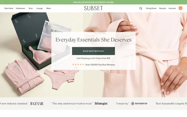
Subset embraces a grounded, natural aesthetic, combining the tactile feel of organic materials with a clean, unadorned interface. The visual design prioritizes clear product presentation against a muted, almost oatmeal-colored canvas, punctuated by utilitarian typography and a few carefully chosen, moderately saturated accent colors. Components are minimal and unfussy, focusing on function over adornment, embodying a sense of reliable simplicity. Color is used sparingly, primarily to distinguish states or add a subtle brand signature rather than for bold visual statements.
Prioritize FoundersGrotesk for all functional text, ensuring precise letter-spacing at different scales to maintain a compact, legible feel.
Use TTRamillas_Light for all marketing headlines; its light weight and negative tracking provide an elegant contrast.
Maintain a strict 0px border-radius for all component cards, badges, and primary/secondary buttons to preserve the structured, unadorned aesthetic.
Apply Oatmeal Canvas (#f5f4ee) as the primary background for all static content areas, grounding the interface in a natural, soft tone.
Use Deep Forest (#233735) for filled primary action buttons and Mineral Blue (#6487ba) for secondary actions; these are the core chromatic accents.
Separate content sections with ample vertical spacing (64px sectionGap) for visual breathing room, avoiding horizontal dividers between major content blocks.
Employ a 50% border-radius for all circular interactive elements and small ghost buttons, creating distinct visual cues.
Avoid using drop shadows on any components; the system relies on flat surfaces and clear borders for definition.
Do not introduce new typefaces; FoundersGrotesk and TTRamillas_Light are the only approved fonts.
Refrain from using gradients for backgrounds or components; the design emphasizes flat, solid colors.
Do not use saturated chroma for general text or borders; stick to the neutral palette for UI elements to maintain a muted appearance.
Avoid decorative icons or illustrations that are not rendered in Spring Bud (#8bbd78) or Sunset Orange (#ff965b); color accents are reserved and intentional.
Do not deviate from the specified padding and margin values; the compact density is carefully calibrated.
Never use box-shadow for elevation, as this design system eschews overt layering effects.