Preview image. Unlock full-res
Color palette
Primary page and background surfaces, default text fill for inverted states
Neutral form states, badge text, and quiet UI feedback where color should stay understated. Do not promote it to the primary CTA color
Secondary text, subtle instructional prompts, and inactive or subordinate border elements
Typography
- Weights
- 400
- Sizes
- 16px, 24px, 48px, 80px
- Line height
- 0.8, 1.2
- Fallback
- Montserrat
Dominant font for headings and large display text, creating a bold, geometric presence. Its narrow character forms set a distinct, modern tone.
- Weights
- 400
- Sizes
- 16px, 20px, 24px
- Line height
- 0.9, 1, 1.1, 1.2
- Fallback
- Open Sans
Used for body text, links, and general content, providing readability with a consistent contemporary feel that complements the display font. It maintains the system's geometric ethos.
- Weights
- 400
- Sizes
- 13px, 20px
- Line height
- 1.2
- Fallback
- system-ui
System fallback for small utility text, input fields, and specific button elements, ensuring baseline legibility where custom fonts might not load.
Spacing & shape
Components
Text in Diagramatika Text, 16px, weight 400, color Diagram Black. Features a solid Diagram Black border on hover/active states, indicating a selected navigational path. Often paired with dotted lines to visually connect actions.
Uses Diagramatika Display, 80px, weight 400, color Diagram Black. Highly condensed line-height (0.8) to maintain visual tightness. Often appears as single characters or short words, acting as graphic elements.
Composed of Diagramatika Text, 16px-24px, weight 400, color Diagram Black, with a standard line-height of 1.2. The content fills available space, forming dense, readable blocks against the Canvas White background.
A dotted line stroke in Diagram Black, primarily used to guide the eye or visually link related actions/content. Functions as a non-standard interactive element often with associated text.
A button with a transparent background (rgba(0,0,0,0)), Diagram Black text (Arial, 13px), and a 1px Diagram Black border. Features 0px border-radius and 0px padding, integrating seamlessly into the surrounding layout rather than standing out.
A small, fixed banner at the bottom of the viewport with a transparent dark grey background (#000000 with opacity via rgba), white text, and a minimal 'X' close icon. Uses Arial 13px, color Canvas White, 0px radius.
Uses Diagramatika Text, 16px, weight 400, color Muted Gray. Often found accompanying interactive elements like navigational links to provide context.
Guidelines
- Prioritize Diagram Black (#000000) for all text and UI outlines against Canvas White (#FFFFFF) backgrounds to maintain high contrast.
- Use Diagramatika Display for all large type elements (48px and above) with a tight line-height of 0.8 to create a graphic, almost abstract feel.
- Define interactive pathways and relationships using single-pixel dotted lines in Diagram Black, connecting elements visually rather than relying on traditional button styling.
- Employ 0px border-radius for all UI components, including buttons and inputs, to uphold a sharp, rectilinear visual language.
- Maintain a comfortable density for content blocks, using 20px padding around text or within cards, and 20px as a primary element gap.
- Use Muted Gray (#999999) exclusively for secondary, contextual labels or inactive states, ensuring it never competes with primary Diagram Black text.
- Structure layouts with a strong emphasis on horizontal and vertical lines as visual anchors, creating a grid-like framework that guides the eye through content.
- Avoid using any colored backgrounds or accent colors; the system relies strictly on a black and white palette with only Muted Gray as a secondary neutral.
- Do not introduce rounded corners or soft edges on any UI elements. All shapes must maintain sharp, 0px radii.
- Refrain from using drop shadows or complex elevation effects; the design emphasizes flat surfaces and defined lines to create separation.
- Do not use bold or italic text styles; the system achieves visual hierarchy through font size, weight 400, and precise spacing rather than stylistic variations.
- Avoid decorative imagery that isn't black and white line art or diagrams; photography or colorful illustrations will disrupt the stark aesthetic.
- Do not use generic button styles with block backgrounds; interactive elements should manifest as text links, ghost buttons, or elements defined by borders/lines.
- Do not introduce unnecessary visual flair or animation; transitions should be subtle (0.3s ease for color/opacity), serving function over decoration.
About this system
ShowHide
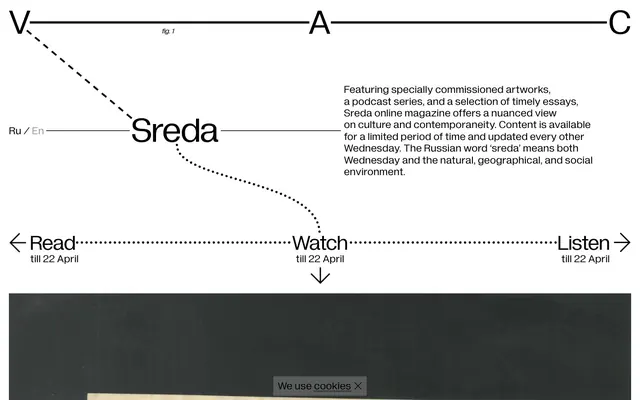
The V–A–C Sreda design system presents a stark, almost architectural aesthetic using a high-contrast black and white palette. Its visual identity revolves around precise lines, dotted paths, and block typography that evokes technical drawings or abstract diagrams. Emphasis is placed on direct, functional navigation with minimal embellishment, conveying information through calculated arrangement and a sense of measured tension between elements. The system eschews softness or fluidity in favor of a rigid-yet-dynamic structure, where type and line work define the visual rhythm.
The page model is full-bleed horizontally but with implicit vertical divisions, centered around a clear information hierarchy defined by lines and text blocks. The hero section is characterized by large, single-character headlines ('V', 'A', 'C') linked by solid lines, acting as abstract graphic anchors, followed by the brand name 'Sreda' as a dominant visual. Content sections flow vertically with strong visual separators, like the long horizontal lines. The primary content arrangement involves a large text block on the right, providing descriptive information, while interactive navigation elements ('Read', 'Watch', 'Listen', linked by dotted lines) are horizontally distributed below. There's no apparent grid for cards or features; instead, a linear flow with strong visual axes. Density is comfortable, with generous blank space around primary interactive elements, but descriptive text blocks can be quite dense. Navigation integrates directly into the content flow through aligned text links and dotted pathway indicators rather than a dedicated header or sidebar.
The visual language is characterized by an absence of traditional imagery in the UI. Instead, dotted lines, stark outlines, and the typographic treatment of headlines like 'V', 'A', 'C', and 'Sreda' function as primary graphic elements. The only visual content observed is a background element which appears to be product/artwork focused, suggesting a content area, rather than UI imagery. Icons, if present, would likely be minimal, outlined, and monochromatic to align with the system's graphic precision. The design is heavily text-dominant, relying on typography and line work to convey information and structure.
Reminiscent of Certain editorial/art magazines online, Dieter Rams' design principles/Braun, Brutalism-inspired websites, Some conceptual art platforms.
# V–A–C Sreda — Style Reference
> Architectural grid on white

**Theme:** light

**Site:** https://sreda.v-a-c.org

The V–A–C Sreda design system presents a stark, almost architectural aesthetic using a high-contrast black and white palette. Its visual identity revolves around precise lines, dotted paths, and block typography that evokes technical drawings or abstract diagrams. Emphasis is placed on direct, functional navigation with minimal embellishment, conveying information through calculated arrangement and a sense of measured tension between elements. The system eschews softness or fluidity in favor of a rigid-yet-dynamic structure, where type and line work define the visual rhythm.

## Tokens — Colors

| Name | Value | Token | Role |
|------|------|------|------|
| Canvas White | `#ffffff` | `--color-canvas-white` | Primary page and background surfaces, default text fill for inverted states |
| Diagram Black | `#000000` | `--color-diagram-black` | Neutral form states, badge text, and quiet UI feedback where color should stay understated. Do not promote it to the primary CTA color |
| Muted Gray | `#999999` | `--color-muted-gray` | Secondary text, subtle instructional prompts, and inactive or subordinate border elements |

## Tokens — Typography

### Diagramatika Display
- **Substitute:** Montserrat
- **Weights:** 400
- **Sizes:** 16px, 24px, 48px, 80px
- **Line height:** 0.8, 1.2
- **Role:** Dominant font for headings and large display text, creating a bold, geometric presence. Its narrow character forms set a distinct, modern tone.

### Diagramatika Text
- **Substitute:** Open Sans
- **Weights:** 400
- **Sizes:** 16px, 20px, 24px
- **Line height:** 0.9, 1, 1.1, 1.2
- **Role:** Used for body text, links, and general content, providing readability with a consistent contemporary feel that complements the display font. It maintains the system's geometric ethos.

### Arial
- **Substitute:** system-ui
- **Weights:** 400
- **Sizes:** 13px, 20px
- **Line height:** 1.2
- **Role:** System fallback for small utility text, input fields, and specific button elements, ensuring baseline legibility where custom fonts might not load.

## Tokens — Type Scale

Augmented Fourth (1.414) from 16px base.

| Role | Size | Line height | Letter spacing |
|------|------|------|------|
| caption | 13px | 1.2 | — |
| body | 16px | 1.2 | — |
| subheading | 20px | 1.2 | — |
| heading | 24px | 1.2 | — |
| heading-lg | 48px | 0.8 | — |
| display | 80px | 0.8 | — |

## Tokens — Spacing

- **Section gap:** 50px
- **Card padding:** 20px
- **Element gap:** 20px

## Tokens — Radius

- **Default:** 0px

## Layout

The page model is full-bleed horizontally but with implicit vertical divisions, centered around a clear information hierarchy defined by lines and text blocks. The hero section is characterized by large, single-character headlines ('V', 'A', 'C') linked by solid lines, acting as abstract graphic anchors, followed by the brand name 'Sreda' as a dominant visual. Content sections flow vertically with strong visual separators, like the long horizontal lines. The primary content arrangement involves a large text block on the right, providing descriptive information, while interactive navigation elements ('Read', 'Watch', 'Listen', linked by dotted lines) are horizontally distributed below. There's no apparent grid for cards or features; instead, a linear flow with strong visual axes. Density is comfortable, with generous blank space around primary interactive elements, but descriptive text blocks can be quite dense. Navigation integrates directly into the content flow through aligned text links and dotted pathway indicators rather than a dedicated header or sidebar.

## Imagery

The visual language is characterized by an absence of traditional imagery in the UI. Instead, dotted lines, stark outlines, and the typographic treatment of headlines like 'V', 'A', 'C', and 'Sreda' function as primary graphic elements. The only visual content observed is a background element which appears to be product/artwork focused, suggesting a content area, rather than UI imagery. Icons, if present, would likely be minimal, outlined, and monochromatic to align with the system's graphic precision. The design is heavily text-dominant, relying on typography and line work to convey information and structure.

## Components

### Navigation Link
*Primary navigation and content links*

Text in Diagramatika Text, 16px, weight 400, color Diagram Black. Features a solid Diagram Black border on hover/active states, indicating a selected navigational path. Often paired with dotted lines to visually connect actions.

### Headline Display Text
*Large, prominent text for section titles and branding.*

Uses Diagramatika Display, 80px, weight 400, color Diagram Black. Highly condensed line-height (0.8) to maintain visual tightness. Often appears as single characters or short words, acting as graphic elements.

### Body Text Block
*Descriptive text for articles and content blocks.*

Composed of Diagramatika Text, 16px-24px, weight 400, color Diagram Black, with a standard line-height of 1.2. The content fills available space, forming dense, readable blocks against the Canvas White background.

### Interactive Dotted Line
*Visual connectors and indicators for user interaction.*

A dotted line stroke in Diagram Black, primarily used to guide the eye or visually link related actions/content. Functions as a non-standard interactive element often with associated text.

### Ghost Button
*Subtle, outlined interactive elements.*

A button with a transparent background (rgba(0,0,0,0)), Diagram Black text (Arial, 13px), and a 1px Diagram Black border. Features 0px border-radius and 0px padding, integrating seamlessly into the surrounding layout rather than standing out.

### Cookie Consent Banner
*Discrete notification for cookie usage.*

A small, fixed banner at the bottom of the viewport with a transparent dark grey background (#000000 with opacity via rgba), white text, and a minimal 'X' close icon. Uses Arial 13px, color Canvas White, 0px radius.

### Muted Helper Text
*Secondary, less prominent textual information.*

Uses Diagramatika Text, 16px, weight 400, color Muted Gray. Often found accompanying interactive elements like navigational links to provide context.

## Guidelines

### Do

- Prioritize Diagram Black (#000000) for all text and UI outlines against Canvas White (#FFFFFF) backgrounds to maintain high contrast.
- Use Diagramatika Display for all large type elements (48px and above) with a tight line-height of 0.8 to create a graphic, almost abstract feel.
- Define interactive pathways and relationships using single-pixel dotted lines in Diagram Black, connecting elements visually rather than relying on traditional button styling.
- Employ 0px border-radius for all UI components, including buttons and inputs, to uphold a sharp, rectilinear visual language.
- Maintain a comfortable density for content blocks, using 20px padding around text or within cards, and 20px as a primary element gap.
- Use Muted Gray (#999999) exclusively for secondary, contextual labels or inactive states, ensuring it never competes with primary Diagram Black text.
- Structure layouts with a strong emphasis on horizontal and vertical lines as visual anchors, creating a grid-like framework that guides the eye through content.

### Don't

- Avoid using any colored backgrounds or accent colors; the system relies strictly on a black and white palette with only Muted Gray as a secondary neutral.
- Do not introduce rounded corners or soft edges on any UI elements. All shapes must maintain sharp, 0px radii.
- Refrain from using drop shadows or complex elevation effects; the design emphasizes flat surfaces and defined lines to create separation.
- Do not use bold or italic text styles; the system achieves visual hierarchy through font size, weight 400, and precise spacing rather than stylistic variations.
- Avoid decorative imagery that isn't black and white line art or diagrams; photography or colorful illustrations will disrupt the stark aesthetic.
- Do not use generic button styles with block backgrounds; interactive elements should manifest as text links, ghost buttons, or elements defined by borders/lines.
- Do not introduce unnecessary visual flair or animation; transitions should be subtle (0.3s ease for color/opacity), serving function over decoration.

## Agent Prompt Guide

Quick Color Reference:
text: #000000
background: #ffffff
border: #000000
accent: no distinct accent color
primary action: no distinct CTA color

Example Component Prompts:
1. Create a primary headline: 'Sreda' using Diagramatika Display, 80px, weight 400, color #000000, line-height 0.8. Ensure no letter spacing or rounded corners.
2. Create a navigation text link: 'Read till 22 April' using Diagramatika Text, 16px, weight 400, color #000000, line-height 1.2. Visually connect it with a dotted line in #000000, 1px stroke.
3. Create a descriptive text block: 'Featuring specially commissioned artworks...' using Diagramatika Text, 16px, weight 400, color #000000, with a line-height of 1.2. Set 20px padding around the block.
4. Create a ghost button: 'We use cookies X' using Arial, 13px, weight 400, color #ffffff. Give it an rgba(0,0,0,0) background and a 1px solid #000000 border, 0px padding, 0px radius.
More like this






Keep what you find
A free account saves references to boards and can send you a weekly email of picks based on what you save.
To see every result, go Pro.