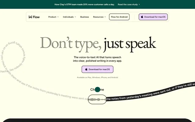
Preview image. Unlock full-res
Warm parchment sophistication
Color palette
Section backgrounds, prominent card backgrounds, active button fills
Primary action button backgrounds, accent underlines for headings
Accent badge backgrounds, decorative fills in illustrations
Page backgrounds, card surfaces, ghost button backgrounds, default borders — creating a soft, warm canvas
Primary text, dark card backgrounds, hero backgrounds, primary borders
Subtle border colors, secondary navigation backgrounds
Secondary text in navigation and neutral buttons
Headline text — a softer black for large, elegant typography
Text on dark backgrounds, icon strokes, active badge borders
Typography
- Weights
- 400, 500, 600, 700
- Sizes
- 14px, 16px, 20px, 22px, 24px, 32px
- Line height
- 0.95, 1, 1.3
- Fallback
- system-ui
Body text, UI elements, navigation, buttons, and detailed content — its clean, modern lines provide functional clarity.
- Weights
- 400
- Sizes
- 32px, 48px, 64px, 120px
- Line height
- 0.85, 0.95, 1.1, 1.3
- Letter spacing
- -0.03em at 32px, -0.05em at 48px, -0.07em at 64px, -0.13em at 120px
- Fallback
- serif
Display headings and prominent headlines — chosen for its classic, elegant character that introduces a sophisticated, editorial feel.
- Weights
- 400
- Sizes
- 72px
- Line height
- 1.3
Apple Color Emoji — detected in extracted data but not described by AI
Spacing & shape
Components
Buttons with Pale Lavender (#f0d7ff) background and Ink (#1a1a1a) text, rounded corners at 12px. Used for primary calls to action.
Transparent background with Ink (#222222) border and text, 0px radius. Used for secondary actions that don't need strong emphasis.
Forest Canopy (#034f46) background with Parchment (#ffffeb) text, 32px radius. Reserved for prominent, section-specific actions.
Parchment (#ffffeb) background, 32px padding, 32px border radius. Used for general content grouping on the light canvas.
Ink (#1a1a1a) background, 70px top-padding, 55px horizontal padding, 40px border radius. Used for featured content and sections on dark backgrounds.
Transparent background with Ink (#1a1a1a) text and 992px border radius, 11px vertical and 16px horizontal padding. For discrete labeling.
Forest Canopy (#034f46) background with White (#ffffff) text, 1000px border radius, 8px vertical and 16px horizontal padding. For prominent categorization.
Guidelines
- Use Parchment (#ffffeb) as the dominant background color for light sections and Ink (#1a1a1a) for dark sections to maintain visual rhythm.
- Apply EB Garamond for all display and large body headings to convey an academic, sophisticated tone, incorporating its specific letter-spacing values.
- Utilize Pale Lavender (#f0d7ff) exclusively for primary call-to-action buttons to ensure consistent highlight for interactive elements.
- Apply a 12px border-radius to all buttons and a 32px border-radius to cards, creating a consistent soft-edged aesthetic.
- Maintain a comfortable density with generous spacing: 64px for section gaps, 32px for card padding, and an 8px base unit for element gaps.
- Offset large typeface headlines with a subtle underline using Pale Lavender (#f0d7ff) to draw attention without excessive weight.
- Avoid using harsh, bright whites or pure blacks that would disrupt the soft, muted color palette.
- Do not deviate from the specified border-radii; sharp corners will undermine the friendly, approachable aesthetic.
- Refrain from heavy drop shadows or excessive elevation, as the design system prioritizes a flat, surface-level presentation.
- Do not introduce additional font families; Figtree and EB Garamond provide the necessary range for both functional and expressive text.
- Avoid overusing saturated colors; limit Sunburst (#ffa946) and Forest Canopy (#034f46) to functional accents and key sections.
- Do not use generic button styles; ensure all interactive elements conform to the Primary, Outline Ghost, or Branded Action Button variants.
About this system
ShowHide
Wispr Flow embraces a serene, almost academic aesthetic, blending a warm, muted palette with classic serif typography for large displays and a modern sans-serif for functional text. The design is characterized by generous spacing and soft, rounded elements that create a friendly and approachable feel. Dark, rich greens and deep grays are used to anchor sections, while a soft lavender provides a playful, yet restrained, accent for interactive elements.
Reminiscent of Grammarly, Otter.ai, Readwise.
# Wispr Flow — Style Reference
> Warm parchment sophistication

**Theme:** light

**Site:** https://wisprflow.ai

Wispr Flow embraces a serene, almost academic aesthetic, blending a warm, muted palette with classic serif typography for large displays and a modern sans-serif for functional text. The design is characterized by generous spacing and soft, rounded elements that create a friendly and approachable feel. Dark, rich greens and deep grays are used to anchor sections, while a soft lavender provides a playful, yet restrained, accent for interactive elements.

## Tokens — Colors

| Name | Value | Token | Role |
|------|------|------|------|
| Forest Canopy | `#034f46` | `--color-forest-canopy` | Section backgrounds, prominent card backgrounds, active button fills |
| Pale Lavender | `#f0d7ff` | `--color-pale-lavender` | Primary action button backgrounds, accent underlines for headings |
| Sunburst | `#ffa946` | `--color-sunburst` | Accent badge backgrounds, decorative fills in illustrations |
| Parchment | `#ffffeb` | `--color-parchment` | Page backgrounds, card surfaces, ghost button backgrounds, default borders — creating a soft, warm canvas |
| Ink | `#1a1a1a` | `--color-ink` | Primary text, dark card backgrounds, hero backgrounds, primary borders |
| Stone | `#e4e4d0` | `--color-stone` | Subtle border colors, secondary navigation backgrounds |
| Charcoal Text | `#222222` | `--color-charcoal-text` | Secondary text in navigation and neutral buttons |
| Muted Ash | `#8a8a80` | `--color-muted-ash` | Headline text — a softer black for large, elegant typography |
| White | `#ffffff` | `--color-white` | Text on dark backgrounds, icon strokes, active badge borders |

## Tokens — Typography

### Figtree
- **Substitute:** system-ui
- **Weights:** 400, 500, 600, 700
- **Sizes:** 14px, 16px, 20px, 22px, 24px, 32px
- **Line height:** 0.95, 1, 1.3
- **Role:** Body text, UI elements, navigation, buttons, and detailed content — its clean, modern lines provide functional clarity.

### EB Garamond
- **Substitute:** serif
- **Weights:** 400
- **Sizes:** 32px, 48px, 64px, 120px
- **Line height:** 0.85, 0.95, 1.1, 1.3
- **Letter spacing:** -0.03em at 32px, -0.05em at 48px, -0.07em at 64px, -0.13em at 120px
- **Role:** Display headings and prominent headlines — chosen for its classic, elegant character that introduces a sophisticated, editorial feel.

### Apple Color Emoji
- **Weights:** 400
- **Sizes:** 72px
- **Line height:** 1.3
- **Role:** Apple Color Emoji — detected in extracted data but not described by AI

## Tokens — Type Scale

Perfect Fourth (1.333) from 16px base.

| Role | Size | Line height | Letter spacing |
|------|------|------|------|
| body-sm | 14px | 1.3 | — |
| body | 16px | 1.3 | — |
| subheading | 20px | 1.3 | — |
| subheading-lg | 22px | 1.3 | — |
| heading-sm | 24px | 1.3 | — |
| heading | 32px | 1.3 | -0.48px |
| heading-lg | 48px | 0.95 | -0.48px |
| display | 64px | 0.85 | -0.48px |
| display-xl | 120px | 0.85 | -0.48px |

## Tokens — Spacing

- **Section gap:** 64px
- **Card padding:** 32px
- **Element gap:** 8px

## Tokens — Radius

- **Buttons:** 12px
- **Inputs:** 14px
- **Cards:** 32px
- **Images:** 40px
- **badges:** 992px
- **global:** 1600px

## Components

### Primary Action Button
*Interactive element*

Buttons with Pale Lavender (#f0d7ff) background and Ink (#1a1a1a) text, rounded corners at 12px. Used for primary calls to action.

### Outline Ghost Button
*Interactive element*

Transparent background with Ink (#222222) border and text, 0px radius. Used for secondary actions that don't need strong emphasis.

### Branded Action Button
*Interactive element*

Forest Canopy (#034f46) background with Parchment (#ffffeb) text, 32px radius. Reserved for prominent, section-specific actions.

### Soft Card
*Content container*

Parchment (#ffffeb) background, 32px padding, 32px border radius. Used for general content grouping on the light canvas.

### Dark Content Card
*Content container*

Ink (#1a1a1a) background, 70px top-padding, 55px horizontal padding, 40px border radius. Used for featured content and sections on dark backgrounds.

### Subtle Badge
*Categorization/status*

Transparent background with Ink (#1a1a1a) text and 992px border radius, 11px vertical and 16px horizontal padding. For discrete labeling.

### Branded Badge
*Categorization/status*

Forest Canopy (#034f46) background with White (#ffffff) text, 1000px border radius, 8px vertical and 16px horizontal padding. For prominent categorization.

## Guidelines

### Do

- Use Parchment (#ffffeb) as the dominant background color for light sections and Ink (#1a1a1a) for dark sections to maintain visual rhythm.
- Apply EB Garamond for all display and large body headings to convey an academic, sophisticated tone, incorporating its specific letter-spacing values.
- Utilize Pale Lavender (#f0d7ff) exclusively for primary call-to-action buttons to ensure consistent highlight for interactive elements.
- Apply a 12px border-radius to all buttons and a 32px border-radius to cards, creating a consistent soft-edged aesthetic.
- Maintain a comfortable density with generous spacing: 64px for section gaps, 32px for card padding, and an 8px base unit for element gaps.
- Offset large typeface headlines with a subtle underline using Pale Lavender (#f0d7ff) to draw attention without excessive weight.

### Don't

- Avoid using harsh, bright whites or pure blacks that would disrupt the soft, muted color palette.
- Do not deviate from the specified border-radii; sharp corners will undermine the friendly, approachable aesthetic.
- Refrain from heavy drop shadows or excessive elevation, as the design system prioritizes a flat, surface-level presentation.
- Do not introduce additional font families; Figtree and EB Garamond provide the necessary range for both functional and expressive text.
- Avoid overusing saturated colors; limit Sunburst (#ffa946) and Forest Canopy (#034f46) to functional accents and key sections.
- Do not use generic button styles; ensure all interactive elements conform to the Primary, Outline Ghost, or Branded Action Button variants.

## Agent Prompt Guide

Quick Color Reference:
text: #1a1a1a
background: #ffffeb
border: #1a1a1a
accent: #f0d7ff
primary action: #f0d7ff (filled action)

3-5 Example Component Prompts:
1. Create a Primary Action Button: #f0d7ff background, #1a1a1a text, 9999px radius, compact pill padding. Use this filled treatment for the main CTA.
2. Design a Dark Content Card: Ink (#1a1a1a) background, 40px border radius, 70px top padding. White (#ffffff) text at 22px Figtree weight 400 for subheadings and 16px for body. Include a white icon using a White (#ffffff) stroke if possible.
3. Implement a Branded Action Button: Forest Canopy (#034f46) background, White (#ffffff) text at 16px Figtree weight 400, 32px radius and 32px padding overall.
4. Create a Section Header: EB Garamond at 64px, Muted Ash (#8a8a80), letter-spacing -0.07em, with a Pale Lavender (#f0d7ff) underline for emphasis.
More like this









Keep what you find
A free account saves references to boards and can send you a weekly email of picks based on what you save.
To see every result, go Pro.