Preview image. Unlock full-res
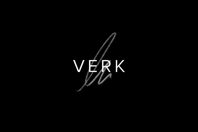
Minimalist hand-drawn logo for VERK featuring a split quill or leaf form with sans-serif wordmark on black background.
Summary
A sophisticated logo combining a hand-drawn quill or split-leaf mark in silver-gray with a clean sans-serif wordmark on a black background, suggesting luxury, writing, or editorial brands.
Visual description
Against a pure black background, a light gray hand-drawn quill or leaf shape sits above the word "VERK" in modern sans-serif. The mark appears organic and slightly imperfect (as if hand-sketched), with a delicate taper and split at the top. The typography is perfectly kerned and utilizes a narrower or condensed weight. The black-and-silver palette is classic and refined. The overall composition is vertically centered and symmetrical.
Key takeaway
Pairing hand-drawn organic marks with precisely executed typography creates elegance without sterility. The quill motif immediately suggests writing, creativity, or luxury goods. Monochromatic branding (black + one accent color) reads as premium and timeless.
Reuse notes
Ideal for luxury stationery, publishing houses, editorial platforms, or high-end creative agencies. The hand-drawn element adds warmth to formal sans-serif, working well for brands balancing modernity and craft. Reverses cleanly on dark backgrounds. The mark's simplicity ensures it scales from favicon to billboard.