Preview image. Unlock full-res
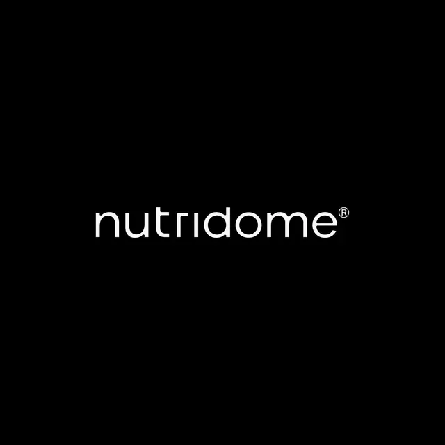
Centered wordmark in a light sans-serif with a registered trademark symbol, set against a deep black background for maximum contrast.
Summary
Nutridome wordmark in light geometric sans-serif with a registered trademark symbol, centered on black with no additional texture or decoration.
Visual description
A nutrition brand name set in a modern, light-weight sans-serif typeface with even stroke width and open letterforms (particularly the 'a' and 'e'). The word is in lowercase except for the first letter. A registered trademark symbol appears as a small superscript to the right. The entire composition is centered both horizontally and vertically on a pure black background, occupying roughly 40 percent of the frame height. The white text creates maximum contrast against the black.
Key takeaway
The restraint: a single typeface at one weight, centered with massive breathing room, lets the wordmark itself be the sole graphic element. The open letterforms read clearly at any scale. The ® mark is integrated naturally as a typographic detail rather than a visual accent.
Reuse notes
Effective for health-tech, nutrition, and wellness brands targeting professional or premium positioning. This approach works across all media because the contrast is absolute and the type is system-independent. Requires a truly good typeface choice, as there is nowhere for weak letterforms to hide.