Preview image. Unlock full-res
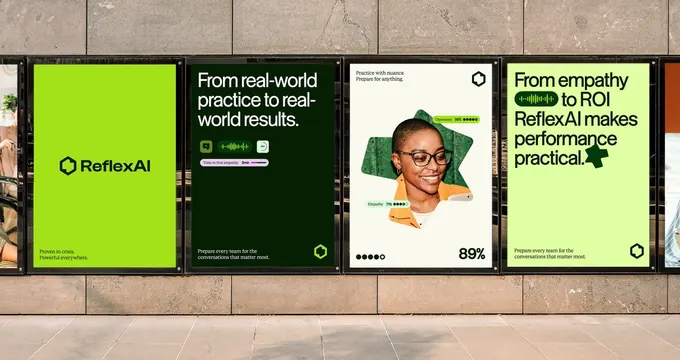
A row of street-poster brand executions for ReflexAI alternating lime-green and near-black panels, pairing a hexagon mark with bold sans headlines and waveform UI snippets.
Summary
Four ReflexAI posters mounted in a concrete corridor, alternating bright lime-green and near-black panels to build rhythm across a campaign. The system pairs a small hexagonal mark, heavy sans-serif headlines, and inline waveform UI fragments.
Visual description
Brand posters sit framed against a tiled concrete wall photographed at a slight angle. Panel one is solid lime green with the ReflexAI wordmark and hexagon mark plus small footer copy. Panel two is forest-black with a white headline ("From real-world practice to real-world results.") and a green audio-waveform widget with a slider. Panel three is light cream, centered on a cut-out photo of a smiling woman against a green hexagram shape, with small "Openness" and "Empathy" score chips and a large "89%" stat. Panel four returns to lime with a black headline ("From empathy to ROI...") and another inline waveform. The hexagon mark recurs in the corner of each panel as a consistent anchor.
Key takeaway
Alternating two saturated brand colors (lime and forest green) across sequential panels turns a flat poster row into a rhythm you read left to right. Embedding the actual product UI (waveforms, score chips, a percentage) directly into poster copy advertises the product feature instead of just the logo. The small recurring hexagon mark stitches varied layouts into one system.
Reuse notes
A strong template for an AI or SaaS out-of-home or social campaign that needs several layouts to feel like one family. Leans on one electric accent color, so it only works where that color is genuinely ownable. The embedded-UI trick requires a product interface clean enough to crop into a headline; messy dashboards will not survive the shrink.