Preview image. Unlock full-res
Bold modular identity for Cult using black-white quadrants, yellow accent panels, and nested circular motifs on a structured grid.
Summary
Bold modular identity for Cult using black-white quadrants, yellow accent panels, and nested circular motifs on a structured grid.
Visual description
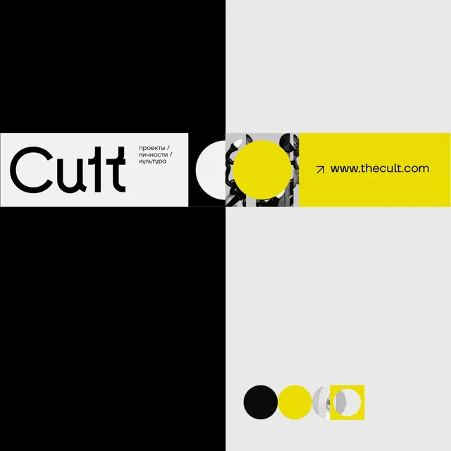
The composition is split into a stark black left half and light gray/white right half, each containing distinct identity elements. On the left, the "Cult" wordmark sits in black serif capitals against white, with Russian descriptive text ("проекты / личности / культура" translating to projects/personalities/culture) in smaller sans-serif. The right half contains a series of overlapping circles in black, white, and gray tones, leading into a bright yellow rectangle housing the website URL (www.thecult.com) in black sans-serif. At the bottom, a row of color swatches (black circle, yellow circle, gray ring, yellow square) shows the identity's core palette and geometric vocabulary. The overall grid is extremely disciplined, with precise alignment and clear quadrant divisions.
Key takeaway
The modular nested-circle device that transitions smoothly into the yellow block creates strong visual continuity. The Russian text hierarchy adds personality while the color discipline (pure black, white, yellow, gray) makes the system versatile. The icon row at bottom serves as both a color key and a proof of the geometric language.
Reuse notes
Strong for design agencies, creative studios, or cultural institutions. The high contrast works beautifully in print and on screen. The modular circle vocabulary could extend into application patterns (buttons, badges, dividers). Requires confident typography and negative space to land the Russian text as a feature, not a distraction.