Preview image. Unlock full-res
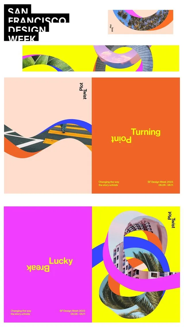
SF Design Week 2023 campaign posters built on a Plot Twist theme, using looping image-filled ribbons, upside-down headlines, and flat magenta, orange, and yellow fields.
Summary
A San Francisco Design Week 2023 campaign whose Plot Twist concept loops photographs into knotted ribbon shapes and flips half of every headline upside down across hot magenta, orange, and yellow posters.
Visual description
The board stacks several pieces of one campaign. At top, a chunky stacked black logotype reads SAN FRANCISCO DESIGN WEEK in a stencil-cut all-caps display face. Below it run two yellow banner crops where photos of architecture, palms, and sky are masked into curling looped ribbons. The large orange poster pairs a soft peach panel, where a street crosswalk image bends into a ribbon with a tiny walking figure, against a flood-orange panel carrying the headline Turning Point with Point set rotated 180 degrees. Footer text reads Changing the way the story unfolds and SF Design Week 2023, 06.06 to 06.11. A magenta-and-yellow poster repeats the system with Lucky Break, again half-inverted, beside buildings and palms knotted into interlocking loops. A small Plot Twist lockup, with Twist rotated, recurs as the campaign signature.
Key takeaway
The literal Plot Twist device: rotating one word of each two-word headline 180 degrees turns a plain phrase into the whole concept, cheap to apply and instantly consistent across a series. Masking ordinary location photography into looping ribbon shapes is a reusable way to make stock-feeling images feel custom and on-theme.
Reuse notes
A strong template for event or festival identities that need many variations from one rule. The flat fluorescent fields and inverted type read well at poster scale and on social tiles. The upside-down word hurts legibility, so keep it on short, familiar phrases and never on critical info like dates or venue.
More like this



Keep what you find
A free account saves references to boards and can send you a weekly email of picks based on what you save.
To see every result, go Pro.