Preview image. Unlock full-res
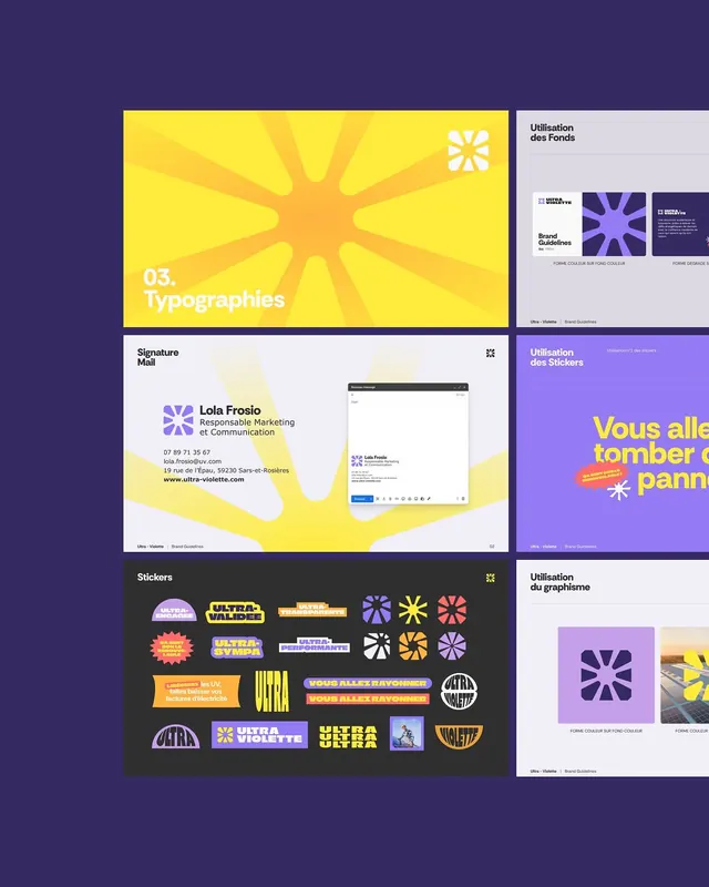
Six brand-guideline pages tiled on a deep indigo ground, pairing a yellow sunburst typography divider with sticker sheets, an email signature mockup, and a violet eight-point star mark.
Summary
A montage of "Ultra Violette" brand-guideline pages on indigo, anchored by a violet eight-point burst mark and a bright yellow sunray motif, showing the system stretched across typography, stickers, and stationery.
Visual description
Six guideline pages float as cards on a flat deep-indigo field, arranged in an uneven two-column grid. Top left is a yellow "03. Typographies" divider with radiating sunray rays behind the star mark. Below it, a "Signature Mail" page renders an email-client mockup over a faint yellow sunburst. The bottom-left "Stickers" page is a black sheet packed with rounded pill badges, die-cut stars, and bold French slogans in yellow, violet, red and white. The right column shows pale "Utilisation des Fonds", violet "Utilisation des Stickers" with oversized cut-off French headline type, and a "Utilisation du graphisme" page presenting the violet eight-point star in a swatch and on a photo. The recurring mark is an eight-point pinwheel star; the system runs entirely on violet, bright yellow, black and off-white.
Key takeaway
The single eight-point star mark deployed at every scale, as a flat icon, a die-cut sticker, a swatch fill, and a sunray background, proves a brand from one geometric primitive. The yellow sunburst behind otherwise plain pages is a cheap, high-energy way to make repetitive guideline spreads feel alive.
Reuse notes
A model for a playful, youth-leaning brand book where energy matters more than restraint, good reference for agency or marketing identity systems and sticker-heavy merch programs. Pairs the loud display layouts with calm utility pages so the deck breathes. Caveat: the saturated yellow-on-violet contrast is striking but tiring at length and demands strong type discipline to stay legible.
More like this




Keep what you find
A free account saves references to boards and can send you a weekly email of picks based on what you save.
To see every result, go Pro.