Preview image. Unlock full-res
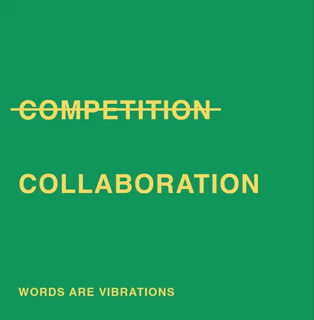
A bold typographic manifesto replacing COMPETITION with COLLABORATION via a single strikethrough, set in gold on emerald green.
Summary
A square poster that argues a single point through typography alone: COMPETITION is struck through in gold caps, replaced by COLLABORATION in a heavier weight of the same typeface on emerald green.
Visual description
Vertical square format on a solid emerald green background. Upper third: the word COMPETITION in light-weight gold sans-serif capitals, bisected by a thin horizontal strikethrough in matching gold, centered on the canvas. Below, separated by white space, the word COLLABORATION in the same sans-serif but noticeably bolder and heavier, rendered in the same gold. The bottom-left corner carries a small gold all-caps line reading WORDS ARE VIBRATIONS, credited as the concept or tagline. Left-aligned, type-only composition with no imagery, relying entirely on weight contrast and the negative green field to carry the message.
Key takeaway
A strikethrough paired with a heavier replacement word creates an instant argument without body copy. The weight progression (thin struck form to bold replacement) makes the hierarchy read immediately: light weight signals rejection, bold weight signals the preferred alternative. Color saturation and size alone would not carry the shift as clearly as weight does.
Reuse notes
A template for value-statement, manifesto, or position-statement graphics for nonprofits or cause-driven brands. Translates to any before/after or this-not-that messaging. The two-color approach (gold on green) maintains visual punch without color multiplication; swap out words and the format scales instantly. Works best as a shareable square or standalone statement rather than paired with photography.
More like this


Keep what you find
A free account saves references to boards and can send you a weekly email of picks based on what you save.
To see every result, go Pro.