Preview image. Unlock full-res
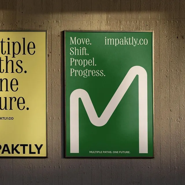
Three color-blocked posters with bold sans-serif type mounted on textured wall, featuring yellow, green, and beige panels with overlapping messaging.
Summary
Three color-blocked posters with bold sans-serif type mounted on textured wall, featuring green, yellow, and beige panels with messaging around movement and progress.
Visual description
Three poster panels hang on a rough textured wall in warm grey-brown tones. Left panel: mustard yellow with incomplete black sans-serif text fragments ('tiple', 'ths', 'ure', 'ktly.co'), suggesting cropped content and flow across the triptych. Center panel: deep forest green with stacked black sans-serif text 'Move. Shift. Propel. Progress' plus website 'impaktly.co' and a bold white curved form suggesting forward momentum or a wave. Right panel (partial): beige/cream tones with minimal visible type. The color palette (yellow, green, warm brown wall) is complementary and energetic. Typography is condensed, high-impact sans-serif in all-caps, creating rhythm through color blocks and staggered text placement.
Key takeaway
The bold color-blocking strategy using complementary warm (yellow) and cool (green) hues to separate and energize distinct messages; the white curved form as an abstract movement metaphor; the intentional text cropping that suggests content continuing beyond the frame, encouraging engagement across panels.
Reuse notes
Strong for sustainability, change-management, or motivational corporate campaigns where forward motion and optimism are core messages. The complementary green-yellow palette is particularly effective for environmental or growth-focused brands. Works well as a series where visual continuity and cropping create narrative flow. Requires confident typography and color to avoid feeling chaotic.
More like this

Keep what you find
A free account saves references to boards and can send you a weekly email of picks based on what you save.
To see every result, go Pro.