Preview image. Unlock full-res
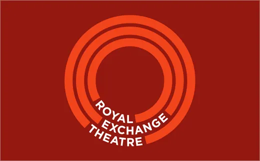
A concentric set of orange rings on deep red forms the Royal Exchange Theatre mark, with the name reversed in white type curving along the lower arcs.
Summary
The Royal Exchange Theatre mark built from three concentric orange rings on a deep brick-red field, with the theatre name set in white caps that curve along the open lower portion of the rings.
Visual description
A dark red rectangle holds a centered roundel of three nested orange rings of decreasing weight, leaving a clean hole of red negative space at the center. The orange-on-red pairing is close in hue, so the rings read as a tonal, almost glowing target rather than a hard contrast. At the bottom the rings break and the words "ROYAL EXCHANGE THEATRE" run in white sans-serif caps, each word riding the curve of a different ring so the type and the geometry interlock as one circular system.
Key takeaway
Curving the wordmark along the same arcs that form the symbol fuses logotype and logomark into a single object instead of stacking them. The near-tonal orange-on-red keeps the mark feeling rich and warm while still reading clearly, and the empty center invites a spotlight or stage association without spelling it out.
Reuse notes
A good model for cultural, arts, or venue identities that want warmth and a sense of focus or assembly. The concentric-ring-plus-curved-caps construction scales down to a favicon or stamp cleanly. Works best when the symbol color and background sit close on the wheel; a high-contrast version would lose the tonal glow.