Preview image. Unlock full-res
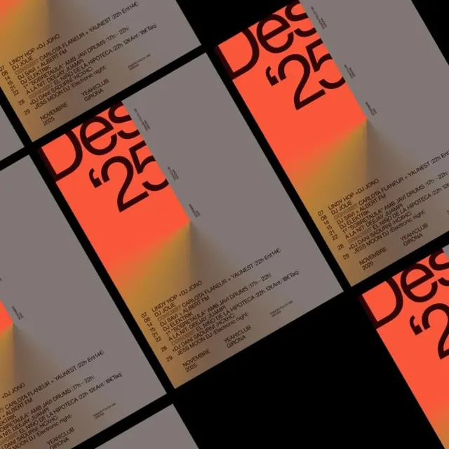
Event poster series using overlapped rectangular cards in burnt orange, tan, and charcoal, each tilted at an offset angle to create dynamic rhythm and layering effect.
Summary
Event poster series using overlapped rectangular cards in burnt orange, tan, and charcoal, each tilted at an offset angle to create dynamic rhythm and layering effect.
Visual description
Three overlapping rectangular cards arranged in a staggered composition, each rotated slightly counterclockwise and positioned to create visual overlap. The left card is burnt orange with black text; the center card is tan or light grey with darker accents; the right card is charcoal with white or light text. Each card contains small paragraphs of information in a clean sans-serif typeface. The offset arrangement creates a sense of movement and playfulness, preventing a static grid feeling. The warm and neutral tones work together to create sophisticated contrast.
Key takeaway
The offset-card technique for breaking the monotony of a standard grid. Slight rotation and overlapping creates depth and visual interest without adding decorative elements. The warm-to-cool color shift across the cards (burnt orange, tan, charcoal) adds sophistication to an otherwise minimal composition.
Reuse notes
Ideal for event posters, music promotion, or ticketing systems where you need to present multiple pieces of information without overwhelming the viewer. The overlap works well for dynamic, contemporary brands. Test the offset angles on small screens; some mobile contexts may benefit from a reduced tilt or full-width stacking instead.