Preview image. Unlock full-res
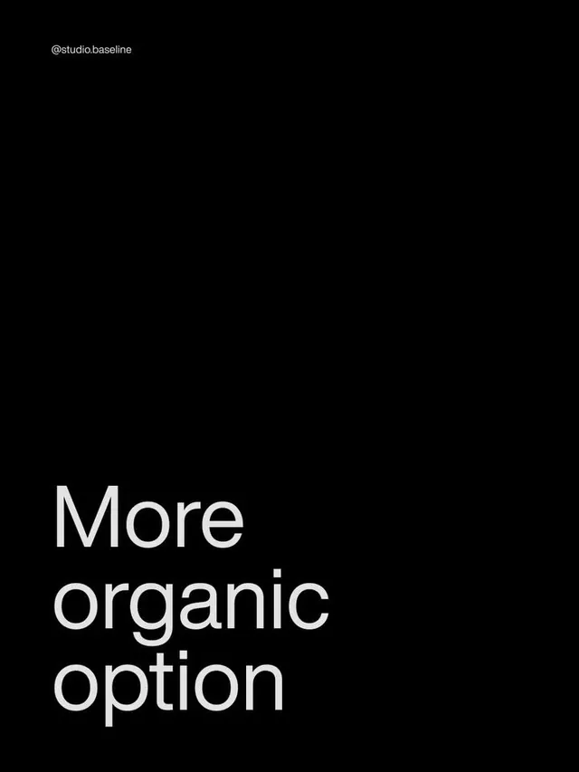
A near-empty black poster with a small studio handle top-left and a three-line white headline anchored to the bottom-left corner.
Summary
A portrait-format black slide that leaves the top two-thirds empty and drops a three-line white headline, "More organic option," into the bottom-left corner. The defining move is the extreme bottom-anchoring of the type.
Visual description
Pure black field. In the top-left a small grey handle reading "@studio.baseline" sits at caption size. The rest of the canvas is empty until the lower third, where the phrase "More / organic / option" stacks across three left-aligned lines in a light-weight white sans-serif. The type is large but not bold, with generous line spacing, and the baseline of the last line sits close to the bottom edge. No imagery, rules, or secondary elements.
Key takeaway
Anchoring the headline to the bottom-left and leaving the upper canvas deliberately empty creates tension and reads as a confident presentation slide rather than a centered placard. The tiny social handle in the opposite corner does all the branding work without competing with the message.
Reuse notes
Good template for a design-studio carousel slide, a quote card, or a section divider where you want one phrase to land. Works only on a dark field with a light-weight type; a bolder face would lose the calm. Pair with a follow-up slide that fills the empty top to vary rhythm.
More like this




Keep what you find
A free account saves references to boards and can send you a weekly email of picks based on what you save.
To see every result, go Pro.