Preview image. Unlock full-res
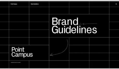
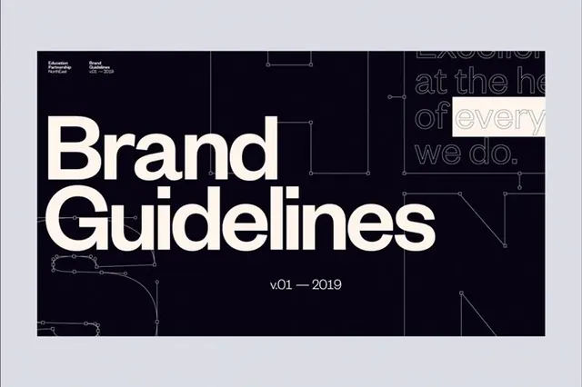
Dark brand-guidelines cover slide with an oversized white sans-serif title and a faint visible grid that exposes the layout structure.
Summary
A black guidelines cover that leaves its layout grid faintly visible, with a large white two-line "Brand Guidelines" title floating in the upper-right module.
Visual description
Near-black background overlaid with a low-contrast dark-grey column-and-row grid. A thin running header sits in the top margin: small labels reading "Point Campus" and "Brand Guidelines" at left, a page marker at the far right. The hero title "Brand Guidelines" is set in a heavy white sans-serif across two lines, occupying the upper-right cells. Lower-left, a secondary "Point Campus" lockup is set smaller with a tiny caption beneath. A single thin hand-drawn arrow curves from the title down toward the lower-left mark, the only organic gesture in an otherwise rigid frame.
Key takeaway
Letting the grid stay barely visible so the cover advertises its own system, then breaking that rigor with one hand-drawn arrow connecting the two type lockups. The offset placement (title upper-right, sub-lockup lower-left) creates diagonal tension instead of dead-centering the title.
Reuse notes
A clean opener for a brand-guidelines deck, design system doc, or campus/institutional identity. The visible grid reads as confident when alignment is genuinely tight, so only expose it if everything snaps. Pairs with light interior pages for a dark-to-light cover-to-content rhythm.
More like this




Keep what you find
A free account saves references to boards and can send you a weekly email of picks based on what you save.
To see every result, go Pro.