Preview image. Unlock full-res
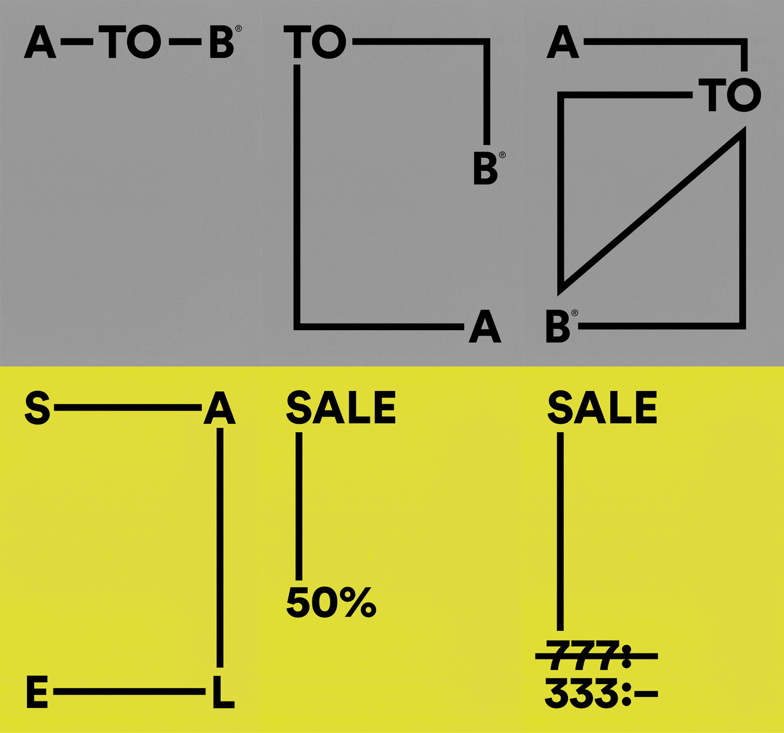
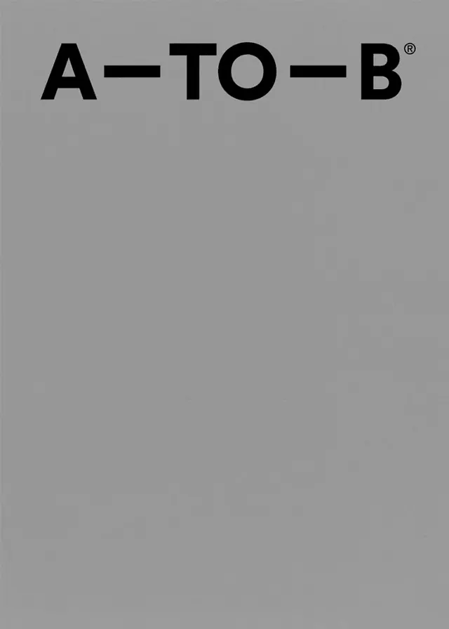
A minimal logotype reading A-TO-B in heavy black grotesque caps sits high-left on a flat mid-gray field, with the rest of the frame left as deliberate empty space.
Summary
A single bold wordmark, "A-TO-B" in heavy black uppercase grotesque, locked into the top-left of an otherwise empty flat gray field with a small registered-trademark mark. The vast unused space is the point.
Visual description
The frame is one flat mid-gray with a faint paper-like texture. The logotype runs across the top, set in a heavy geometric sans-serif with the letters joined by short bold hyphens ("A-TO-B"), and a small circled R superscript at the end. The type sits high and left rather than centered, leaving roughly four-fifths of the canvas as bare gray. No imagery, rule, or secondary text appears; the whole composition is the wordmark plus negative space. (Frame from an animated GIF.)
Key takeaway
Anchoring a wordmark hard to the top-left and surrounding it with a huge field of flat color, so the empty space reads as confidence rather than an unfinished layout. The hyphens-as-connectors turn a three-part name into a single continuous mark.
Reuse notes
Good model for a brand cover, title card, or poster where one short name should dominate through scale and restraint. Pairs with a single heavy grotesque and a muted background. Caveat: empty fields only feel intentional when the type weight and placement are decisive, and the flat gray needs the right tone to avoid looking like a placeholder.
More like this




Keep what you find
A free account saves references to boards and can send you a weekly email of picks based on what you save.
To see every result, go Pro.