Preview image. Unlock full-res
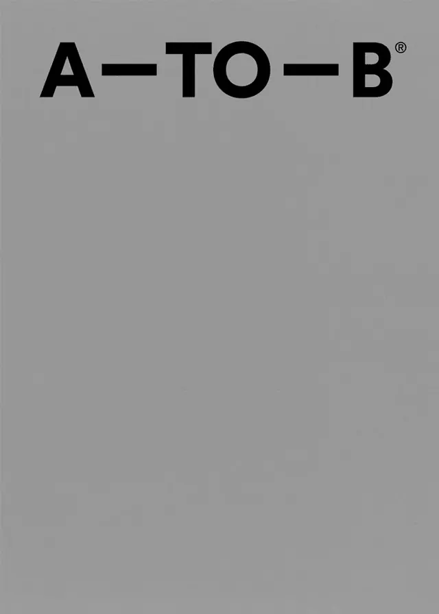
A minimalist wordmark reading 'A-TO-B' in heavy black grotesque with linked em-dashes and superscript registered mark, anchored to the top-left of a mid-grey field.
Summary
A condensed sans-serif wordmark with "A", "TO", and "B" connected by em-dashes and marked by a circled registered symbol, positioned at the top-left of a uniform grey ground with ample white space below.
Visual description
A full-page composition dominated by a single uniform mid-grey with no visible texture. One horizontal line of type anchors the upper-left quadrant: a bold, slightly condensed grotesque in pure black. The lockup reads as A, em-dash, TO, em-dash, B, with a small superscript circled R lifted to cap height after the final B. The em-dashes function as structural connectors, spacing the three tokens evenly and reinforcing the directional flow. The remaining four-fifths of the canvas is left completely empty, forcing the eye to read the mark as a discrete logo set against a large quiet void, as if on a cover or opening page. No other elements compete.
Key takeaway
Using em-dashes as the only connective element to link short words transforms a plain phrase into a structured, rhythmic logotype with built-in visual momentum. Positioning the mark hard to the top-left with the rest of the page empty reads as deliberate and reserved, not centered and timid. The small superscript registered mark adds legality and confidence without clutter. The compressed sans-serif with moderate contrast creates authority while maintaining simplicity.
Reuse notes
Strong reference for logistics, mobility, or consultancy wordmarks, or for a cover and title-page system where the mark sits top-left and content or imagery flows below. The em-dash linking pattern scales to any two- or three-word descriptor. Caveat: black on mid-grey reduces contrast compared to black on white, so verify legibility if the mark must work small or at distance. Pairs well with content-heavy layouts that use the top-left anchor as a persistent header.
More like this



Keep what you find
A free account saves references to boards and can send you a weekly email of picks based on what you save.
To see every result, go Pro.