Preview image. Unlock full-res
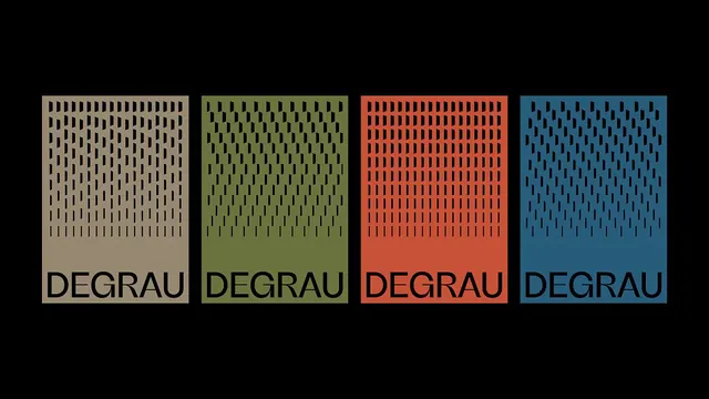
Four DEGRAU poster panels on black, each a different muted color with a field of vertical dashes that thins toward the bottom and a heavy uppercase wordmark anchoring the base.
Summary
A four-panel poster system for "DEGRAU" rendered as the same vertical-portrait template in four muted colorways. Each panel fills with a grid of short vertical dashes that grows sparser toward the bottom, leaving room for a heavy all-caps wordmark.
Visual description
Four equal portrait rectangles sit side by side on a pure-black ground: warm taupe, olive green, terracotta red, and slate blue. Each is filled top-to-bottom with a dense matrix of small black vertical dash marks that read like a typographic halftone, densest at the top and dissolving into open space lower down, suggesting a descending stair (the word degrau means "step" in Portuguese). The black wordmark "DEGRAU" is set heavy and uppercase across the lower third of every panel, breaking out of the dash field. The colorways are flat and desaturated, and the black gaps between panels turn the set into a unified strip.
Key takeaway
One template, four flat colorways: holding the dash field, wordmark size, and proportions constant while swapping only the panel color is the entire identity system in a single image. The dashes thinning toward the base does the conceptual work, turning a texture into a literal staircase.
Reuse notes
Reach for this when an identity needs to scale across a series (event posters, chapter covers, a publication's section dividers) and you want recognizability through pattern plus a fixed colorway rotation. The dash-density-as-gradient trick reads at any size and reproduces cleanly in one ink per panel.
More like this







Keep what you find
A free account saves references to boards and can send you a weekly email of picks based on what you save.
To see every result, go Pro.