Preview image. Unlock full-res
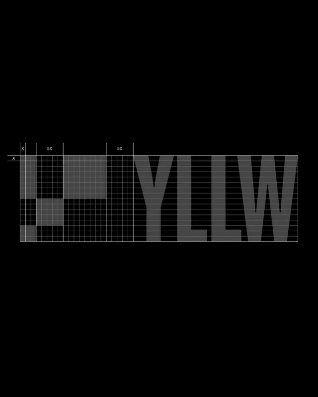
A logo-construction diagram on black showing the heavy YLLW wordmark overlaid with a fine measurement grid and X and 5X clearspace annotations in dark charcoal on black.
Summary
A brand-guideline construction sheet showing the bold "YLLW" wordmark rendered in dark charcoal on black, with a fine unit grid laid over it and "X" and "5X" callouts defining proportion and clearspace.
Visual description
Set against pure black, the heavy condensed sans wordmark "YLLW" sits in a near-black charcoal that is barely lighter than the ground, so it reads as a tonal ghost rather than a bright mark. A precise thin-line grid overlays the left portion and the leading "L" glyph, with white tick labels marking one unit "X" along the top and left and two "5X" spans across the width. The whole figure floats low and left in a wide black frame, leaving large empty margins. The aesthetic is engineering-diagram, not decorative.
Key takeaway
The deliberately low-contrast tonal-on-tonal treatment: putting a logo in charcoal on black makes a construction page feel restrained and premium while still showing the build. The X / 5X unit system communicates spacing rules visually without a paragraph of text.
Reuse notes
A reference for the construction/clearspace page of a brand guidelines deck. The tone-on-tone move suits austere tech, fashion, or studio identities. Note that the charcoal-on-black is intentionally hard to read; only use it where the audience is studying the page, not skimming it.
More like this





Keep what you find
A free account saves references to boards and can send you a weekly email of picks based on what you save.
To see every result, go Pro.